- Home
- :
- All Communities
- :
- Products
- :
- ArcGIS Survey123
- :
- ArcGIS Survey123 Questions
- :
- Re: Question: Live, Built-In Survey Feedback for U...
- Subscribe to RSS Feed
- Mark Topic as New
- Mark Topic as Read
- Float this Topic for Current User
- Bookmark
- Subscribe
- Mute
- Printer Friendly Page
Question: Live, Built-In Survey Feedback for Users and General Survey Formatting Advice
- Mark as New
- Bookmark
- Subscribe
- Mute
- Subscribe to RSS Feed
- Permalink
Hey all,
I'm putting together a survey that's digitizing an existing paper form and hoping to get advice to build in live feedback for the user, in addition to general survey formatting advice.
Overview
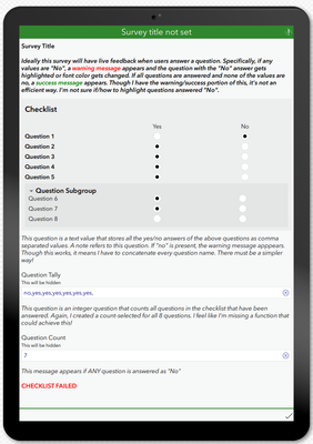
In essence the survey is really simple. It's an equipment checklist where the user just has to check if equipment is present or not (this isn't an inspection, just an inventory check). If any equipment is missing, that inspection is flagged. An excerpt of the survey can be found as attached to the post.
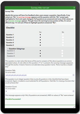
Though simple on paper, I'm hoping to add value using S123. Ideal vision is to have a warning message display if equipment is missing or a success message if all equipment is accounted for. Additionally, I'd love to have any equipment missing be highlighted (or at least have a font color change) in the form to clearly identify what is missing.
Current Progress
Survey Format
As I don't believe we can do single checkboxes in S123, I have the checklist currently setup as a group with appearance table-list. Each checklist item is a select_one yes_no question which accomplishes something similar. I believe this is the best formatting choice for this type of survey, but I'm not entirely sure.
Please note that I've added a genericized XLSForm so anyone taking time to look at this (thank you!) can better see and experience what's currently implemented.
Warning/Success Message
I have accomplished the warning/success message portion, but not in an efficient way at all. Hopefully I'm missing a function to make this easy.
Essentially what I did was to create a text question (will be hidden) that concatenates all answers of the checklist questions as comma separated values.
I also have an integer question (also to be hidden) that counts all the of the questions answered as the success message should appear if all equipment is present (i.e., marked as yes) and all checklist questions are answered.
For the warning message, I have a note that appears if the value of 'no' is present in that text question. Relevant expression:
contains(${question_tally}, 'no')
For the success message, I have a note that appears if the value of 'no' is not present in the text question, and, the count of questions answered equals the total number of equipment questions (8 questions in this example). Relevant expression:
contains(${question_tally}, 'no')=false and ${question_count}=8
This works, however the calculation I have to to concatenate and count answers for each question which is far from efficient.
E.g.,
concat(${question_1}, ',', ${question_2}, ',', ${question_3}, ',', ...)
count-selected(${question_1}) + count-selected(${question_2}) + count-selected(${question_3}) + ...
Is there a better way to achieve this? Maybe completely changing the survey format from select_one with table-list appearance something with select_multiple and using count-selected() or something similar?
Note the XLSForm is attached in this post.
Highlighting Responses of 'No'
With respect to the vision of highlighting/changing font color for responses that are no, is there a way to add an expression in one of the columns to change its appearance when "no" is selected?
The other option I can think of is adding a note below each question and having an appropriate "relevant" expression for each note if that question is answered "no". However if there is a better workflow for this, I'm all ears!
Questions
- Regarding the summary message - is there a better way to go about this than the method I have used? Either a function I'm missing or a completely different method that I haven't thought of/researched?
- Regarding highlighting questions answered no - is there an established workflow for this such as adding an expression in a column that changes appearance based on the answer? Or is the solution I presented one of the better options?
- Regarding the survey itself, is the format chosen appropriate for this survey, or should I re-design it to better match the functionality I'm hoping to implement?
Any and all suggestions are welcome and appreciated!
Thanks
Solved! Go to Solution.
Accepted Solutions
- Mark as New
- Bookmark
- Subscribe
- Mute
- Subscribe to RSS Feed
- Permalink
Have you seen my post on using emojis for this?
- Mark as New
- Bookmark
- Subscribe
- Mute
- Subscribe to RSS Feed
- Permalink
Have you seen my post on using emojis for this?
- Mark as New
- Bookmark
- Subscribe
- Mute
- Subscribe to RSS Feed
- Permalink
I just read through it and that's a great technique! Thanks for sharing that. Will definitely incorporate the emojis for each question to give instant feedback which answers the piece I didn't have a process for yet.
I'm still hoping that there is a way I don't know of to summarize a group of select_one questions to do the final summary check at the bottom, but at least I have a method (though inefficient) that works at this time.
Thanks again @DougBrowning !
- Mark as New
- Bookmark
- Subscribe
- Mute
- Subscribe to RSS Feed
- Permalink
No not really the way you are doing it is the standard way. I have tons of calc fields like that, often at 2 levels when using repeats. It can be a lot but copy paste it out, set the calc fields to bind esri null and its not too bad. This is really data analysis and not collection so we have been moving more to do these stats after the fact. We had so many cases where people do QA fixes in the web map, which skips the form and thus the calculations. Using Dashboards, Python, and Arcade worked out better for us.
I personally avoid select multiple since the data is so hard to use that way.
Hope that helps
- Mark as New
- Bookmark
- Subscribe
- Mute
- Subscribe to RSS Feed
- Permalink
That helps a lot! Great to know I wasn't too far off track, and the note about considering QA fixes in web maps that don't utilize form calculations is a fantastic point. Thanks so much for you time and advice Doug. Much appreciated 🙂

