- Home
- :
- All Communities
- :
- Products
- :
- ArcGIS Survey123
- :
- ArcGIS Survey123 Ideas
- :
- New Appearance Option for Multiple Choice Question...
- Subscribe to RSS Feed
- Mark as New
- Mark as Read
- Bookmark
- Follow this Idea
- Printer Friendly Page
- Mark as New
- Bookmark
- Subscribe
- Mute
- Subscribe to RSS Feed
- Permalink
We are using Survey123 as the basis of a works planning system, and we are loving the functionality that it provides.
It would be great to either have an alternative appearance option, similar to Minimal, which uses the drop down menu style, but that adjusts the width of the drop down menu box to the screen width when viewing the survey from a browser. Or for the current Minimal appearance option to allow for the drop down menus to extend to the width of the page/ width of the text labels as necessary.
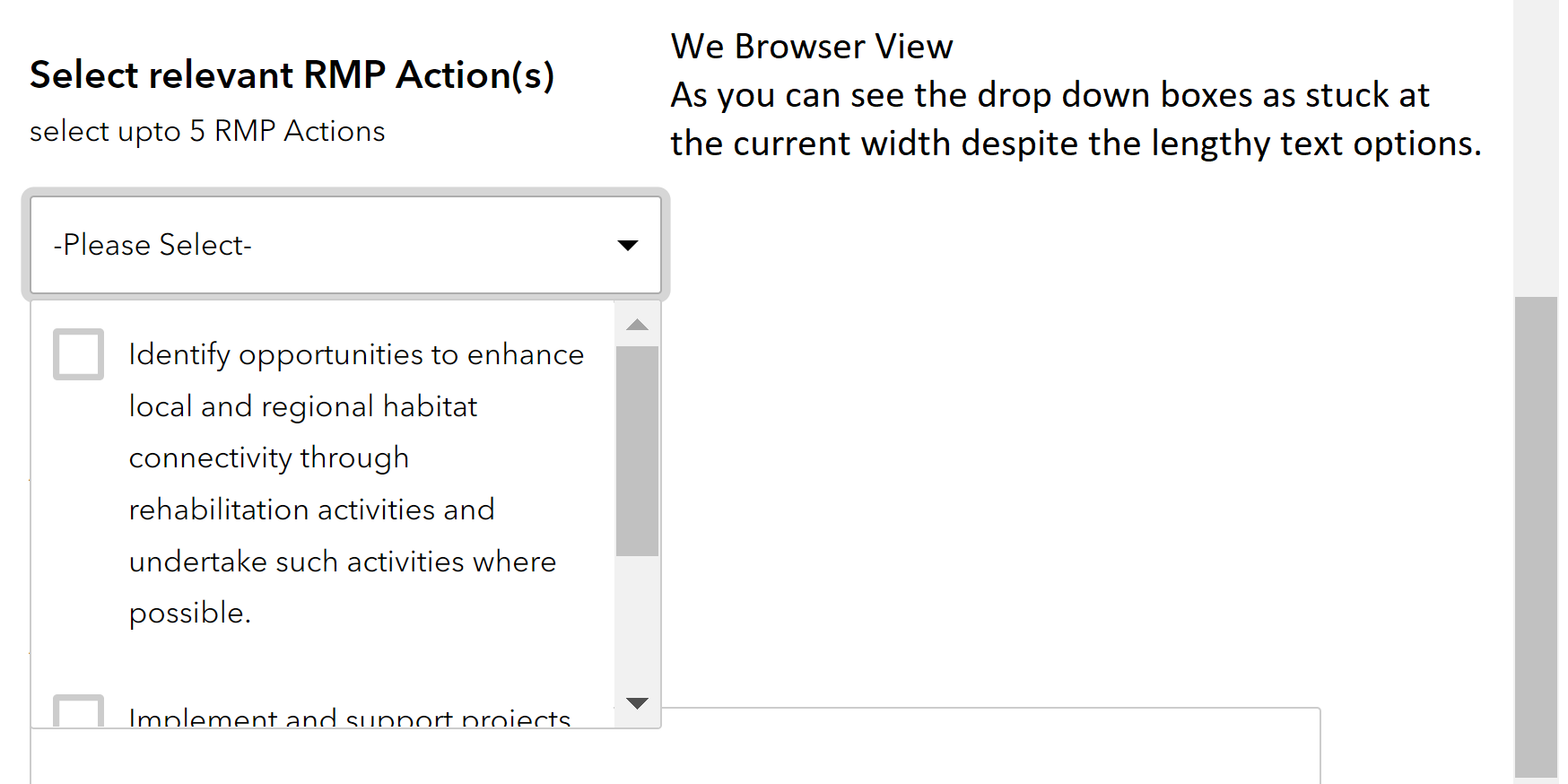
We have noticed that when using the Select Multiple Question Type via Web Browser, The minimal appearance does not provide enough width for the drop down to be able to successfully read the available options when the select multiple label texts are very long. We still want to use a drop down menu as otherwise the Survey becomes significantly longer with many options with a large amount of text when arranged in the horizontal or compact appearance options. At the moment the width of the minimal appearance drop down is not very user friendly.
I have found that we do not have the same issue when using the survey via the app, as the drop down boxes fit the available screen width, however when viewing via browser, they do not exhibit the same behaviour.
I have attached screen captures to show what currently happens.
Thanks!
Increasing the width of the drop down for the minimal/autocomplete appearance type on the Survey123 web app would be a nice enhancement. I've also found it can increase the amount of scrolling if the labels are long.
It completely sucks that the app and the browser look so much different all of the time. The app has so much more functionality in how it looks. I wish the survey 123 team would put a little more effort in making them match.
You must be a registered user to add a comment. If you've already registered, sign in. Otherwise, register and sign in.