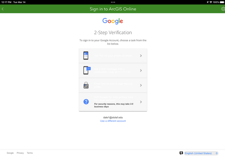
When you log into Survey123 on the mobile version (ex. iPad) the 2FA login text is all white!

You can definitely make a good guess what the methods are - but it's almost impossible to read the text. It would definitely make the app more accessible to users if the text was black.
For additional details - we are using the Google login through the organization/hosted (we are SAML/OATH) and the text always appears white when you are doing 2-Factor Authentication.