- Home
- :
- All Communities
- :
- Products
- :
- ArcGIS StoryMaps
- :
- ArcGIS StoryMaps Questions
- :
- What are the recommended browsers and versions for...
- Subscribe to RSS Feed
- Mark Topic as New
- Mark Topic as Read
- Float this Topic for Current User
- Bookmark
- Subscribe
- Mute
- Printer Friendly Page
What are the recommended browsers and versions for viewing the new style of storymaps?
- Mark as New
- Bookmark
- Subscribe
- Mute
- Subscribe to RSS Feed
- Permalink
- Report Inappropriate Content
I have a storymap built using the new (beta) style and when I open it in Chrome, Firefox or MS Edge on my Windows 10 laptop it displays fine. However in Safari on a mobile phone the text and images appear and behave as expected but the maps do not load. The place where they would display loads as a light gray box. If I open the storymap in Chrome on the same mobile device all elements display as expected.
The phone is an older iPhone 6s+ so I was wondering if this problem might be isolated to older devices. I will try to locate a newer one on which to test, but was wondering if there any more detailed device and browser requirements or if this is a known issue?
I found some browser requirements here: System requirements—ArcGIS StoryMaps | Documentation but it makes no mention of versions or devices.
Thanks,
Ken
Solved! Go to Solution.
Accepted Solutions
- Mark as New
- Bookmark
- Subscribe
- Mute
- Subscribe to RSS Feed
- Permalink
- Report Inappropriate Content
Ken -- The supported browsers are "evergreen" browsers that update automatically or with the mobile OS, so the supported version is the latest/current one. If we find a critical issue with older browser versions we look at addressing it depending on its impact for viewing stories.
Sounds like that older device doesn't support WebGL. We will be updating our system requirements page at the next release to list WebGL as a requirement since that is not currently shown.
Lead Product Engineer | StoryMaps
- Mark as New
- Bookmark
- Subscribe
- Mute
- Subscribe to RSS Feed
- Permalink
- Report Inappropriate Content
Thanks Owen. I suspected it might be something about the older device that was getting in the way. Maybe time for an upgrade.
- Mark as New
- Bookmark
- Subscribe
- Mute
- Subscribe to RSS Feed
- Permalink
- Report Inappropriate Content
It seems to be related to Safari. I'm currently on my Mac desktop Mohave 10.14, using Safari 13, and have lots of issues with Storymaps when viewing in Safari: maps not rendering; filters not working; charts not rendering correctly when underlying data is fine, etc. Just today when viewing ESRI StoryMap team's (Farm) Animal Planet, the map in the Sidecar remains static when I view using my desktop machine -- but on my iPad Pro, the same map does change.
Mia
- Mark as New
- Bookmark
- Subscribe
- Mute
- Subscribe to RSS Feed
- Permalink
- Report Inappropriate Content
Hi Mia Massicotte -- I replied to your comment on the other thread about the issue you reported in Safari but also wanted to ask you about the issues you describe above about charts and filters not working in your story in Safari.
Can you please provide some more information and possibly links to examples of these issues? We'd be happy to look into any problems you are seeing.
Lead Product Engineer | StoryMaps
- Mark as New
- Bookmark
- Subscribe
- Mute
- Subscribe to RSS Feed
- Permalink
- Report Inappropriate Content
Hi Owen,
I didn't report the charts/filters issues because initially I thought it was something I was doing incorrectly (and maybe still is). After battling with it for a while, I viewed my StoryMap popups and compared them to the filter layers/charts with the map popups in ArcGIS online, where I saw that they rendered fully, and correctly. I shrugged and had to press on.
But at that time I was also using Apple's wireless Magic Mouse which has a mind of its own. For working in ArcGIS Storymaps I've since switched to a Logitech cordless with scroll wheel which is much better suited, and that has eliminated some variables.
If I still have those layers/popups around in a storymap and am able to locate them, I'll post back to you.
Thanks --
Mia
- Mark as New
- Bookmark
- Subscribe
- Mute
- Subscribe to RSS Feed
- Permalink
- Report Inappropriate Content
Hi Owen,
I've temporarily shared my very-much-in-progress prototype storymap to illustrate the chart in popups problem:
- https://arcg.is/1594bq for the storymap.
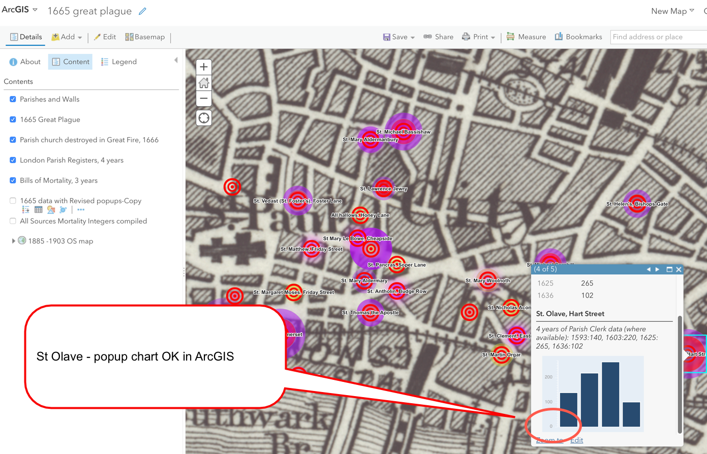
- temporarily shared web map viewed on ArcGIS: https://arcg.is/1vGr450
The Sidecar in question is more than half-way through the storymap. The popups in the 7th slide (heading is Bills of Mortality), see the Column chart for St Olave, Hart Street parish in StoryMap and compare to the same parish web map. Compare to St De'nis Backchurch (and others).
In the 8th slide (on 1665 Great Plague), view the Line chart for St Olave, compare StoryMap and Web Map. Compare to St De'nis Backchurch (and others).
I've attached some screenshots taken using Safari - using my desktop machine.
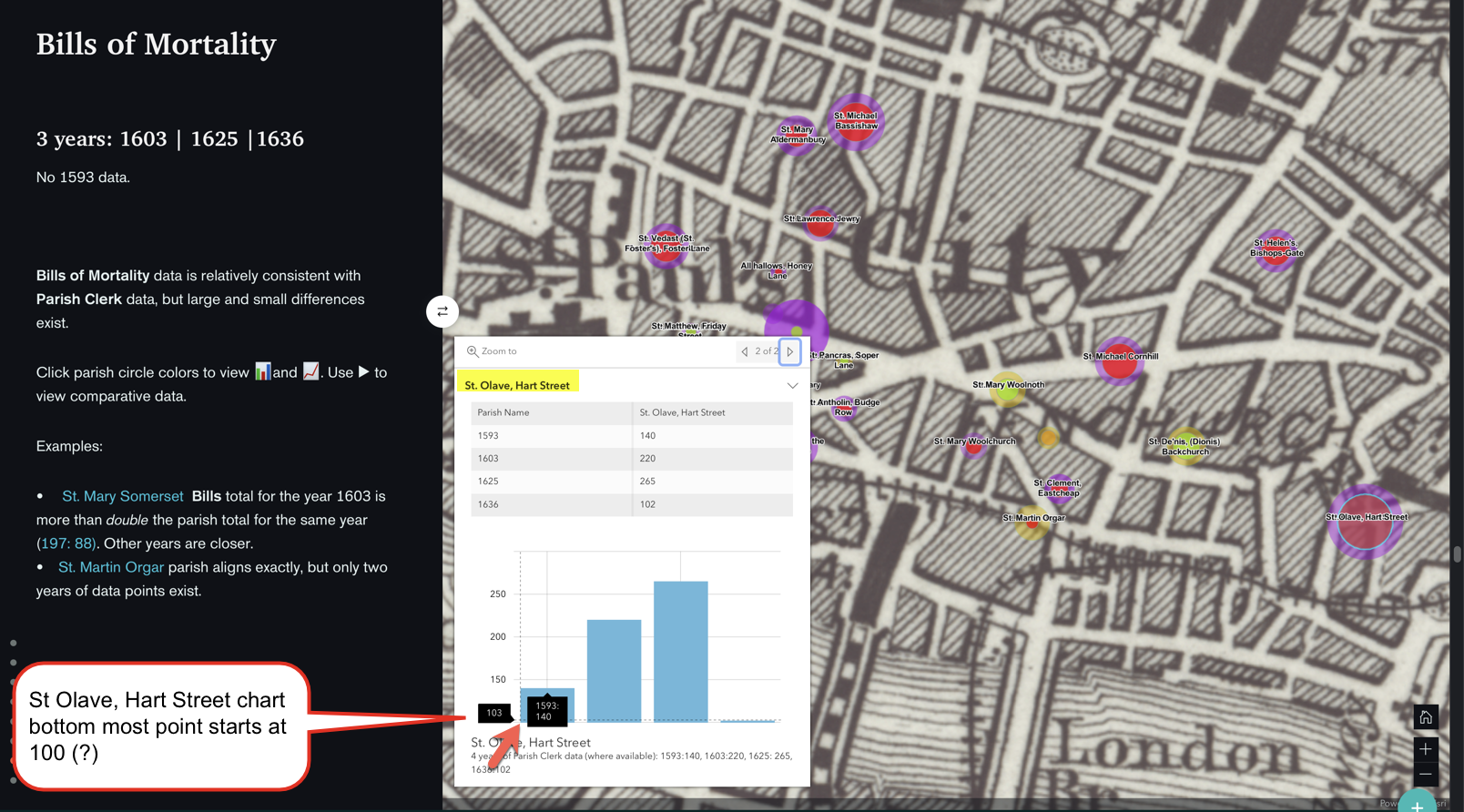
I had done a lot of fiddling but had spent ages and was reluctant to do any more changes, and since I'm just using a public account and am pretty much winging it, wanted to quit while I was ahead. 
Thanks arcgis storymap safari browser
Mia
- Mark as New
- Bookmark
- Subscribe
- Mute
- Subscribe to RSS Feed
- Permalink
- Report Inappropriate Content
Hi Owen,
Here's a followup.
- Mark as New
- Bookmark
- Subscribe
- Mute
- Subscribe to RSS Feed
- Permalink
- Report Inappropriate Content
Hi Mia -- Thanks for the additional information.
The reason the pop-up charts look different between your screenshots is that the ArcGIS.com map viewer (bottom screenshot in your post) uses the 3.x version of the ArcGIS API for JavaScript and ArcGIS StoryMaps (top screenshot in your post) uses the newer 4.x version. The 4.x version is the latest-generation mapping API that is already being used by some ArcGIS web apps, and it will be generally adopted by other apps in the ArcGIS platform moving forward.
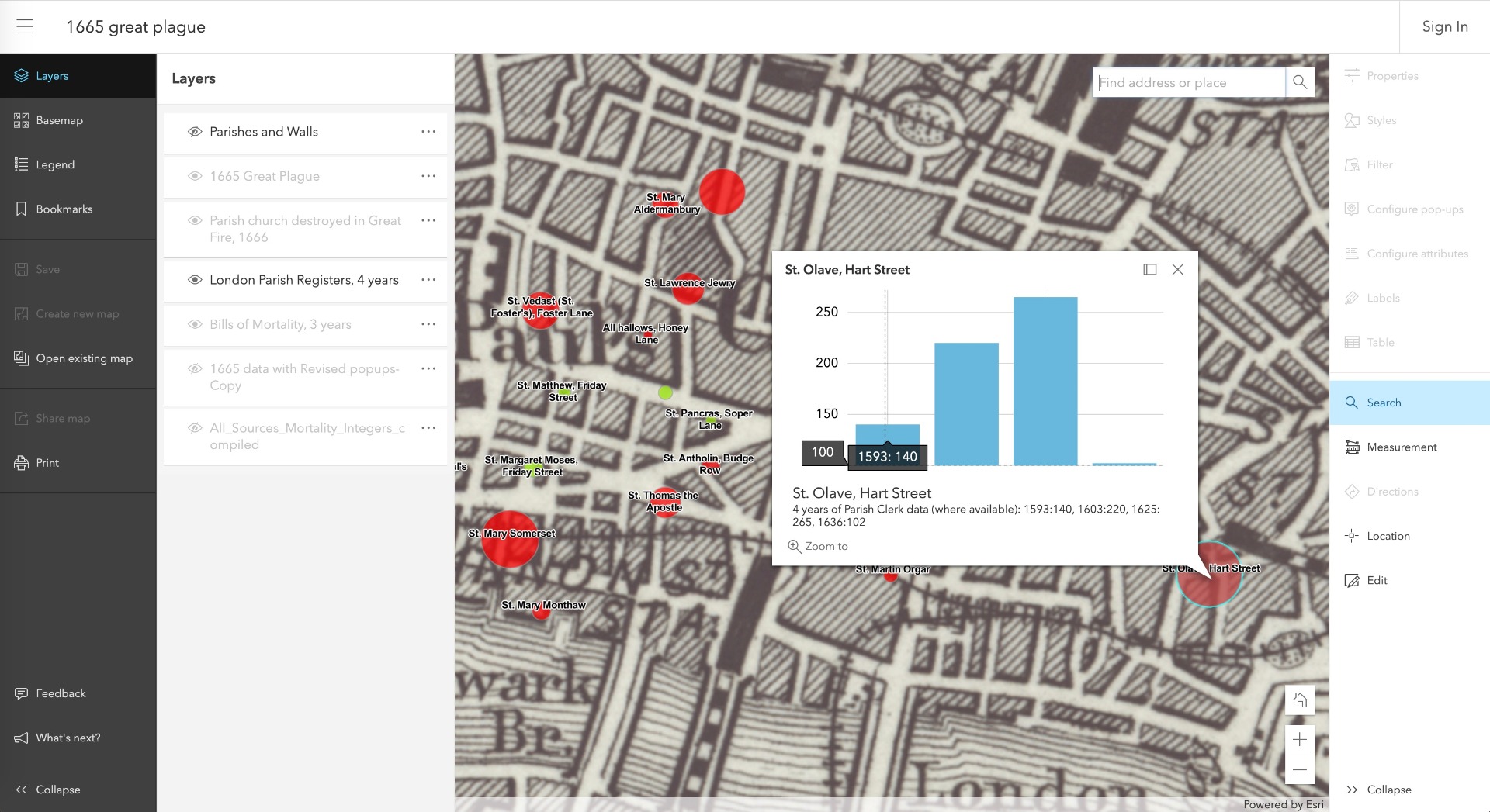
The pop-up charts will look like they do in ArcGIS StoryMaps in any 4.x-based app. For example, if you open you web map in the 4.x-based beta map viewer, you'll see the same chart style (see screenshot, below).
https://www.arcgis.com/apps/mapviewer/index.html?webmap=b3d9a25aa1a748c99b89410eda7a8398
So this isn't an error or bug, it's an updated chart style that adjusts the y-axis range in some circumstances. If you have feedback about how charts look in the 4.x JSAPI you can submit that on their GeoNet community page here: ArcGIS API for JavaScript
Also note that this is not an issue with a particular browser. This chart style will be seen in Safari, Chrome, and other browsers in any 4.x-based app like ArcGIS StoryMaps.
I hope this helps explain the differences you are seeing. Please let us know if you have any other questions or see other issues.
Lead Product Engineer | StoryMaps
- Mark as New
- Bookmark
- Subscribe
- Mute
- Subscribe to RSS Feed
- Permalink
- Report Inappropriate Content