- Home
- :
- All Communities
- :
- Products
- :
- ArcGIS StoryMaps
- :
- ArcGIS StoryMaps Questions
- :
- Re: Storymap links working on desktop but not on m...
- Subscribe to RSS Feed
- Mark Topic as New
- Mark Topic as Read
- Float this Topic for Current User
- Bookmark
- Subscribe
- Mute
- Printer Friendly Page
Storymap links working on desktop but not on mobile
- Mark as New
- Bookmark
- Subscribe
- Mute
- Subscribe to RSS Feed
- Permalink
I put links to 8 different public story maps on a website. They will currently load on desktop but have an error screen or appear in desktop layout when using mobile deceives. Does anyone know what would cause this issue?
website link: https://sustainability.uga.edu/community-engagement/campus-arboretum/
Solved! Go to Solution.
Accepted Solutions
- Mark as New
- Bookmark
- Subscribe
- Mute
- Subscribe to RSS Feed
- Permalink
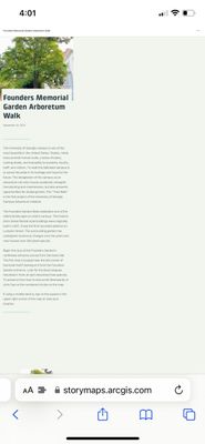
@rrs16117Sexton -- I'm sorry you are seeing an issue with some of your stories. I did some testing and I do see an issue for some stories where the story column width is much smaller than expected when viewing on a phone (screenshot below), but I didn't encounter an error screen for any of the stories.
Half of the stories displayed just fine and the other half showed too narrow. Here's a summary of what I saw.
- Display as expected: North Campus, Reed Quad, Lumpkin Woods, Myers Quad
- Display too narrow: Founders Garden, Ag Hill, DW Brooks, Oconee Forest Park
In the stories that show with a narrow column, it looks like there are a bunch of extra spaces in some of the tour place descriptions, and this appear to be throwing the formatting off when the story is viewed on smaller screens. For example,
Can you remove those spaces and see if that addresses the issue? I would recommend putting the cursor at the beginning of the second line of the description, hitting BACKSPACE, and then SHIFT+ENTER.
Lead Product Engineer | StoryMaps
- Mark as New
- Bookmark
- Subscribe
- Mute
- Subscribe to RSS Feed
- Permalink
Hey! Thank you for the response. I made those edits and now it seems like all the maps are loading correctly on some phones but not others. All maps loaded on my friend's iPhone 13 but not my iPhone 7. Do you know why this would be occurring? The story maps from this site loaded off of my phone serval weeks ago.
- Mark as New
- Bookmark
- Subscribe
- Mute
- Subscribe to RSS Feed
- Permalink
Glad that addressed the issue for the most part. The issue with iPhone 7 might be a bug in the older version of iOS/Safari. If it persists, you can contact Esri Support to log a bug for that specific device/OS.
Lead Product Engineer | StoryMaps
- Mark as New
- Bookmark
- Subscribe
- Mute
- Subscribe to RSS Feed
- Permalink
I can verify the stories that weren't working for me before are shown as expected now on my iPhone 12 (running iOS 16).
Lead Product Engineer | StoryMaps

