- Home
- :
- All Communities
- :
- Products
- :
- ArcGIS StoryMaps
- :
- ArcGIS StoryMaps Ideas
- :
- Story Map Tours different color pins
- Subscribe to RSS Feed
- Mark as New
- Mark as Read
- Bookmark
- Follow this Idea
- Printer Friendly Page
Story Map Tours different color pins
- Mark as New
- Bookmark
- Subscribe
- Mute
- Subscribe to RSS Feed
- Permalink
I'm making a Story Map tour (explorer) with a number of different "themed" stories. Is there any way to have different color pins? I'm not a coder, so simpler solutions are better for me, if possible!
- « Previous
-
- 1
- 2
- 3
- 4
- Next »
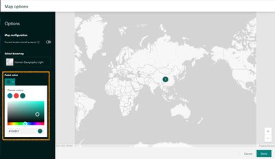
@SarahLevy1 - Sure, each tour (even tours in the same story) can use a different color.
Just go into the Map settings (in the top corner of the tour map) and you'll see the option to change the point color for that tour's points.
Sarah A. Levy
External Affairs
Desk: 503-231-6208
Cell: 971-263-4024
sarah_levy@fws.gov
@SarahLevy1 - That option is not currently available, but we are considering it for a future enhancement.
Could you provide some detail about what you'd like to be able to do so we can understand how you would use the colors? Would you use this in a guided tour, explorer tour, or both? What aspect of the tour locations would you be differentiating with color? How many different colors would you use in a single tour?
@SarahLevy1 - I've moved this to the ideas board so others can vote for it and share their use cases.
I work for the U.S. Fish and Wildlife Service, and we're highlighting the geographic locations of all of our success stories. We'd like to be able to group them by themes according to agency or Departmental priorities. So for example, fixing up infrastructure would be one priority, community outreach another, etc. Each of these themes would be their own color (fixing infrastructure blue, community outreach yellow, etc.). That way when someone is looking at the map, they can immediately tell what our stories cover. A legend would help with that as well.
I appreciate that you put this on the Ideas board!
Sarah A. Levy
External Affairs
Desk: 503-231-6208
Cell: 971-263-4024
sarah_levy@fws.gov
Designing an interactive map to display Northern California Marine Protected Areas and would really like to have points on my map with colors corresponding to the different color codes of the MPA's. I'd love to see the ability to have multiple different colored points on my map!
Not sure if this should be a different idea or not -- but additionally to this idea, I would also really like to see custom icons for the Map Tours (same functionality that was just added to express maps) as well as being able to change the color of the numbers on the points for a guided tour. I'm currently working with a dark basemap and would like to use white icons, but the numbers on the stops are white by default and so you wouldn't be able to read them. Even just a toggle for white or black numbers, depending on which contrasts best.
Thanks for all the great updates you've been putting out!
Yes, I would like the same. I am doing some water quality maps and would like to differentiate between sample locations ( with different colors for results that are within acceptable range and above acceptable range) and potential source locations (also a different color). This would allow us to see where the hot spots potentially coincided with locations that could be contributing to issues.
We would like to do this as well to symbolize projects that are "In Progress" vs. "Complete".
You must be a registered user to add a comment. If you've already registered, sign in. Otherwise, register and sign in.
