- Home
- :
- All Communities
- :
- Products
- :
- ArcGIS StoryMaps
- :
- ArcGIS StoryMaps Ideas
- :
- Customize "Get Started" button in Collections
- Subscribe to RSS Feed
- Mark as New
- Mark as Read
- Bookmark
- Follow this Idea
- Printer Friendly Page
Customize "Get Started" button in Collections
- Mark as New
- Bookmark
- Subscribe
- Mute
- Subscribe to RSS Feed
- Permalink
Hi there,
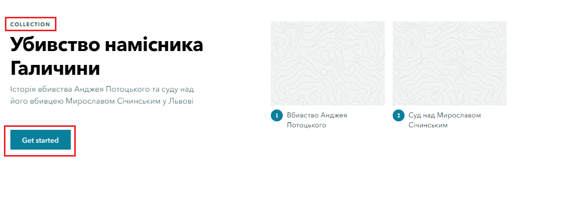
Is there a chance to edit/customize 'Get started' button and 'Collection' heading?
 I use storymaps in for Ukrainian-speaking audience. So, it would be great having the possibility to fully localize textual elements on the page. Ideally, I would like to change the text in red frames for the purpose of each collection/story I want to tell.
- « Previous
-
- 1
- 2
- Next »
I agree.
When using StoryMaps and Collections as a "professional" publication, it doesn't make sense to communicate the product name in the title.
So the possibility to change the text and also hide it would be useful.
I would like the option to remove the "collections" header and the "get started button". I use collections to provide the same story map in different language. To me, these two "features" are a hinderance and they potentially confuse users. The same goes for the little numbers displayed each element, indicating that the entries are to be viewed concecutively, which, again, is not the case for my setup. It seems rather shortsighted and inconsiderate by the developers to implement functions aimed at a very narrow set of use cases whilst being completely disruptive to others and without the option to disable them.
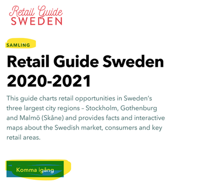
Yesterday a feature was added to ArcGIS StoryMaps that allows you to set the language for a collection. This ensures the "collection" heading and "get started" button appear in your selected language. For more information, see What’s new in ArcGIS StoryMaps (May 2022) (esri.com).
I'll leave this idea open so anyone that votes for it can weigh in on whether further customization is needed or if setting the collection language meets your needs.
-----
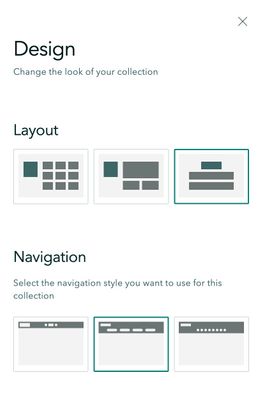
@Thorsten_Kahlert -- In the collection builder there are several choices for the cover page layout and navigation style, some options have/include item numbers and some do not. Open the Design panel to explore these options (see screenshot below).
This is the first time I've heard the suggestion of disabling numbers on the grid layout, but I understand how you feel that would be useful. If you'd like to see that as an enhancement the best way to build support for it is to submit your suggestion as a new, separate idea here on the ideas board so others can vote for it.
I noticed that in some layouts the numbers do not appear. The point is, however, that the assumption is that every collection consist of a set of items that can be viewed consecutively, almost like the chapters in a book. I would like to see an option where individual items within a collection are exclusive to each other. Like, for example, when publishing a story map in multiple languages.
Yes, great start @OwenGeo
Hopefully, additional votes come in on also adding full customization of the elements.
Chiming in just to say that seeing collections as less consecutive would be useful for me too! Would love to be able to disable the Get Started button entirely.
We got this enhancement done early! You can now remove the "get started" button and "collection" heading from the collection settings.
What's New in ArcGIS StoryMaps (May 2023) (esri.com)
I'm going to close this as implemented, although I realize the original idea mentioned full customization of the button. Most people commenting seemed to need either translation (which is covered by the collection language setting) or removal of the button. And now that you also have the ability to add a full description to the collection overview page, there is a lot more flexibility in how to create a collection.
If customization of the button text is still important to anyone for other reasons, please create a new idea for that and provide detail on the use cases where it would be needed.
You must be a registered user to add a comment. If you've already registered, sign in. Otherwise, register and sign in.

