- Home
- :
- All Communities
- :
- Products
- :
- ArcGIS StoryMaps
- :
- ArcGIS StoryMaps Ideas
- :
- Ability to put buttons next to each other
- Subscribe to RSS Feed
- Mark as New
- Mark as Read
- Bookmark
- Follow this Idea
- Printer Friendly Page
Ability to put buttons next to each other
- « Previous
-
- 1
- 2
- Next »
Thanks for sharing this idea. We have discussed this, but would like more information about how this would be used specifically in a story.
Could you please provide a little more about this use case? What is an example where you would use buttons next to each other? How many buttons would be required for your use case -- is two enough, or would three or more be needed?
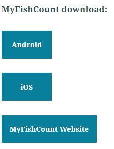
I think for situations where you may want to include options, yes vs no, android vs iOS, etc. It would be really nice to have a side by side button capability, rather than vertical stacking. Here is an example of something I am working on where I believe a horizontal layout would look better. At least 2 buttons side by side would be great!
I also think that this would be a nice option to have, for both aesthetic reasons and a better use of space on larger screens (less scrolling). Perhaps a new widget for a "Button Group"? It could have vertical stacking, horizontal placement, and maybe even a grid layout option for if there are many buttons.
The vertical stacking of subsequent buttons (the way it is now) is great for mobile and should probably stay like that, but horizontal and grid layouts that only appear when screen size allows would be wonderful.
Edit: I'll add that one of the most common criticisms we hear from our staff and readers for StoryMaps in general is the amount of scrolling involved. I don't always get it and people apparently have very different thresholds for what's considered too much scrolling, but we hear it a lot. The way buttons stack now isn't very space efficient on large screens, so any little thing to help reduce the amount of scrolling would be nice for those folks.
I support this idea too. Sometimes you will have several 'call to action' links at the end of a story, and it would be much nicer if we could add buttons in a horizontal row or a card gallery. Listing them vertically creates a lot of white space and additional scrolling. It can also give the impression that they are listed in order of importance.
This could also be resolved by my idea to Add links/buttons to images in a gallery card.
Hi, I am also looking to use buttons in a horizontal row. My example is in creating a "donate" button, for my organization to raise money. We have different donation-priced buttons for people to click. It does not work well aesthetically to have them vertically.
Has this issue been resolved?
This issue still hasn't been resolved. The only way around it is to have multiple links in normal paragraph text. Doesn't look as good or stand out on the page unfortunately.
I support this idea thoroughly.
Our marketing team have asked that we 'centre align' buttons and put more one one row.
I've had to go back and say 'this isn't possible' which is a bit awkward as it really is a basic function.
Not sure you need a 'use case' other than aestehics - and if all the other text is centre aligned ...
The 'side by side' thing is something our customers ask a lot too. We are always saying 'can't be done' to all the 'place these buttons side by side', 'place images with links side by side', 'place credits side by side'.
When you have just a few (2 or 3) buttons, links, credits or whatever the vertical placement does not look the best approach. We end up looking for some workaround with text and an image with al the images in a row.
You must be a registered user to add a comment. If you've already registered, sign in. Otherwise, register and sign in.
