- Home
- :
- All Communities
- :
- Products
- :
- ArcGIS Pro
- :
- ArcGIS Pro Questions
- :
- Re: Pie Chart Problem
- Subscribe to RSS Feed
- Mark Topic as New
- Mark Topic as Read
- Float this Topic for Current User
- Bookmark
- Subscribe
- Mute
- Printer Friendly Page
Pie Chart Problem
- Mark as New
- Bookmark
- Subscribe
- Mute
- Subscribe to RSS Feed
- Permalink
Hello, I am mapping our fish survey trawls on ArcGISpro, and I was wondering if it's possible to place a pie chart on each location that we trawled showing the % species caught. Is it possible to do that since the species is not numeric? Is there any other work around that doesn't involve me having to write the expression to convert to numeric data for 20 different fish species? Any help would be great.
- Mark as New
- Bookmark
- Subscribe
- Mute
- Subscribe to RSS Feed
- Permalink
Can you show us a sample of the data you want to summarize in the Pie Chart symbols... an image of the fields you have to use and their values maybe; or a sample .csv file?
- Mark as New
- Bookmark
- Subscribe
- Mute
- Subscribe to RSS Feed
- Permalink
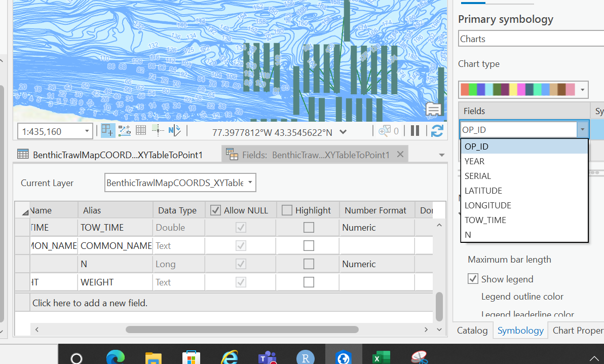
So I took a screenshot. in the symbology pane, it shows that two fields are missing (Common name of fish, and their associated weight totals for that particular tow). I noticed that both are not numeric type of fields, and I know in order to make a pie chart, I guess the fields it uses need to be numeric and not a string. Is there any work around other than having to write expressions to turn that "common name" field into a numeric type of data. All I want to do is add a pie chart for each lat/long point to help visually represent the make up of catches and how that changes with depth.
- Mark as New
- Bookmark
- Subscribe
- Mute
- Subscribe to RSS Feed
- Permalink
Sorry to ask another question, but I'm trying to picture the data: each tow will have many records in the table; one for each fish type? For example:

If this is true is this a table linked to a point feature class or is it a feature class with multiple points at the same location.. I.E. stacked on top of each other, one point for each fish type at each tow location?
- Mark as New
- Bookmark
- Subscribe
- Mute
- Subscribe to RSS Feed
- Permalink
Its just like your example and its a feature class with multiple points stacked on top.
- Mark as New
- Bookmark
- Subscribe
- Mute
- Subscribe to RSS Feed
- Permalink
Sorry. No easy way. Just a not so bad way.
If your data is in a database table leave it their before you convert the data to points. Then create a database view using SQL similar to that shown below.
Original Data (SQL Table, could have been imported from .csv):

Use the "Create Database View" geoprocessing tool using this code

easier to read version below

Then you can use this view (TestView in my case) to create a new query layer in your map by dragging it onto your map's table of contents. The new query layer looks like this:

You can now use the add data tool's X,Y point conversion tool to bring the data into the map in such a way that it can use Pie Chart Symbology

As for the weights being in text, you can make the conversion when you make your database view using the SQL CAST() function... something like this should work:

Hope this helps.