- Home
- :
- All Communities
- :
- Products
- :
- ArcGIS Pro
- :
- ArcGIS Pro Questions
- :
- Re: Labelling of bar chart x-axis labels in full
- Subscribe to RSS Feed
- Mark Topic as New
- Mark Topic as Read
- Float this Topic for Current User
- Bookmark
- Subscribe
- Mute
- Printer Friendly Page
- Mark as New
- Bookmark
- Subscribe
- Mute
- Subscribe to RSS Feed
- Permalink
Hi there
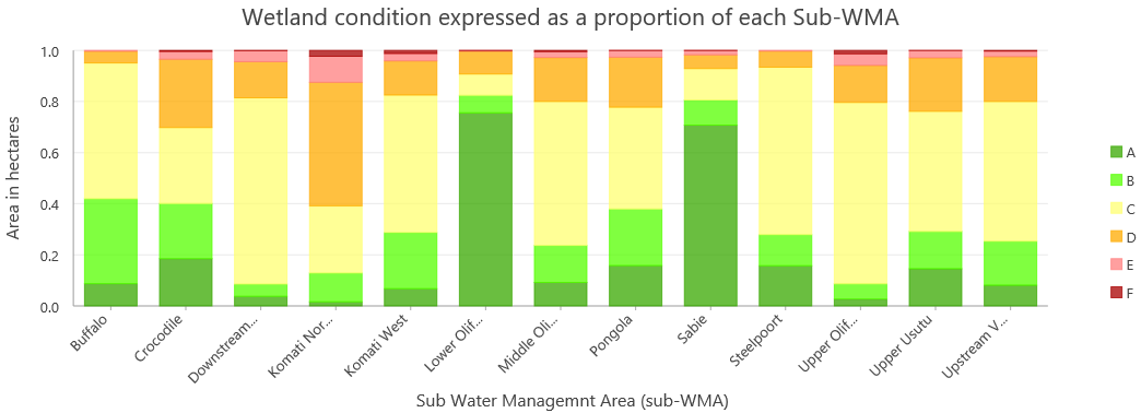
I am having trouble creating a stacked bar chart that displays my x-axis labels in full. It seems that after 10 character spaces, the name is truncated and '...' is added at the end of the name. See below example.
Changing font size of axis labels has no effect.

I first thought this may be a limitation of Pro's great charting functionality but then I saw a bar chart that Flora Vale had created for a Dev Summit tech workshop last year, while discussing Pro's charting functionality, where the x-axis label's were displayed in full. See below screengrab from that presentation on charts where District of Columbia is 20 characters long.

So I suspect it is possible and I would like to improve may bar chart before sharing it. I would therefore appreciate any advice or pointers from anyone that may have encountered a similar problem in the past. I have already checked out all the relevant help docs before writing.
Solved! Go to Solution.
Accepted Solutions
- Mark as New
- Bookmark
- Subscribe
- Mute
- Subscribe to RSS Feed
- Permalink
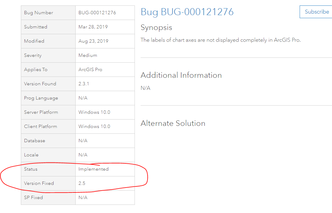
What you're seeing is described by this bug: https://support.esri.com/en/bugs/nimbus/QlVHLTAwMDEyMTI3Ng==
I'd recommend subscribing to that which will provide you with notifications on status updates and also increment the count of affected users:

- Mark as New
- Bookmark
- Subscribe
- Mute
- Subscribe to RSS Feed
- Permalink
Hi Kory
Thank you for the feedback, much appreciated.
Regards
Mervyn
- Mark as New
- Bookmark
- Subscribe
- Mute
- Subscribe to RSS Feed
- Permalink
Just in case you weren't subscribed, exciting to see that this will be fixed in Pro 2.5. So look for that when it releases in Q1 2020.
