- Home
- :
- All Communities
- :
- Products
- :
- ArcGIS Pro
- :
- ArcGIS Pro Questions
- :
- Hatched Symbology Legend Patch Only Showing Spaces...
- Subscribe to RSS Feed
- Mark Topic as New
- Mark Topic as Read
- Float this Topic for Current User
- Bookmark
- Printer Friendly Page
Hatched Symbology Legend Patch Only Showing Spaces, Not Hatches

- Mark as New
- Bookmark
- Subscribe to RSS Feed
- Permalink
I have some hatched polygons on my map with pretty wide spacing so when I export the figure, the legend patches are blank as they are just showing the spaces and not the hatches. To make things even worse, the way the legend patch looks in ArcGIS Pro is not the way it looks in the exported file so its not like I can mess with the offset to get one of the hatches to show. I've seen a few others ask about this on here but they haven't gotten real answers and since some of the questions are 10 years old, surely ESRI has done something about this by now?
The only work around in ArcGIS Pro that I can think of would be to make copies of all my feature classes, move the features outside of map extent, change symbology to very close together hatches. I'm trying to avoid this though with how tedious it would be considering I've spent a lot of time on these figures already and they are otherwise finished.
I am using ArcGIS Pro 2.8.1.
Thanks for any help,
Alex
Solved! Go to Solution.
Accepted Solutions


- Mark as New
- Bookmark
- Subscribe to RSS Feed
- Permalink
A potential workaround is to create a legend, then convert to graphics. The graphic patch symbology can then be adjusted as needed.
I suspect the reason an "official" workaround for this does not exist is that the whole point of a legend is to be representative of the features seen in the map. Having a map which does not accurately depict the features shows opens the door to misinformation, intentional or accidental.
You could also increase the patch size for that item in the legend so that it's large enough to clearly depict the hatching.
Kendall County GIS
- Mark as New
- Bookmark
- Subscribe to RSS Feed
- Permalink
A potential workaround is to create a legend, then convert to graphics. The graphic patch symbology can then be adjusted as needed.
I suspect the reason an "official" workaround for this does not exist is that the whole point of a legend is to be representative of the features seen in the map. Having a map which does not accurately depict the features shows opens the door to misinformation, intentional or accidental.
You could also increase the patch size for that item in the legend so that it's large enough to clearly depict the hatching.
Kendall County GIS


- Mark as New
- Bookmark
- Subscribe to RSS Feed
- Permalink
@AlexVerville this is the same as my idea.
We need the ability to modify the symbol scale, similar to how you set a reference scale on a map frame.
David
..Maps with no limits..
- Mark as New
- Bookmark
- Subscribe to RSS Feed
- Permalink
If you set a reference scale on a map, the legend will sync with the map frame.
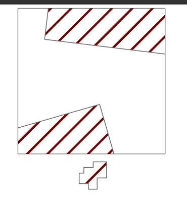
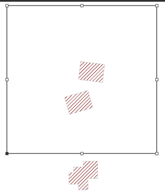
Here's an easy workaround to accomplish a legend with a separate reference scale than your map.
- Situate the main map frame how you want.
- Activate the frame and set the reference scale.
- Create a second map frame element, pointing to the same map. Put it off the page so it isn't included in your export.
- Tell your legend element to look at the new map frame.
- Adjust the zoom on the second map until the legend looks right.
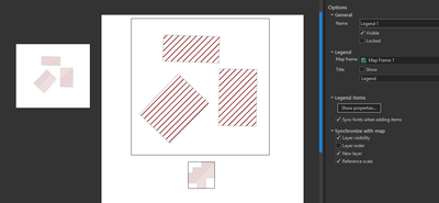
I'm still a bit dubious of the value of a legend which is not representative of the map, but regardless, you can do it, and without creating copies of layers or maps. All you need is a second map frame.
Kendall County GIS
- Mark as New
- Bookmark
- Subscribe to RSS Feed
- Permalink
@jcarlson Thanks for the response, I tried both and converting to graphics worked much better for me. All I had to do was change the spacing from 10pt to 5pt.
I am still disappointed in how poor the legend symbology is for hatched polygons though. In Contents, the hatched symbology is readable and consistent across each patch with the 10pt spacing. In the legend, the hatched symbology is not readable with the 10pt spacing, and with the 5pt spacing each patch looks different (left screenshot is Contents, right is from the exported figure).
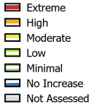
I agree that people can make a legend that is not representative of the map if they are able to change it from what is shown by default, but that's a risk the user should be aware of and willing to take if they decide to make changes. In my case, the symbology ArcGIS was showing in my legend made my map completely unreadable because it was not representative of what was shown on the map. I shouldn't be losing most of a day of work and making people wait because of something like this, not only is it unproductive but its embarrassing. At the very least they could just make the legend symbology match the contents symbology.
- Mark as New
- Bookmark
- Subscribe to RSS Feed
- Permalink
Note that the patches in your Contents pane are a bit taller than the legend patches, which would account for some of the difference there. But it still wouldn't show the symbols that well, even resized to being quite tall.
Kendall County GIS
