- Home
- :
- All Communities
- :
- Products
- :
- ArcGIS Pro
- :
- ArcGIS Pro Questions
- :
- Attribute Editor Docking and Placement Saving
- Subscribe to RSS Feed
- Mark Topic as New
- Mark Topic as Read
- Float this Topic for Current User
- Bookmark
- Subscribe
- Mute
- Printer Friendly Page
Attribute Editor Docking and Placement Saving
- Mark as New
- Bookmark
- Subscribe
- Mute
- Subscribe to RSS Feed
- Permalink
In old ArcMap, I could easily open any map, and have my Attribute Editor show up at the very bottom, extending to the entire screen showing only a certain number of rows. It was obviously saved in the normal.mxt and that was fine. Anytime I wanted to close it and reopen it, it would come back in that same format.
With ArcPro now not having a normal.mxt, each time I set up the position (having to use the weird and hidden "float" option) the way I want, when I close it, it defaults back as large and docked taking up most my screen and I have to reset the position and such every time which is highly annoying.
Is there anyway to customize where and how the Attribute Editor looks and is positioned (and left undocked at all times) at all?
In addition it would also be very nice to have the option to get rid of that large extra white space on top...
- Mark as New
- Bookmark
- Subscribe
- Mute
- Subscribe to RSS Feed
- Permalink
From the screenshot you included, I think you're referring to the attribute table. If so, this will be improved in ArcGIS Pro 2.5 coming in Q1 2020.
See this idea: ArcGIS Pro: Remember Attribute Table Location
And there are some screenshots and gifs here: https://community.esri.com/ideas/12696
and here: https://community.esri.com/ideas/13940
Cheers
- Mark as New
- Bookmark
- Subscribe
- Mute
- Subscribe to RSS Feed
- Permalink
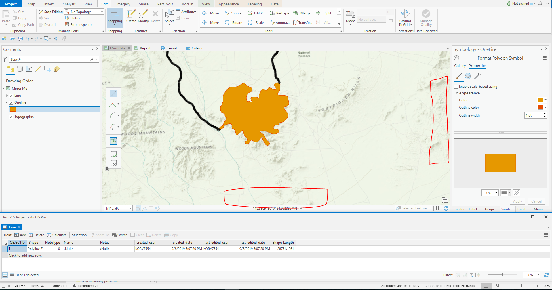
Yes thank you. This was what I was talking about. There is also the issue at the bottom too of some of the tools Feedback pane also not being able to be moved. I assume that too might be fixed so that doesn't show at the bottom of the screen as well in a locked and un-dockable location?
Seems like the Configure Tool Feedback only allows you to resize that pane, but not move it to another more appropriate location when I place the Attribute Table at the bottom and it covers it...
"Tool bar locked in place"
Attribute table when placed where I like it, covers the tool bar above
- Mark as New
- Bookmark
- Subscribe
- Mute
- Subscribe to RSS Feed
- Permalink
You could move that interactive bar to the left or right... Though depending on how you have your table view sized, it still might cover up some of it:

- Mark as New
- Bookmark
- Subscribe
- Mute
- Subscribe to RSS Feed
- Permalink
Maybe I should add here, that a more complete way to fake the "table docked across the bottom of the screen" behavior, would be to resize the main application. Somewhat like this:

That way you're not blocking any of the map view with the table. But if the real purpose is editing, why not close the attribute table and use the Attributes Pane for editing?

- Mark as New
- Bookmark
- Subscribe
- Mute
- Subscribe to RSS Feed
- Permalink
Yes at least moving the toolbar as you said through options to the left or right does solve the problem. Though it would be still easier if there was an option to just move it manually to where you want it. In the meantime this will be a quick fix and it does work.
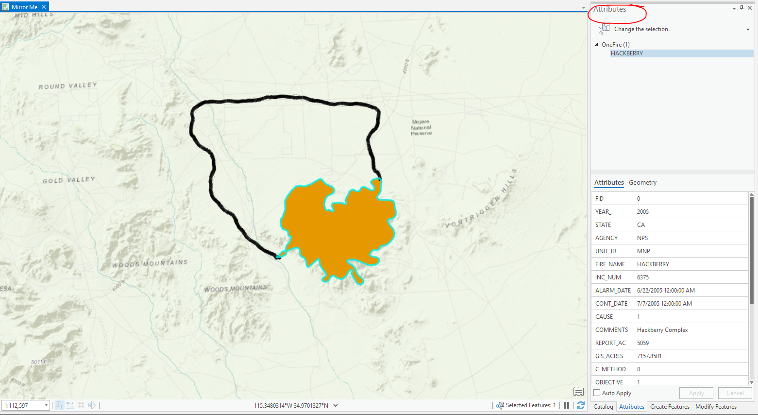
With the attribute pane, the issue is it takes up too much space, especially if you have templates also along the side and even the Create Pane. Seems everything is a new pane and each one just adds to the side, minimizing the work space.
I still would prefer to have the Attribute table at the bottom showing only 3 records and then I can easily edit from there as it would take away must less map real estate...
- Mark as New
- Bookmark
- Subscribe
- Mute
- Subscribe to RSS Feed
- Permalink
Hi Pete,
Just a thought: perhaps you can turn off the toolbar in Editing options, and only use the construction context menu by right-clicking on the map to bring it up wherever you right-click while constructing features. This mini toolbar contains the same construction tools. See A quick tour of editing—ArcGIS Pro | ArcGIS Desktop
-Scott
- Mark as New
- Bookmark
- Subscribe
- Mute
- Subscribe to RSS Feed
- Permalink
Thanks Scott. I tried that, but my issue is that I am using "accelerators" so I have the arc segment and line hotkeyed. With the slight delay between the two, the tool bar is the only way I can make sure I'm on the correct tool. The right-click on the map only temporarily removes it, but for those that don't have things keybound like I do, that is something that could really help them, so I will make a note of that. Plus it's nice for those tools I don't have keybound...