- Home
- :
- All Communities
- :
- Products
- :
- ArcGIS Pro
- :
- ArcGIS Pro Ideas
- :
- Table Appearance settings
- Subscribe to RSS Feed
- Mark as New
- Mark as Read
- Bookmark
- Follow this Idea
- Printer Friendly Page
- Mark as New
- Bookmark
- Subscribe
- Mute
- Subscribe to RSS Feed
- Permalink
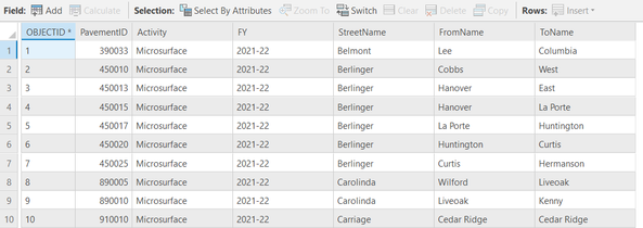
Table Appearance Options are lacking. Field names look the same as field values with background gray same as value area. Would like the ability to change settings for easier legibility - font (all font settings, bold, size, etc) and background color to users choice. See sample image.
Just adding a note here that there is an idea related specifically to adjusting cell height here: Be able to see an entire cell in Pro attribute tab... - Esri Community
and Coordinate selection color in map and table for Pr... - Esri Community for setting colors.
This idea would be helpful. One of the first things I do when working with a big table in Excel is change the formatting of the header row to distinguish it from the data. If I use an alternating row color, header would get a 3rd color.
Unless I made a change I forgot about, ArcMap does this by default using bold, and that worked fine for me.
In ArcGIS Pro 2.9, we'll be making the table header more distinct to help with this stated issue, "Field names look the same as field values with background gray same as value area." Note that there is no plan to enable additional header settings like changing color and font, but hopefully the improvement in 2.9 will make the field headers more easily distinguishable.
Example in dark theme:
Example in light theme:
You must be a registered user to add a comment. If you've already registered, sign in. Otherwise, register and sign in.


