- Home
- :
- All Communities
- :
- Products
- :
- ArcGIS Pro
- :
- ArcGIS Pro Ideas
- :
- Pivot Table Chart Style in ArcGIS Pro
- Subscribe to RSS Feed
- Mark as New
- Mark as Read
- Bookmark
- Follow this Idea
- Printer Friendly Page
- Mark as New
- Bookmark
- Subscribe
- Mute
- Subscribe to RSS Feed
- Permalink
In some map products I've been making, I'm required to include relatively simple statistics in the map legend (i.e. SUM of feature areas by Category). I've had a look at the Dynamic Text option which can SUM values for a field (almost does the trick), but as I'm using the Shape_Area value to get dynamic areas, they're recorded in square metres. I'm wanting to display the figures as Hecatares. In the Attribute tables, this is easy done using the Rate format with a value of 10,000, but this doesn't flow through to the Dynamic Text (still sums in m2). Instead I'm using the Bar Chart option to display the numbers, though really it doesn't need the "Chart" element, just the category and numbers (like in a pivot table). This method does honour the formatted values to show Hectares instead of m2.
Instead of this;
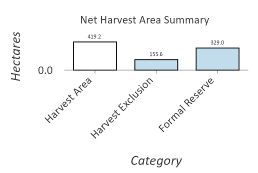
Display this;
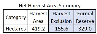
Options could include colouring the columns as per the Category (like in the Bar Chart), having a Total Column on the end, wrapping the Category labels like in my image, number formatting, etc.
Can someone at ESRI tell us if anything like this is on the roadmap? Basic Pivot tables would make our life soooooo much easier!
It's not a chart style, but have you tried using the pivot table tool? https://pro.arcgis.com/en/pro-app/latest/tool-reference/data-management/pivot-table.htm
Hi @KoryKramer I haven't tried that tool - we don't have an Advanced licence so won't work for us anyway. I'm really looking for a dynamic function here that would serve well in Map Series or dynamic map templates for non-gis staff to use (open - zoom to area - export sort of work flows).
I would like to create dynamic pivot table layers using the UI in ArcGIS Pro.
- Similar to Excel pivot tables.
- The tool would produce a query layer.
- Similar to pivoting data using SQL, but using the UI. Writing SQL pivot queries is time consuming and it’s very easy to make a mistake. Whereas Excel pivot tables are easy to use. And it’s pretty hard to make a mistake like accidentally omitting data or mishandling nulls.
Related: Pivot Charts
You must be a registered user to add a comment. If you've already registered, sign in. Otherwise, register and sign in.