- Home
- :
- All Communities
- :
- Developers
- :
- JavaScript Maps SDK
- :
- JavaScript Maps SDK Questions
- :
- Re: Determine Orientation on Mobile Device
- Subscribe to RSS Feed
- Mark Topic as New
- Mark Topic as Read
- Float this Topic for Current User
- Bookmark
- Subscribe
- Mute
- Printer Friendly Page
Determine Orientation on Mobile Device
- Mark as New
- Bookmark
- Subscribe
- Mute
- Subscribe to RSS Feed
- Permalink
How does one determine if a mobile device is being used so changes can be made when the orientation goes from portrait to landscape? Any help would be appreciated.
Thank you,
William
- Mark as New
- Bookmark
- Subscribe
- Mute
- Subscribe to RSS Feed
- Permalink
William,
There are a couple of ways to know this. You can use css media queries or use dojo/has and dojo/sniff
Using media queries - CSS | MDN
https://dojotoolkit.org/reference-guide/1.10/dojo/has.html
https://dojotoolkit.org/reference-guide/1.10/dojo/sniff.html
- Mark as New
- Bookmark
- Subscribe
- Mute
- Subscribe to RSS Feed
- Permalink
Hi Robert,
Thanks for the links. I had been planning to use the following to determine whether the device being used was mobile or not. (I think this logic is correct. I was referencing this GeoNet thread.)
if(isFullWindow()){
//true, mobile device
} else {
//false, not mobile device
}where
function isFullWindow() {
if (window.appInfo.isRunInMobile) {
return true;
} else {
return false;
}
}Now I need a way to determine if the screen orientation is portrait or landscape.
Looking at the links you provided, it appears the best way to go about this is to use two media queries in the CSS.
@media screen and (orientation: portrait){},
@media screen and (orientation: landscape){}Is this the way you would go about solving the problem?
I had hoped to make the changes in the JavaScript file. I see how dojo/has and dojo/sniff can help with determining the device being used, but not with screen orientation. Maybe I'm missing something...
William
- Mark as New
- Bookmark
- Subscribe
- Mute
- Subscribe to RSS Feed
- Permalink
Hi Robert,
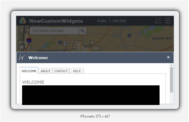
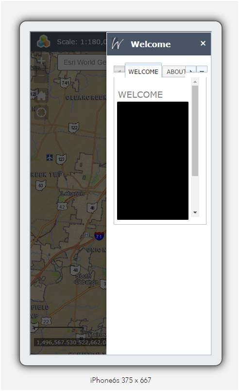
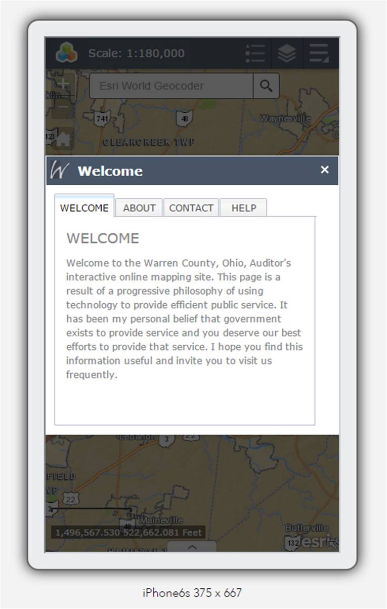
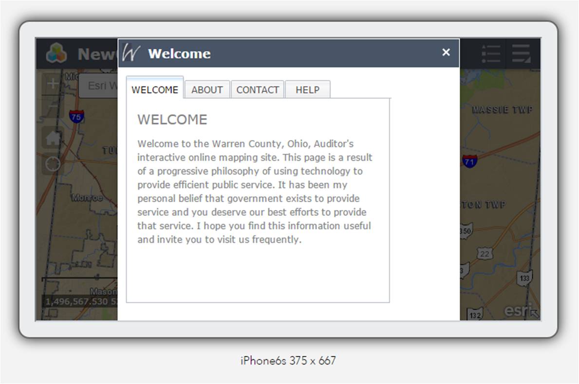
I looked at the link you shared. From reading the article, it sounds like the resize event is the best option, but I'm having trouble implementing it. I have a modal panel, incorporating ideas from the splash widget, that works except for the screen rotation. Below are pictures of the panel (with a widget inside) upon first opening it in the orientation shown.
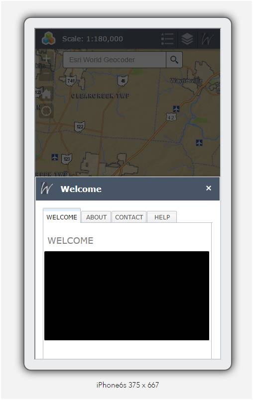
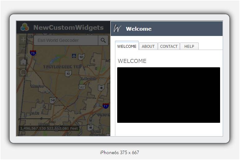
Here is what they look like after rotation, respectively.
I get the following error:
Uncaught TypeError: b.call is not a function(…) init.js:1355
I've attached my panel, along with the original modal panel that is presented in Create a new panel.
Any thoughts would be appreciated and enjoy your first fall weekend of the year.
William
- Mark as New
- Bookmark
- Subscribe
- Mute
- Subscribe to RSS Feed
- Permalink
William,
I don't have time to look into your code right now but here are the events I use:
if(has('event-orientationchange')){
this.own(on(window, 'orientationchange', lang.hitch(this, function() {
if (this._fixedHeight || this.autoHeight) {
this._calculatePosition();
this._moveToMiddle();
return;
}
this._positioning();
})));
}
this.own(on(window, 'resize', lang.hitch(this, function() {
if (this._fixedHeight || this.autoHeight) {
this._calculatePosition();
this._moveToMiddle();
return;
}
this._positioning();
})));- Mark as New
- Bookmark
- Subscribe
- Mute
- Subscribe to RSS Feed
- Permalink
Hi Robert,
I have a few questions.
- Would the code you provided be added to the startup function?
-How do I get values for this._fixedHeight and this.autoHeight?
- Do I write the _calculatePosition, _moveToMiddle and _positioning functions, do I refer to them (I see all three functions are in jimu.js\dijit\Popup.js) or are they automatically referenced?
-Should the resize code be included in an if statement?
As always, any guidance you can provide is greatly appreciated. Thank you.
William
- Mark as New
- Bookmark
- Subscribe
- Mute
- Subscribe to RSS Feed
- Permalink
William,
The code I provided is from me customizing the Popup.js
Would the code you provided be added to the startup function?
I have it in the postCreate.
How do I get values for this._fixedHeight and this.autoHeight?
Those are Boolean vars in my code.
Do I write the _calculatePosition, _moveToMiddle and _positioning functions, do I refer to them (I see all three functions are in jimu.js\dijit\Popup.js) or are they automatically referenced?
you would need to write these functions
Should the resize code be included in an if statement?
Nope
- Mark as New
- Bookmark
- Subscribe
- Mute
- Subscribe to RSS Feed
- Permalink
Hi Robert,
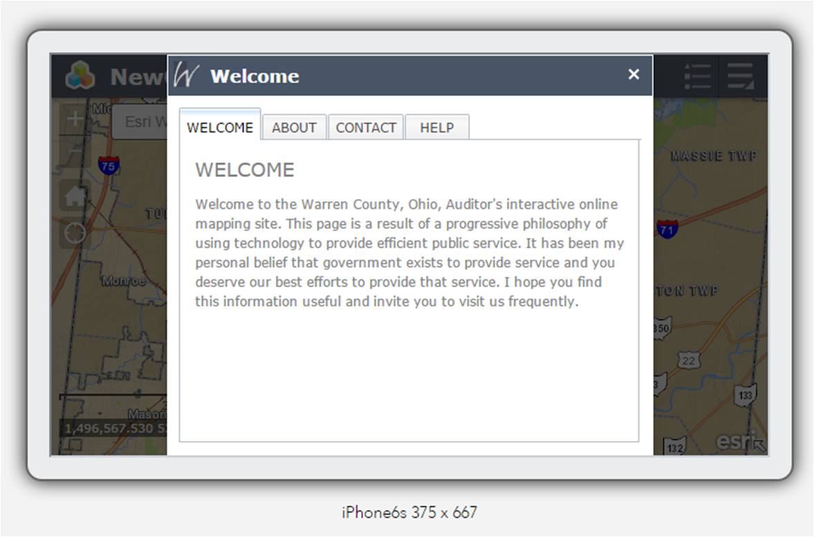
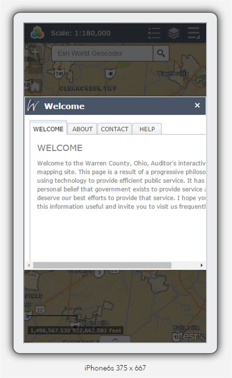
Thank you for your help. I added the code you suggested to the modal panel and made some modifications. The panel responds, but the widget inside keeps the same layout it started with originally. (Please see images below.)
Starting in Portrait View
After switch to Landscape
Starting in Landscape View
After switch to Portrait
Do I need to add the same code to the widget as well?
Thanks again Robert.
William
- Mark as New
- Bookmark
- Subscribe
- Mute
- Subscribe to RSS Feed
- Permalink
Hi Robert,
How do I reference the panel from the widget inside it? (Or should I ask this in a new question thread?)
Thanks again,
William