- Home
- :
- All Communities
- :
- Developers
- :
- JavaScript Maps SDK
- :
- JavaScript Maps SDK Ideas
- :
- Accessibility - Calcite Navigation Toggle (3D scen...
- Subscribe to RSS Feed
- Mark as New
- Mark as Read
- Bookmark
- Follow this Idea
- Printer Friendly Page
Accessibility - Calcite Navigation Toggle (3D scene)
- Mark as New
- Bookmark
- Subscribe
- Mute
- Subscribe to RSS Feed
- Permalink
Hello,
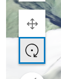
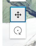
Our team has observed a potential accessibility issue with the current design of the toggle button. The toggle is presented as two separate buttons but behaves like a single toggle control, which can cause confusion for users.
When the button receives focus, only the selected state button is highlighted, rather than the entire toggle control. This behavior is unintuitive, as conventional users might attempt to navigate between the buttons using the Tab or Shift+Tab keys, but without success.
To improve usability and accessibility, we recommend adjusting the focus behavior to surround the entire toggle control. Additionally, making the active and inactive states more visually distinct could further enhance clarity.
We hope this feedback is helpful and would love to hear any thoughts or suggestions from the community.
Thank you!
You must be a registered user to add a comment. If you've already registered, sign in. Otherwise, register and sign in.

