- Home
- :
- All Communities
- :
- Products
- :
- ArcGIS Instant Apps
- :
- ArcGIS Instant Apps Questions
- :
- Instant App Accessibility - Zone Lookup UX
- Subscribe to RSS Feed
- Mark Topic as New
- Mark Topic as Read
- Float this Topic for Current User
- Bookmark
- Subscribe
- Mute
- Printer Friendly Page
- Mark as New
- Bookmark
- Subscribe
- Mute
- Subscribe to RSS Feed
- Permalink
Hello: I am utilizing the Zone Lookup Template for a property details app. Some colleague in our UX team have raised the concern that the address bar precedes the instructions window, and so those that use screen readers may not ever TAB to the instructions. It was suggested that the instructions section should come first and send focus there prior to doing the address lookup.
Thank you for your consideration.
Ross Findlay
The City of Calgary
Solved! Go to Solution.
Accepted Solutions
- Mark as New
- Bookmark
- Subscribe
- Mute
- Subscribe to RSS Feed
- Permalink
@RossFindlayCOC Thanks for this feedback. We will look into improving the flow in the next update of ArcGIS Online.
- Mark as New
- Bookmark
- Subscribe
- Mute
- Subscribe to RSS Feed
- Permalink
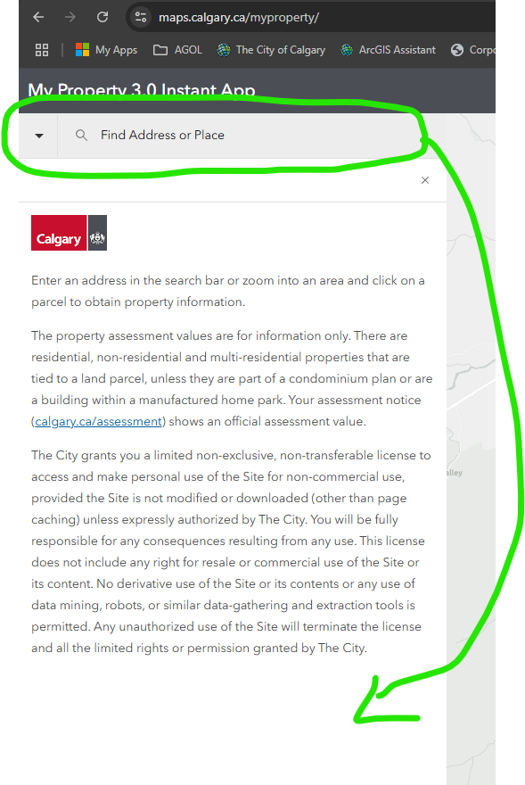
@RossFindlayCOC Thanks for the feedback on the flow. One way to highlight the introduction text is to remove it from the panel and open it as an introduction window, instead of in the panel. To do this, disable express mode of the app (upper left corner toggle), navigate to the About section -> App details, and toggle on Open as introduction window. This should have the screenreader read the introduction text first when the app is launched.
- Mark as New
- Bookmark
- Subscribe
- Mute
- Subscribe to RSS Feed
- Permalink
I appreciate your reply. I tried this however, focus goes automatically to the close button on the top right of the modal, screen reader users can therefore miss content as they are given the option to close the modal before they have been given the instructions. If this close button were removed and focus went to the body of the modal first. this would be a viable option.
Also when the modal is closed focus then goes to the search bar, skipping the headers in the app. keyboard navigation should really follow the visual layout.
Thanks for your time
Ross Findlay
The City of Calgary
- Mark as New
- Bookmark
- Subscribe
- Mute
- Subscribe to RSS Feed
- Permalink
@RossFindlayCOC Thanks for this feedback. We will look into improving the flow in the next update of ArcGIS Online.
- Mark as New
- Bookmark
- Subscribe
- Mute
- Subscribe to RSS Feed
- Permalink
Hello, I noticed a few other things regarding the UX on the Zone Lookup Instant App.
The first is something simple (I think). The expand and collapse arrow seems to be backwards.
The second thing I think needs to be fixed or enhanced is the formatting of the statistic panel. There should be a way to show the full number like 7,500 instead of 7.5K. It does not give you the arcade option on this particular instant app. In Dashboards, it does.
