- Home
- :
- All Communities
- :
- Products
- :
- ArcGIS Hub
- :
- ArcGIS Hub Questions
- :
- Issues with custom Cedar JSON charts for HUB
- Subscribe to RSS Feed
- Mark Topic as New
- Mark Topic as Read
- Float this Topic for Current User
- Bookmark
- Subscribe
- Mute
- Printer Friendly Page
Issues with custom Cedar JSON charts for HUB
- Mark as New
- Bookmark
- Subscribe
- Mute
- Subscribe to RSS Feed
- Permalink
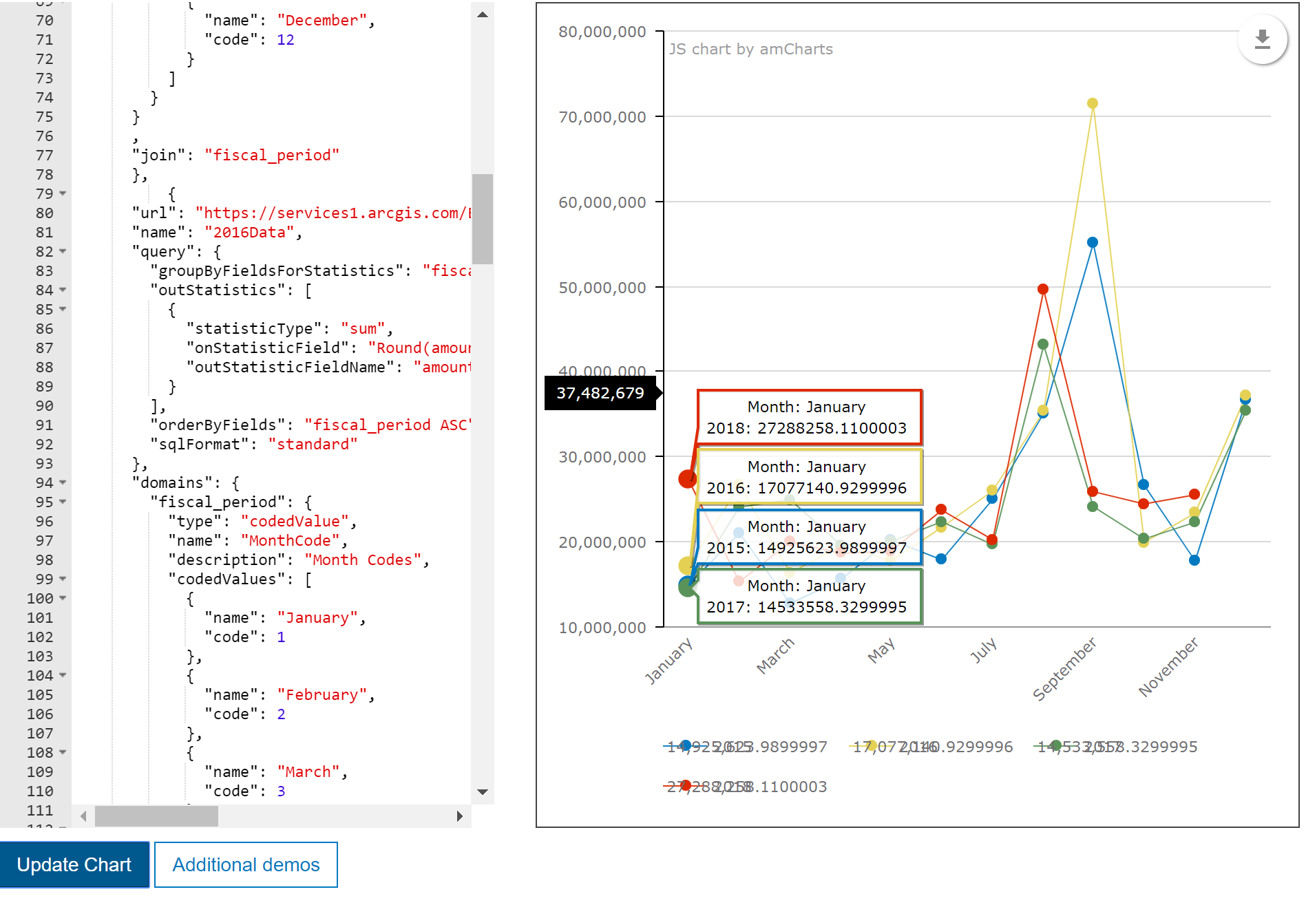
I'm trying to create some custom JSON charts for our open data HUB. I've got my serial chart created, but there are some things/issues that I can't figure out. I've attached an image of the chart in question.
1. The data source has month as an integer so I'm using domains to pull in the month name. Is this the most appropriate way to do this or is there an override that I can use to replace the integers with the month name?
2. As can be seen in the popup, the numbers are pretty messy. I can round the data in the onStatisticField part of my query, but is there any way to do this after the fact? What I mean, is there an override for number Format? I tried throwing in some amCharts JSON for the number formatting to no avail. Ideally I would like the popup to show something like $1,600,000 or $1.6M.
3. In the image you can see the legend. Upon hovering over a set of points, the numbers completely cover the legend items making them unreadable. Can this just be turned off in the legend or spacing changed?
4. If I paste the code in the image into the custom JSON chart in the ArcGIS HUB, the apply button remains greyed out and I am unable to save the chart on a page.
I guess, my main questions are, what actual properties can be manipulated with overrides? I've tried a lot and seem to only be able to control the position of the legend, guides, and the color of the data series.