- Home
- :
- All Communities
- :
- Products
- :
- ArcGIS Hub
- :
- ArcGIS Hub Questions
- :
- Edit CSS in ArcGIS Open Data 2.0
- Subscribe to RSS Feed
- Mark Topic as New
- Mark Topic as Read
- Float this Topic for Current User
- Bookmark
- Subscribe
- Mute
- Printer Friendly Page
Edit CSS in ArcGIS Open Data 2.0
- Mark as New
- Bookmark
- Subscribe
- Mute
- Subscribe to RSS Feed
- Permalink
Hi everyone,
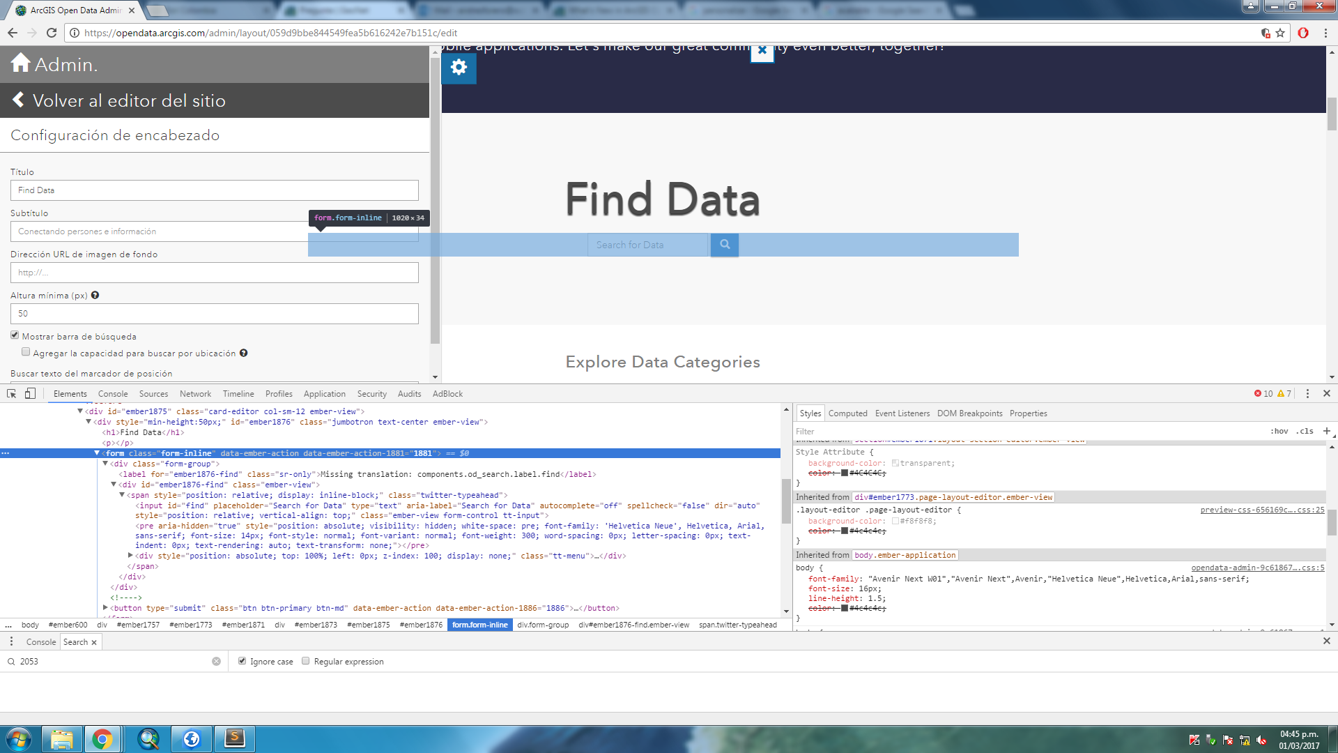
Currently I'm trying to personalize an Open Data Portal using new release available in my organization. I added many sections with bootstrap 3 using Layout Builder and Text Section. I've modified JSON Code with ArcGIS Online Assistant but I haven't see an option to customize CSS... I mean, I just want to fix the size of search box in "Found Data". Where Can I find it?
- Mark as New
- Bookmark
- Subscribe
- Mute
- Subscribe to RSS Feed
- Permalink
Hi Andrés,
I'm trying to add a collection of CSS snippets and tricks to GeoNet for those who want more customization. While the search bar is not directly editable from inside the banner card and the option to choose what size it is from the settings will be a little further down the road, it is possible to manipulate the CSS on it via an embedded style tag in a text card. Perhaps my latest post will help you out?
Tips: Styling the Search Bar
-Klara
- Mark as New
- Bookmark
- Subscribe
- Mute
- Subscribe to RSS Feed
- Permalink
Hi Klara Schmitt,
I saw your code snippets on how to use cards on your open data page (Tips: Create Custom Cards with HTML ). I wanted to create some cards of different sizes on my open data page and cannot seem to find a way to override the default height/width of the card since it is configured in the <style> in my initial cards. Is there a way to override this? I tried to add some height= and width= code in the thumbnail tag <div class="col-sm-12 thumbnail text-center"> but nothing I try works. I can take out the thumbnail background but want to be consistent with how I show my cards elsewhere. Thanks for any suggestions.
- Mark as New
- Bookmark
- Subscribe
- Mute
- Subscribe to RSS Feed
- Permalink
Hello C E Howard,
Your code above suggests you are using my .featured-gallery example. For those cards, you can change the width by changing the Bootstrap grid classes. So rather than use
<div class="col-xs-12 col-sm-6 featured-gallery">which basically says, "make this card 100% on phones, and 50% on all screens larger," you could change it to this for example
<div class="col-xs-12 col-sm-6 col-md-4 featured-gallery">This will give you a 100% width card on phones, 50% width card on tablets/small laptops, and 33% width card on large screens. The Bootstrap grid is based on a 12 column row, so each column-size (xs, sm, md, lg) needs to add up to 12 and this dictates width by screen-size, but you can set multiple column classes per card. You can find more information here: https://getbootstrap.com/docs/3.3/css/#grid-example-mixed-complete
The image will proportionately resize height based on the width of the Bootstrap column classes; therefore you do not set a height. I would strongly recommend you use a different type of card if you wish to set height, because if you set height on .featured-gallery cards, you will break the responsive layout and it will not look good on mobile devices.
- Mark as New
- Bookmark
- Subscribe
- Mute
- Subscribe to RSS Feed
- Permalink
Thanks for the information. Yes, I am using the featured gallery cards. I am creating cards for links to state and county level data and I had hoped to have different size logos for different levels of government-- that was my thinking. I understand what you are saying about the responsiveness, I did not think of that.
Thanks for the resource links-- I looked at a lot of it but still not exactly what I want (but that may not be the best decision anyway)
- Mark as New
- Bookmark
- Subscribe
- Mute
- Subscribe to RSS Feed
- Permalink
Could you perhaps use a photo editor to create a consistent sized canvas - like 400x300 pixels, transparent background - and then resize the logos within the context of that canvas and save them? Then you could make the logos smaller or larger based on your preferences, but the actual images would be saved with the context of consistent empty space. If you don't have Photoshop, you could also do this with Online Photo Editor | Pixlr Editor, which is a free browser based tool that is similar (it requires Flash though.)