- Home
- :
- All Communities
- :
- Products
- :
- ArcGIS Hub
- :
- ArcGIS Hub Ideas
- :
- Chart Configuration Improvements
- Subscribe to RSS Feed
- Mark as New
- Mark as Read
- Bookmark
- Follow this Idea
- Printer Friendly Page
- Mark as New
- Bookmark
- Subscribe
- Mute
- Subscribe to RSS Feed
- Permalink
In ArcGIS Hub, provide chart configuration option that is consistent with and improves upon the Operations Dashboard configuration options. This is needed for all chart/statistic types, however the ideas given here are looking specifically at serial/bar charts.
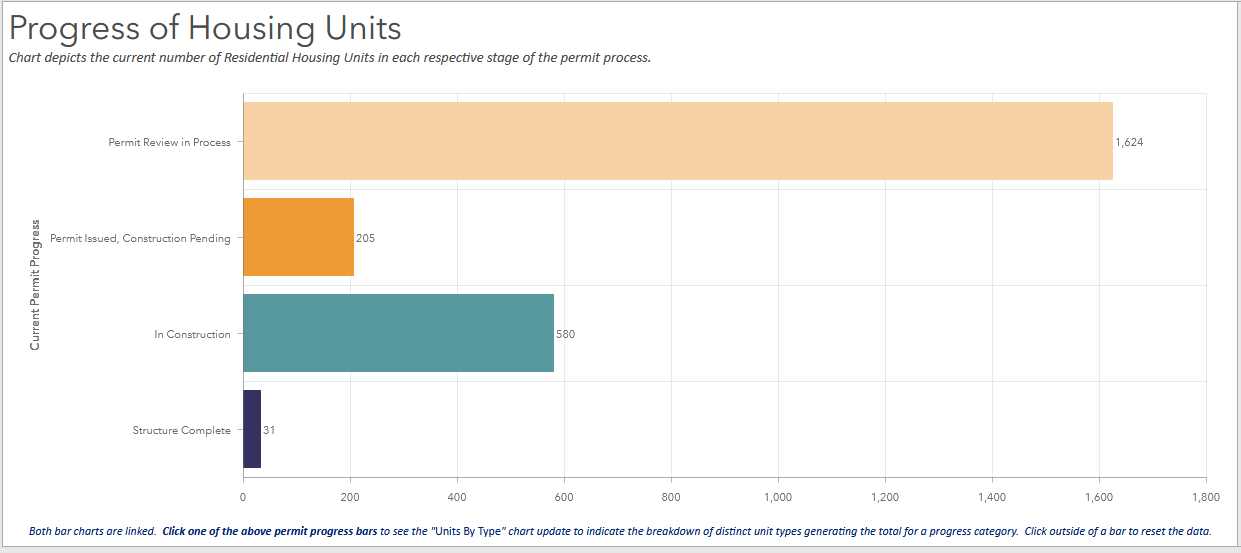
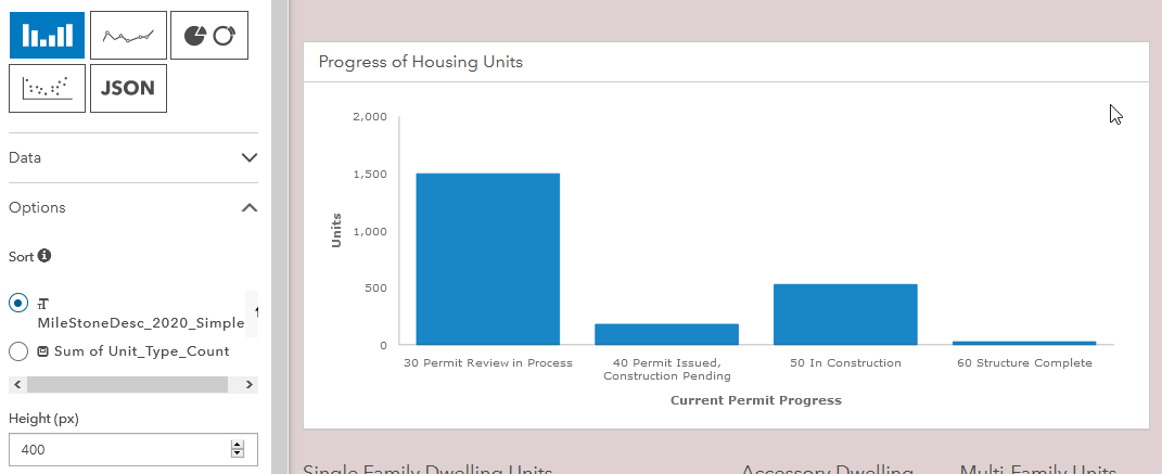
To help convey the disparity, below is a screen shot of a chart generated with the Operations Dashboard followed by my attempt to re-create an identical version of the chart in a ArcGIS Hub site using the same exact table.
Screenshot of "Housing Data" chart configured in Operations Dashboard
Screenshot of "exact same" chart in ArcGIS Hub
General proposed improvements:
- Link the data in different charts/statistics with "Actions" where:
- Option to make a selection in a data graphic refresh the data in other related graphics/statistics and filter those other graphics by selection
- Option to configure predefined filters that will filter charts/statistics within a section/row. These filters would enable a user to chose a series of composite filters to apply to the data. For ease of use, the layout of the predefined filters could be customized. Optionally text, description, hover text could be configured to ensure ease of use for the public user.
- Select a horizontal or vertical chart orientation
- Pop ups/hover text:
- Toggle on/off
- Customize pop-up text
- Ability to add detailed information in the pop-ups (in the example below it would be great to have a pie chart within the pop-up that indicates the break down (count & %) of the different types of units in the selected category).
- Toggle labels on/off for the category axis & value axis
- Toggle "show title" on/off
- Change chart background color
- Option to make a copy of a chart/statistic, this would save time configuring similar charts/statistics
Category Axis:
- Customize color of each bar/category
- Ability to apply compose filters the data/categories that will be included/excluded in the chart. (e.g. use filters: (1 OR 2) AND 3 AND (4 OR 5))
- Ability to sort the display order of categories by any field in the table.
- Ability to create labels/alias for the text of the bar category names (hide the confusing table data values)
- Configure distinct colors for each bar/category
- Toggle bar value labels on/off
Value Axis:
- Ability to apply multiple filters the data/categories that will be included/excluded in the chart. (i.e max value/minimum value)
- Ability to set the value formatting/mask
- Ability to set custom guides (e.g. a line on the chart indicating a fixed goal; e.g. the City has a goal of 2,000 new housing unit structures being completed so place a line on the chart at the 2,000 mark and configure a custom label/symbol/pop-up for it)
While data accessibility/locations may change in the future, currently the example "2020 Housing Units Tracker" Ops Dashboard can be viewed here:
http://santarosa.maps.arcgis.com/apps/opsdashboard/index.html#/6ee1aff761e04539ba984aa25313638e
The data table can be found here: http://santarosa.maps.arcgis.com/home/item.html?id=bbfe98dbe23444309548e94b6f4bf576
The example Hub site is not currently public pending resolving issues displaying data as identified above.
Thank you for considering these ideas.
You must be a registered user to add a comment. If you've already registered, sign in. Otherwise, register and sign in.