- Home
- :
- All Communities
- :
- Products
- :
- ArcGIS Hub
- :
- ArcGIS Hub Documents
- :
- #ProTip: Styling Tips for Your Header
- Subscribe to RSS Feed
- Mark as New
- Mark as Read
- Bookmark
- Subscribe
- Printer Friendly Page
#ProTip: Styling Tips for Your Header
#ProTip: Styling Tips for Your Header
Note: This post, from 2015, covers features that are not present in the newer versions of ArcGIS Open Data.
----------------
One of the easiest ways to start customizing your ArcGIS Open Data site is to start with the header. The this is section at the top of the page that displays your logo and site name.
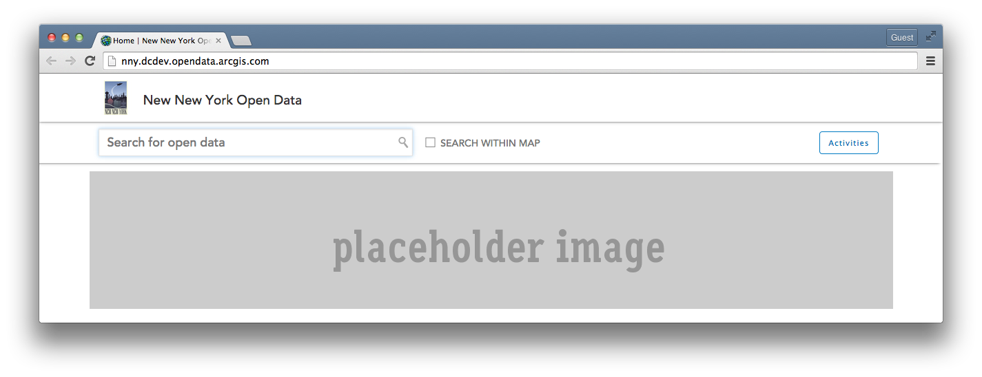
If you use your browsers developer tools to inspect the generated CSS, these are the classes that style it by default:
#header
{
position
: relative
;
width
: 100%
;
min-height
: 60px
!important
;
height
: auto
;
background
: #fff
;
box-shadow
: 0
0
5px
#555
;
}
.header-image
{
float
: left
;
height
: 50px
;
margin-bottom
: 10px
;
padding
: 0
20px
0
0
;
}
.site-brand
{
position
: relative
;
display
: inline-block
;
float
: left
;
margin-top
: 10px
;
font-size
: 1.5em
;
color
: #444
;
margin-right
: 20px
;
}
.site-logo
{
color
: #333
;
float
: none
;
font-family
: "
Avenir LT W01 65 Medium"
,Arial
,sans-serif
;
font-size
: 19px
;
line-height
: 1.25em
;
margin-left
: -5px
;
margin-right
: 20px
;
}
#HEADER is the id for the entire block element.
When customizing the CSS, we only need to add the rules that we want to override. So first, lets make the background red, since that our official organization color. Next, we want to change the height of our header to be 120px tall. Then, lets get rid of the drop shadow.
#header {
min-height: 120px !important;
background: #b41710;
box-shadow: none;
}
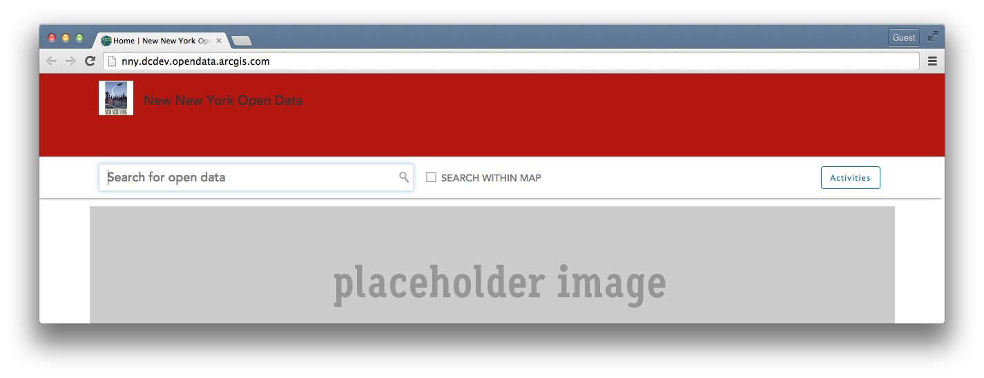
Next, let's adjust our .header-image to take advantage of the increased header height. To figure out the maximum height without having to adjust anything else, make the .header-image 20px less than your header height. In our example, that would be 100px.
.header-image {
height: 100px;
}
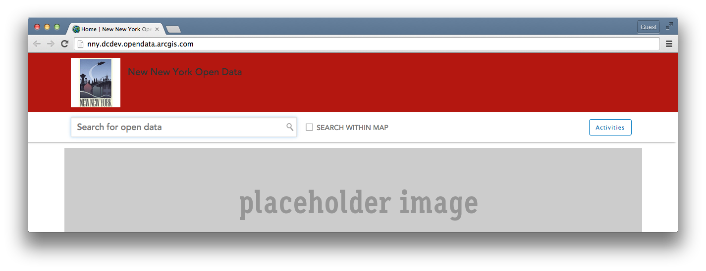
Our site name needs a little work now, so we'll edit the classes for the .site-logo next. Our organizations official colors are red and yellow, so lets change the color to #ffed86. We'll also want to increase the font-size and adjust the line-height to keep it centered.
.site-logo {
color: #ffed86;
font-size: 32px;
line-height: 2.5em;
}
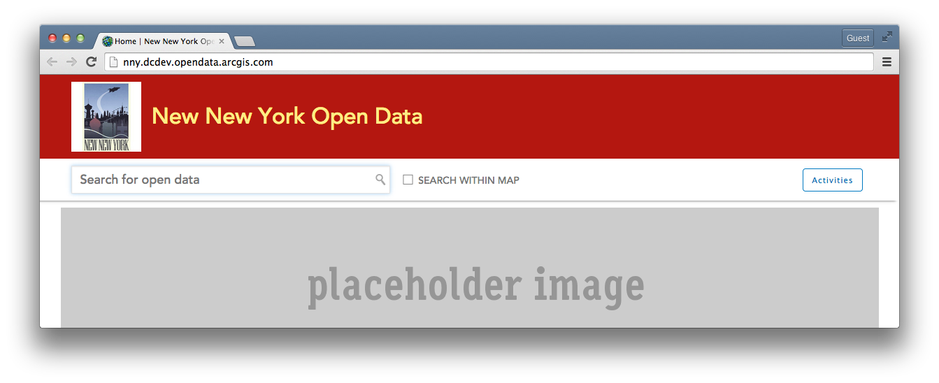
That's starting to look better. However, when I roll over the site name, the color to indicate its link hover state is still dark gray. Instead, let's just make this a slightly darker shade of our bright yellow when we add the .site-logo:hover rules.
.site-logo:hover {
color: #d9c52e;
}
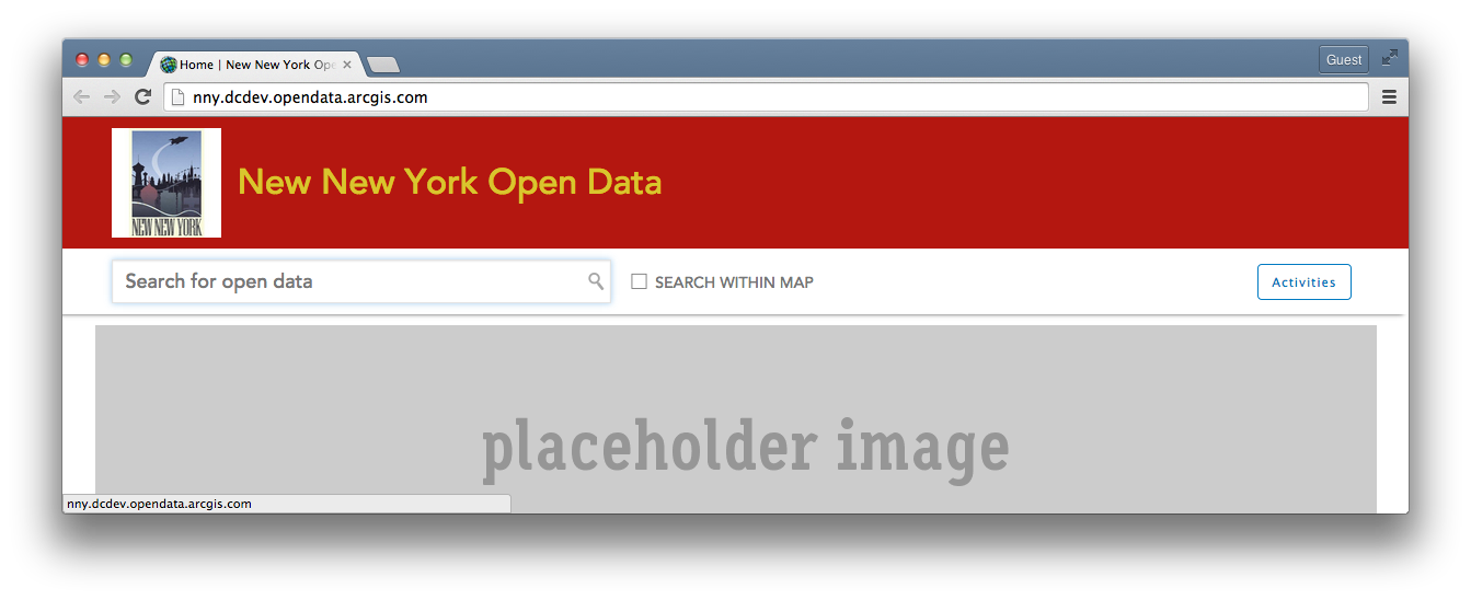 Last, if we want to get tricky and add a background image to the header, we can add just a couple rules to our #header css to pull in the image, center it and make it always scale with the width of the browser.
#header {
min-height: 120px !important;
background-image: url(
http://vignette4.wikia.nocookie.net/en.futurama/images/3/32/New_New_York_Cityscape.jpg);
background-position: 50%;
background-size: cover;
box-shadow: none;
}
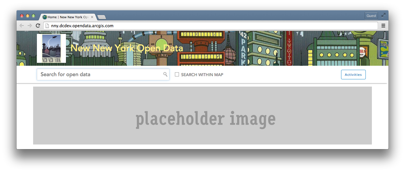
Hope this helps! If you customize your site's header, add a screenshot below and show us how you did it!
Hi ,
This would be a great start but how do I see inspect the generated CSS? I use the developer tools in chrome but the code looks different from your screen shot. How to go about this? Please help.
In Chrome, right click on a part of the page and select Inspect Element form the menu that appears.
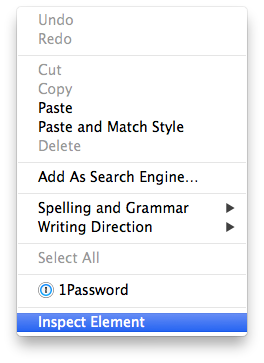
The Developers Tools window should pop open and give you a view like this:
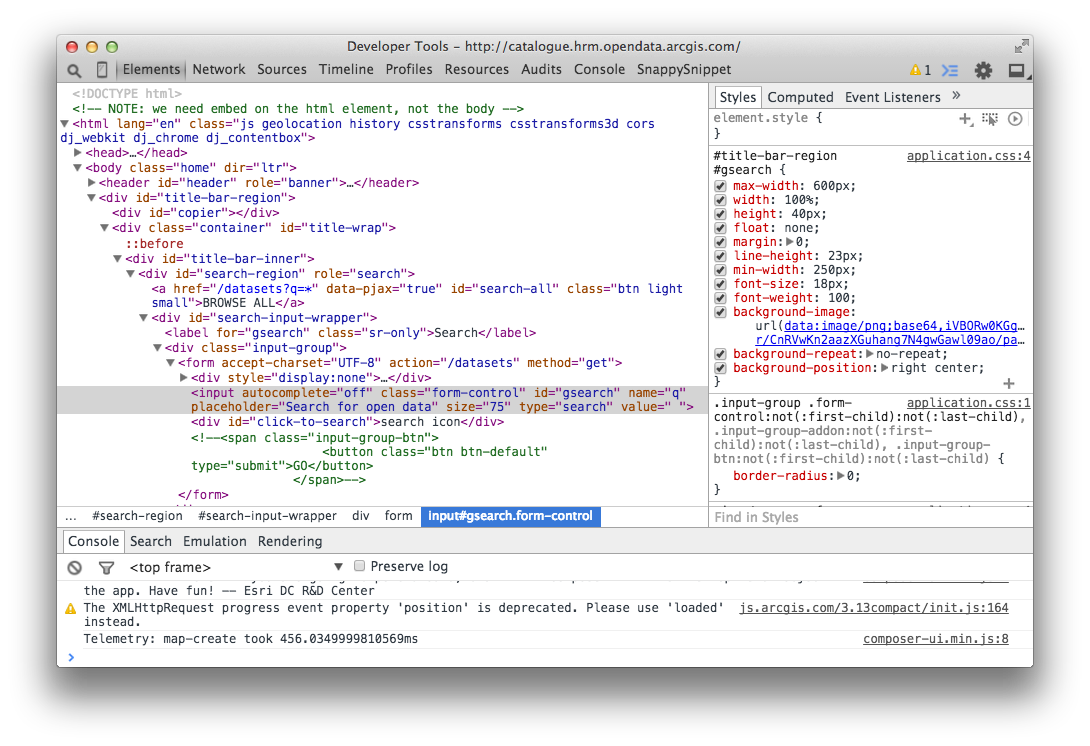
(Safari looks very similar)
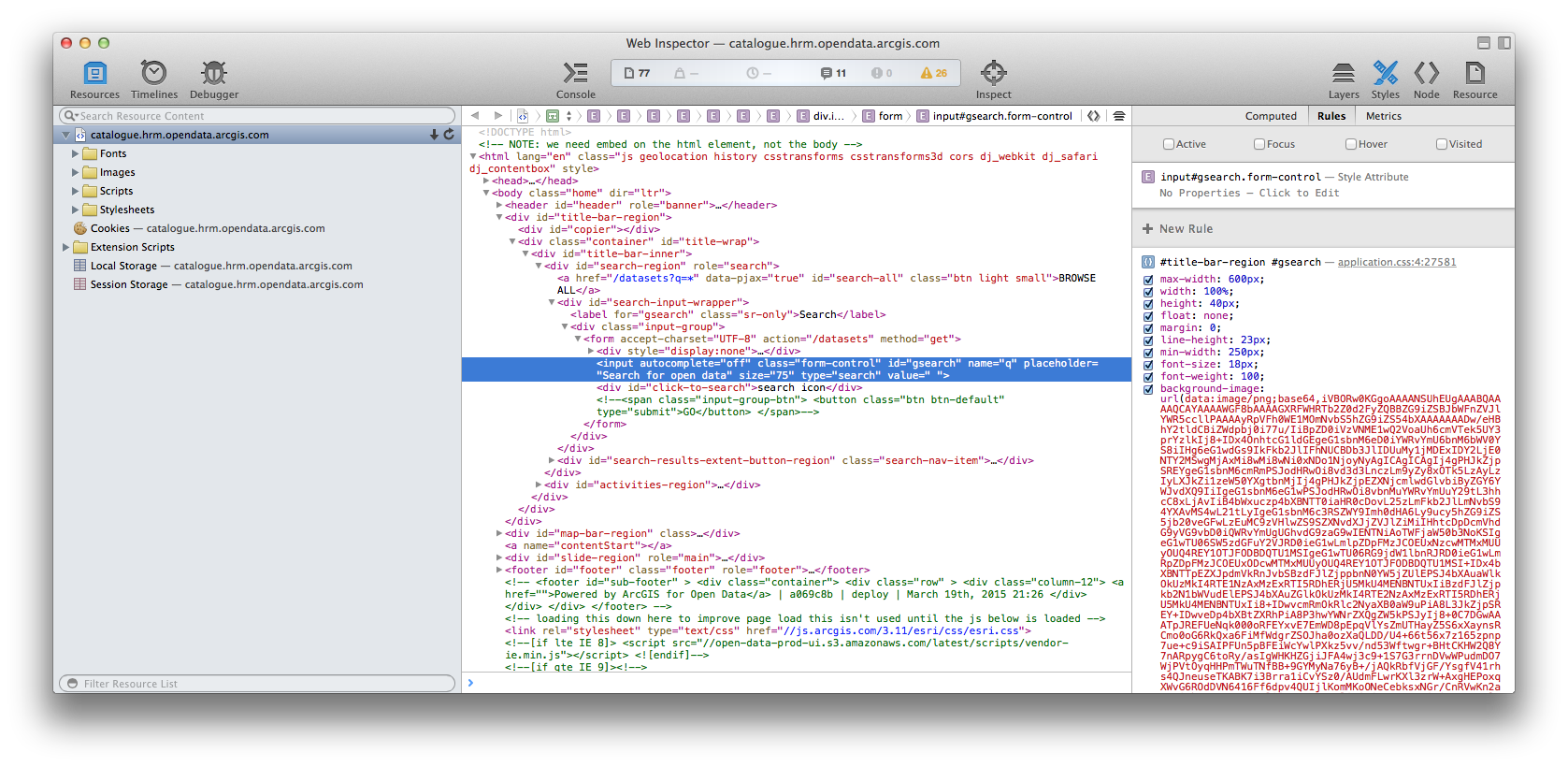
Here, I've inspected the search field which is in #title-bar-region. In the right pane under the Styles tab you can see what rules are affecting the element, separated by the classes and rules. This is a great place to start tinkering as Dev Tools will let you make changes right in this interface and show you the results in real-time.
In this example, if you want the search field to be taller, you would add this to your custom css:
#title-bar-region #gsearch {
height: 80px;
}
If you click on the Computed tab, you can see the full list of every single CSS rule that is touching that element in some way or another.
Thanks Erich
I was inspecting the element on the Design layout page but I understand that it should be done on the preview site. The edits made on the Dev Tools are not saved but just for viewing purposes right? How do I go about to save the changes ? I am missing something here:(
Correct. When making changes in the Dev Tools, that how I just make sure the rule I'm changing is the right one. They are not saved.
You just need to add that class and the new rule to your Custom CSS inside the Admin Layout Editor.
(This doc will point out where to find the Custom CSS field if you haven't found where we hid it. ![]() #ProTip: Changing the page background color on your Open Data site )
#ProTip: Changing the page background color on your Open Data site )
How about the result page? I changed the css to hide the map and search sections. I would like to do the same thing with the result page.
Thank you for this information. It will definitely come in handy when I set up an organizational site.
The changes you make to the header will persist throughout the site. However, If you want to change the page background, there's another tip you need to do so: #ProTip: Changing the page background color on your Open Data site