- Home
- :
- All Communities
- :
- Products
- :
- ArcGIS for Microsoft
- :
- ArcGIS for Microsoft Fabric
- :
- ArcGIS for Power BI
- :
- ArcGIS for Power BI Ideas
- :
- Overlay 2 Maps of differing data
- Subscribe to RSS Feed
- Mark as New
- Mark as Read
- Bookmark
- Follow this Idea
- Printer Friendly Page


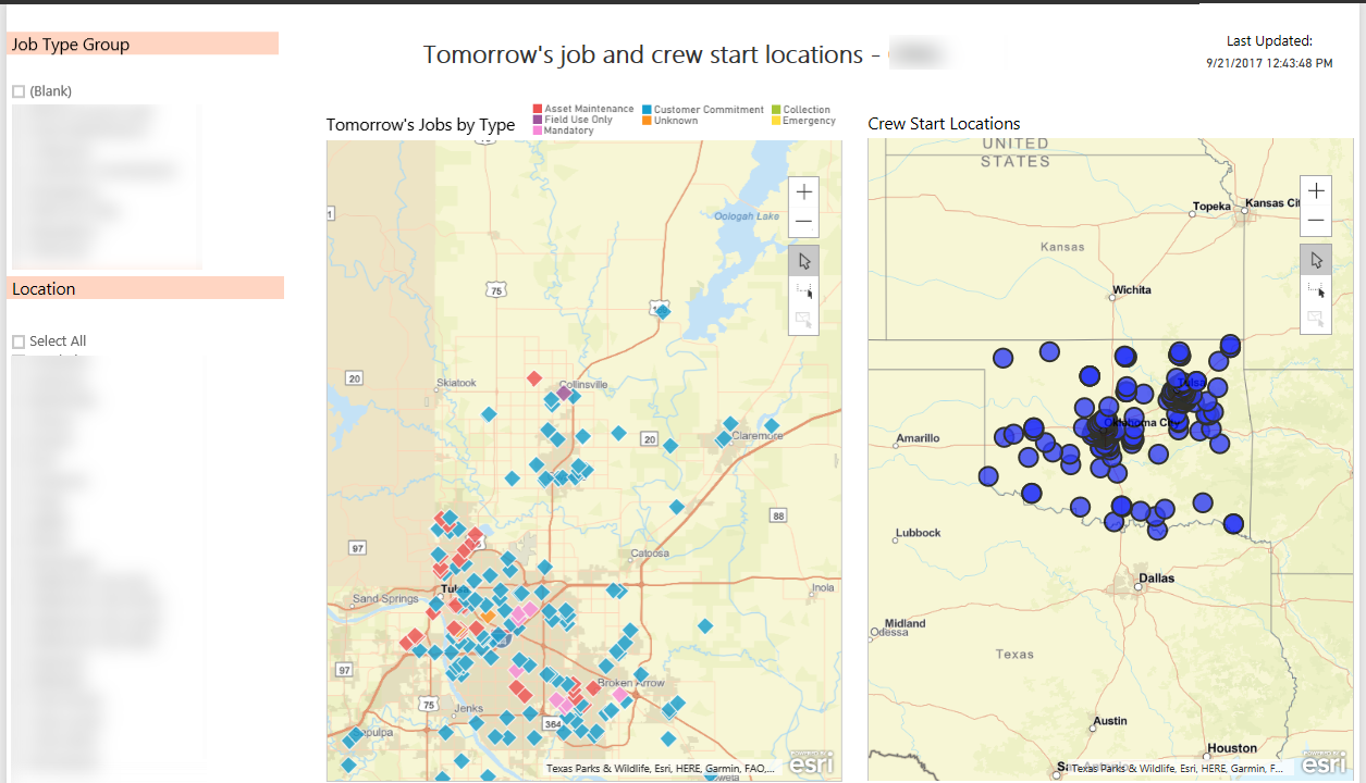
Hey Christy - where does the information for 'tomorrow's jobs' live? Same question for 'crew start locations'.
In the future we plan to enable signing in to ArcGIS and using your private maps and layers as reference layers. If one of those layers you're using lived in ArcGIS, I'm wondering if that would enable you to put both of your layers on one map. One as Power BI business data via the location field well, the other as a reference layer from your ArcGIS organization.
Thoughts?

Just wanted to say that we have a very similar use case. The data for the 2nd (and 3rd, and 4th, etc.) datasets is in the Power BI model. Having the ability to plot multiple datasets on the same map - for example using different symbols - would be amazing. Reference layers would be more of a limited workaround.
Both of the measures that you asked about come from our SSAS Tabular Server (on premise) so the data that we would need to plot would be sourced from the Tabular. We are not sure if these would be layers or not.

We have a very similar need. Both data sets are in the Power BI model. We want to highlight a specified location and have a marker for that (ideally a pin) and then highlight features around it. The current pin ability does not work as the pin location needs to come from the data in the PBI model.


Has anyone gotten ESRI to report from on-prem SSAS tabular cubes? Thank you!


Hi. I have the same feature request. We are attempting to bring data into a Microsoft Fabric environment and create Power BI visuals based on that data, including inserting reference layers such as boundaries from our ArcGIS Enterprise.
I work for African Parks Network, and as a conservation organization we would like to overlay things like wildlife movements, community survey data on perceptions, poaching and security incidents. Overlaying these spatial patterns on the same map can inform adaptive management and data-based decision making within the protected areas we manage. At the moment we have to create separate maps beside each other to see potential drivers of spatio-temporal patterns in the data.
I know we can create these layers in ArcGIS Enterprise and then bring those layers onto the Power BI map, however the performance would decrease as we have millions of points - something Fabric is very good at handling. We also want to control access to specific row sets using Row Level Security (RLS) which is optimized in Fabric.
This would help with scalability as we work towards managing 30 protected areas covering 30M hectares by 2030. We cannot make a custom solution for each protected area with such a small Tech/BI team.
You must be a registered user to add a comment. If you've already registered, sign in. Otherwise, register and sign in.