- Home
- :
- All Communities
- :
- Products
- :
- ArcGIS Experience Builder
- :
- ArcGIS Experience Builder Questions
- :
- Re: Disable viewing experience builder site on med...
- Subscribe to RSS Feed
- Mark Topic as New
- Mark Topic as Read
- Float this Topic for Current User
- Bookmark
- Subscribe
- Mute
- Printer Friendly Page
Disable viewing experience builder site on medium and small devices
- Mark as New
- Bookmark
- Subscribe
- Mute
- Subscribe to RSS Feed
- Permalink
Hi,
Do you know a clever to disable the view of a site, created with experience builder, on medium and small screens? What I am trying to do is making the site solely viewable by desktop computers and not on smaller screen handheld devices, since the experience becomes to clumsy and messy. I am imagining something like a box saying that: "This site has not been configured to be accessed on small screen devices....."
Cheers
Solved! Go to Solution.
Accepted Solutions
- Mark as New
- Bookmark
- Subscribe
- Mute
- Subscribe to RSS Feed
- Permalink
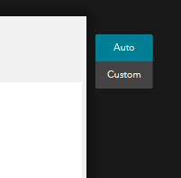
Should be simple enough. When you have the medium and small views active, you can see a little selector to switch between Auto and Custom. Switch it to Custom.
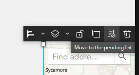
Once you've done that, move all the widgets to Pending. Do not delete them as that will remove the widgets from the Experience entirely, even from the full screen view.
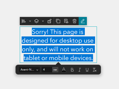
Now insert a new Text widget that has the message you want. This is a great place to use the VW font size setting, as your font will adapt to the screen size that way. Set the size of the text box to auto, and center it in the page.
That takes care of one of the small views. Go into whichever view you haven't yet configured. Again set the layout to custom and move the widgets all to pending.
If you go to the Pending list, you'll see the text box you just created is in there. Go ahead and move it into this view, too. You'll have to re-configure the alignment and size.
That's it! If you use headers and footers, you may need to set those to Custom as well and adjust as needed.
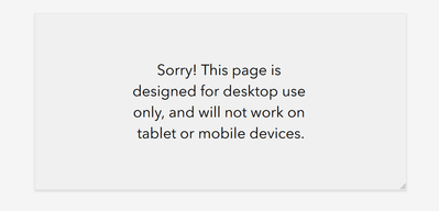
Here's my Experience, being previewed on a landscape mobile view.
Kendall County GIS
- Mark as New
- Bookmark
- Subscribe
- Mute
- Subscribe to RSS Feed
- Permalink
Yep @jcarlson,
This works brilliantly, thanks!
Though, I have this splash screen that still appears at every screen size level, which would also be nice to have disabled, once you try navigating to the site on medium and small screen devices. Maybe you have an idea or perhaps this is a completely new forum question.
- Andreas
Nukissiorfiit Greenland
- Mark as New
- Bookmark
- Subscribe
- Mute
- Subscribe to RSS Feed
- Permalink
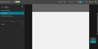
Splash screens and other windows can also have a custom layout setting. Just repeat those same steps, but with the window selected in the table of contents. You can't change the window's settings without affecting the full-screen view, but you can change the contents of the splash screen to display a duplicate "sorry" message as the page underneath.
Kendall County GIS
- Mark as New
- Bookmark
- Subscribe
- Mute
- Subscribe to RSS Feed
- Permalink
Perfect.
That also it remedied that problem!
Thanks a lot @jcarlson
- Mark as New
- Bookmark
- Subscribe
- Mute
- Subscribe to RSS Feed
- Permalink
@Anonymous User
Hi, I don't know the answer, but really would like to know this too. I usually develop for a desktop environment, however, just completed my first "mobile only" exp and someone tried to load it on a desktop.
- Mark as New
- Bookmark
- Subscribe
- Mute
- Subscribe to RSS Feed
- Permalink
@Anonymous User
Ha, I've no idea why I didn't think of this given it was staring me in the face as I dev across devices! Thank you for blowing away the brain fog!
