- Home
- :
- All Communities
- :
- Products
- :
- ArcGIS Experience Builder
- :
- ArcGIS Experience Builder Questions
- :
- Re: Category axis Issue
- Subscribe to RSS Feed
- Mark Topic as New
- Mark Topic as Read
- Float this Topic for Current User
- Bookmark
- Subscribe
- Mute
- Printer Friendly Page
Category axis Issue
- Mark as New
- Bookmark
- Subscribe
- Mute
- Subscribe to RSS Feed
- Permalink
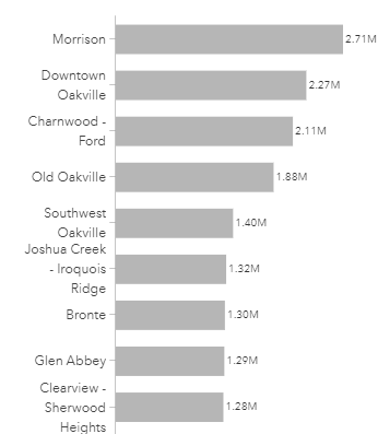
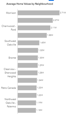
So, I'm creating a bar chart, but I'm running into labeling issues for the category axis.
Edit mode:
In published/preview mode:
Does anyone know why this is happening and also is there a way to make the bars more narrow?
- Mark as New
- Bookmark
- Subscribe
- Mute
- Subscribe to RSS Feed
- Permalink
This is due to resizing as typically the dimensions of the edit window and the full resolution of your screen are slightly different. Try play around with the label font size or make the chart longer if possible
- Mark as New
- Bookmark
- Subscribe
- Mute
- Subscribe to RSS Feed
- Permalink
It attributes to the screen size/ resolution change when you launch the app. In published/preview mode, based on the screen size, the chart size change correspondingly, and not all the category labels can show because of the limited space.
You may try to adjust the Chart size or the Axis font size in Edit mode to make it display well on your commonly used screen size.
- Mark as New
- Bookmark
- Subscribe
- Mute
- Subscribe to RSS Feed
- Permalink
I'm not sure why, in this instance, it would inexplicably choose to only label every other row. Sizing wouldn't be an issue, as all labels are one character in length.


