- Home
- :
- All Communities
- :
- Products
- :
- ArcGIS Dashboards
- :
- ArcGIS Dashboards Questions
- :
- Re: Sort the legend in a Serial Chart (for 'Split ...
- Subscribe to RSS Feed
- Mark Topic as New
- Mark Topic as Read
- Float this Topic for Current User
- Bookmark
- Subscribe
- Mute
- Printer Friendly Page
Sort the legend in a Serial Chart (for 'Split by Field' item)
- Mark as New
- Bookmark
- Subscribe
- Mute
- Subscribe to RSS Feed
- Permalink
Is there a way to sort the legend in a Serial Chart for 'Split by Field' item? It seems to be auto-sorted alphabetically, which doesn't display as well for some data - ie: ranking (No data, Low, Moderate, High).
- Mark as New
- Bookmark
- Subscribe
- Mute
- Subscribe to RSS Feed
- Permalink
Hello Corinne Bexson!
Currently, there is isn't a way to manually sort the series. It's a good idea, however, and the team will consider it as a future enhancement. Thank you for bringing this up! This is also related to another discussion about pie chart sorting. You can see it here:
- John
- Mark as New
- Bookmark
- Subscribe
- Mute
- Subscribe to RSS Feed
- Permalink
Is there any update on this? How are the series sorted? They seem kind of random. I have ordered them in the chart settings using letters and numbers but in the chart they appear different?
- Mark as New
- Bookmark
- Subscribe
- Mute
- Subscribe to RSS Feed
- Permalink
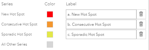
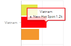
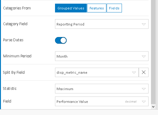
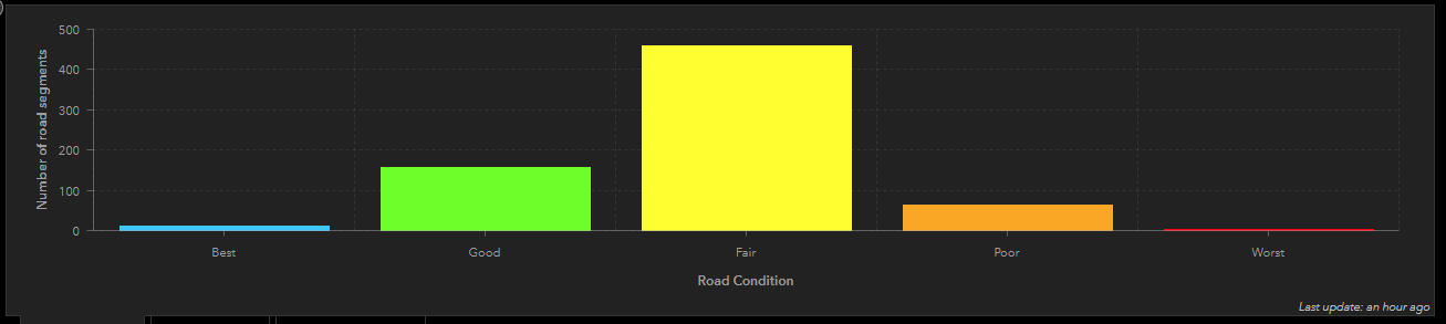
Is there an update on whether this will be included in a future update or if it's being considered? The inability to sort manually or even sort in all cases (when categories are split by field, there is no sort option at all in charts as shown in the image below) can cause misunderstanding or lead to misinformation.
There is still no sort option is available in a chart when the category is a date field and the data is split by a field.
- Mark as New
- Bookmark
- Subscribe
- Mute
- Subscribe to RSS Feed
- Permalink
It's really a shame that there is no way to edit a series order. I was really hoping that Ops dashboard would more seamlessly allow me to bring spatial data and non-spatial data together. Just to display values by fiscal year I had to assign dummy numbers to months as there was no option to manually sort and the months were being ordered alphabetically, beginning with April. I'm also displaying the series by project year, but the order the series appears in is very convoluted.
The series order determined by the serial chart is 0,2,3,1 (year prior to project start, project year 2, project year 3, project year 1). This doesn't allow for easy comparison between years. Unfortunately I don't have good spatial data for all of the project years so tying all of my data to a feature layer is not possible. I was really hoping to show a map with the spatial data and then displaying bar charts for data throughout the project lifespan. I feel like this should be a pretty basic set up, but instead it has just been a very frustrating process.
- Mark as New
- Bookmark
- Subscribe
- Mute
- Subscribe to RSS Feed
- Permalink
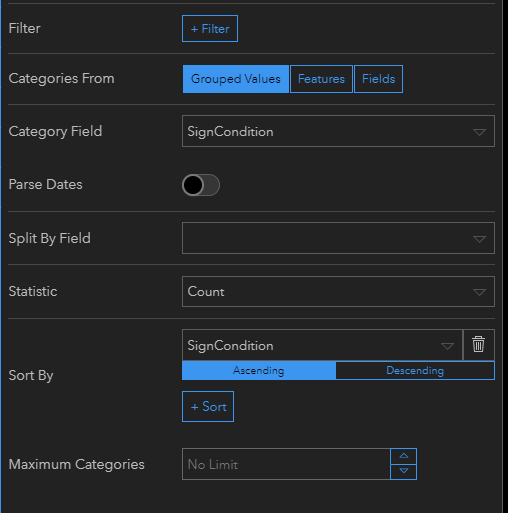
So I was searching for the same solution knowing that I have done this in the past. After searching through my dashboard and the subsequent data / domains that I setup I found the solution to this question. It's not ideal but it works.
We are in the process of doing a street inventory and grading the quality of the roadways. This chart comes in correctly every time (Best, Good, Fair, Poor, Worst - Second Image). We are also collecting drainage systems and signs. Those do not sort well (Fair, Good, Poor - First Image).
The difference....how I set up the domains. In the Road Condition graph I set up the domain to be numbers (1-5) representing words (Best - Worst). This sorts correctly because they are in numeric order. For the Sign and Drainage Conditions I setup the domain to be alpha... (Good - Poor) with the description being the same. These sort alphabetically.
So, I think the answer to this question is to create a field and give it numeric values that associate with the way you want it sorted, or set up domains as numbers. I'm guessing I could add a field to my Signs and Drainage named sort. Enter numeric... or alpha values in the order you want. When setting up the table you could sort the values by that field... see 3rd image.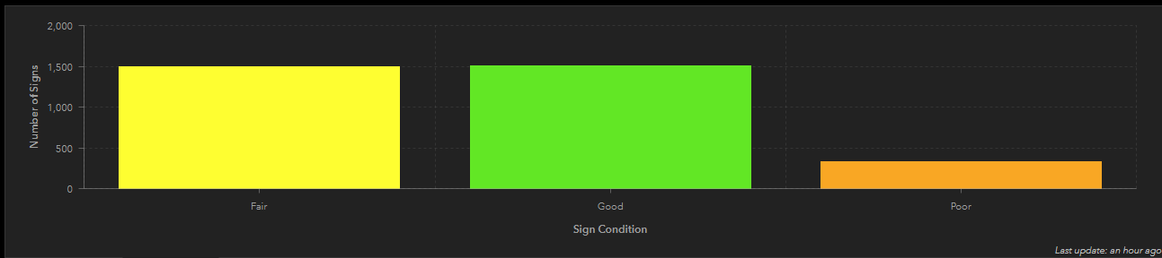
- Mark as New
- Bookmark
- Subscribe
- Mute
- Subscribe to RSS Feed
- Permalink
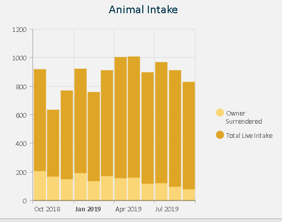
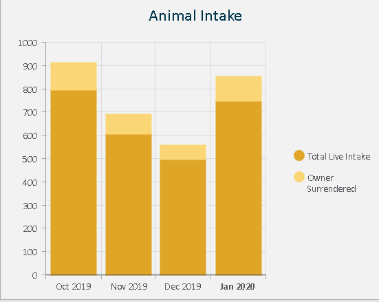
Nicholas, that may work, I haven't tried it myself. However, with the exact same fields in the exact same chart, filtered by year based on a category selector for the page, I've found that the stacked bar sorting seems fairly random. For one fiscal year, it sorts one way with the largest number at the top (preferred so that the smaller number shows as a portion of the larger one), but on a different fiscal year, it sorts in the opposite order. This is one major reason why we need to be able to manually sort the categories:
Preferred Sorting:
Misleading Sorting (it looks like there are more owner surrendered animals than there were animals taken in overall):
- Mark as New
- Bookmark
- Subscribe
- Mute
- Subscribe to RSS Feed
- Permalink
I tried with integer values and no luck. I need to order the groups by quarter but I cannot get it done. I cannot even change the order of the legend to workaround with line charts.
Although the series loads right the chart is random.
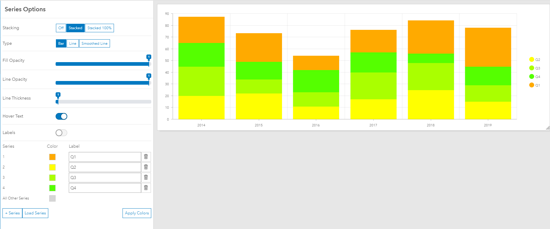
A proper sort for the legend would be a first step

- Mark as New
- Bookmark
- Subscribe
- Mute
- Subscribe to RSS Feed
- Permalink
It's been 3 years since this issue was brought up. Has anyone heard of it being fixed or updated? I'm trying to convince my people to use Dashboard instead of Tableau, but this could be a deal breaker for them.
- Mark as New
- Bookmark
- Subscribe
- Mute
- Subscribe to RSS Feed
- Permalink
I am also frustrated with the inability to sort a series in a dashboard serial chart. It also seems randomly sorted to me, but I have noticed that Firefox sorts the same series exactly backwards from Chrome and Edge. Maybe this is a clue
The chart in Firefox:

The same chart in Chrome and Edge:
