Turn on suggestions
Auto-suggest helps you quickly narrow down your search results by suggesting possible matches as you type.
Cancel
- Home
- :
- All Communities
- :
- Products
- :
- ArcGIS Dashboards
- :
- ArcGIS Dashboards Questions
- :
- Operations Dashboard - Label Time Axis with every ...
Options
- Subscribe to RSS Feed
- Mark Topic as New
- Mark Topic as Read
- Float this Topic for Current User
- Bookmark
- Subscribe
- Mute
- Printer Friendly Page
Operations Dashboard - Label Time Axis with every month
Subscribe
1931
1
04-09-2019 08:49 AM
04-09-2019
08:49 AM
- Mark as New
- Bookmark
- Subscribe
- Mute
- Subscribe to RSS Feed
- Permalink
I have created a Serial Chart in Ops Dashboard, but the axis labeling is spotty and apparently random.
Can I format the chart to label EVERY month on the x-axis?
Jay
Washoe County GIS
Washoe County GIS
1 Reply
04-29-2019
05:45 AM
- Mark as New
- Bookmark
- Subscribe
- Mute
- Subscribe to RSS Feed
- Permalink
Hi Jay Johnson
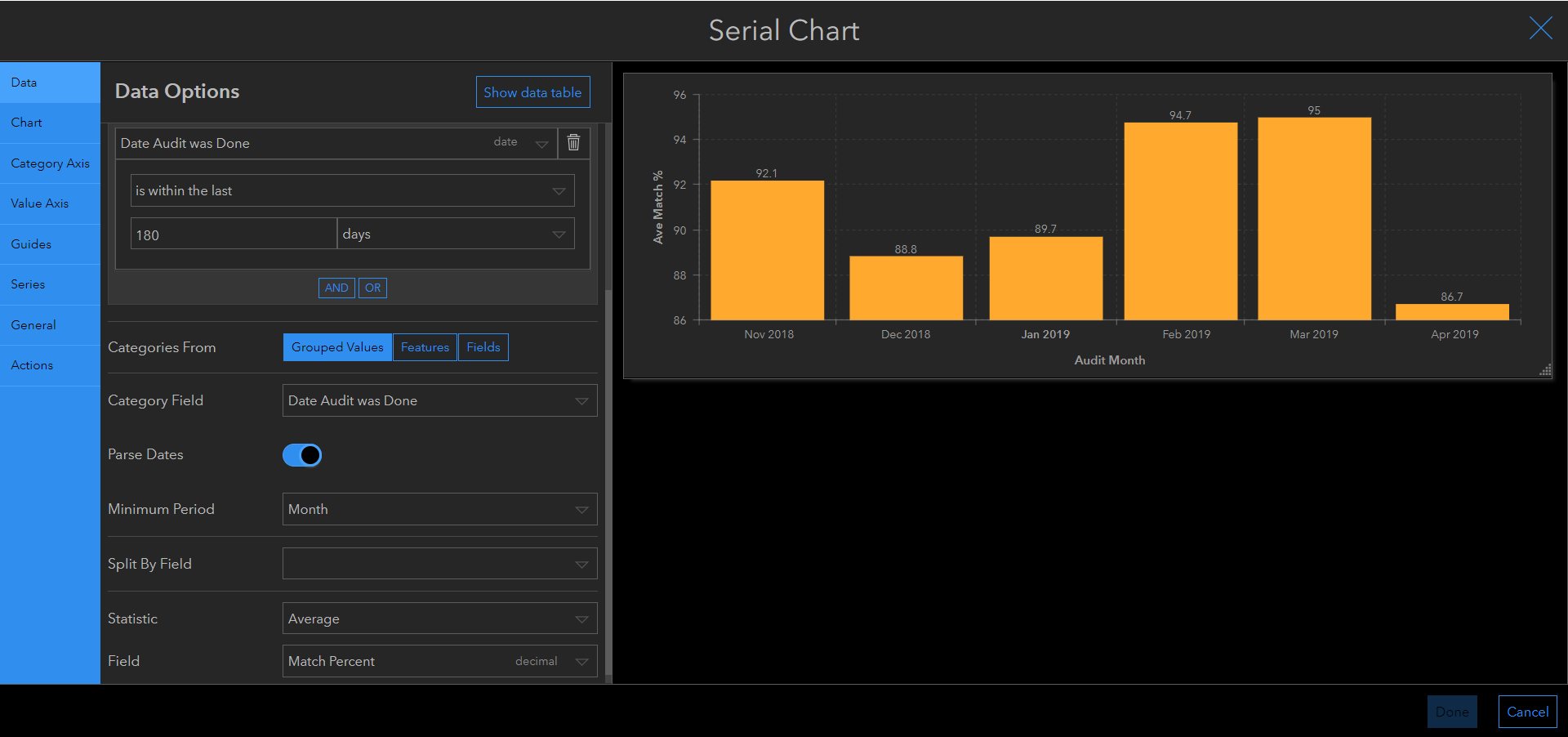
Here's how Patrick Brennan helped me set mine up:
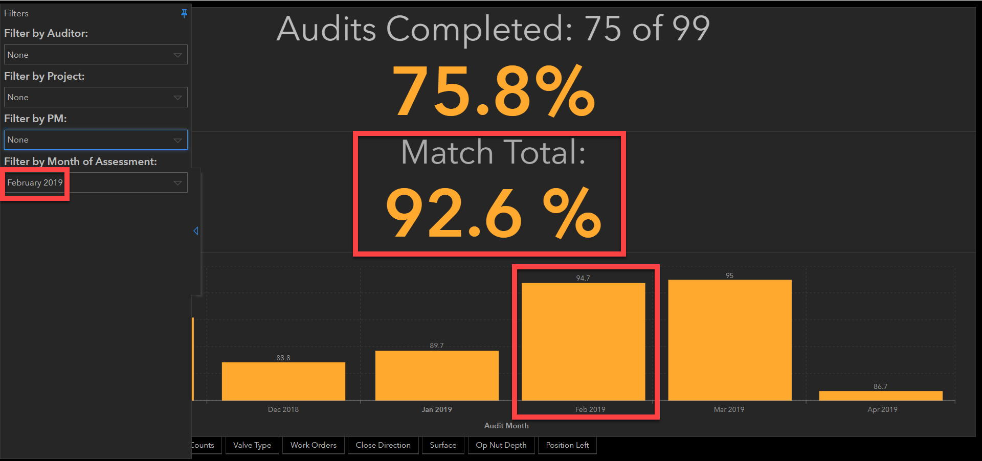
One thing that I need answers on from the Operations Dashboard for ArcGIS is why I see differences between two widgets, using the same dataset. Both my indicator widget and my serial chart use my {Match percent} field which I set to 'average' for both. However, as you can see I get different average percentages in the same month. For example for February the #indicator widget shows 92.6% whereas my #serial chart shows 94.7%.
Anyone able to help me out understanding why?