- Home
- :
- All Communities
- :
- Products
- :
- ArcGIS Dashboards
- :
- ArcGIS Dashboards Questions
- :
- Need help with Serial Chart - Stacked
- Subscribe to RSS Feed
- Mark Topic as New
- Mark Topic as Read
- Float this Topic for Current User
- Bookmark
- Subscribe
- Mute
- Printer Friendly Page
Need help with Serial Chart - Stacked
- Mark as New
- Bookmark
- Subscribe
- Mute
- Subscribe to RSS Feed
- Permalink
I got on with ESRI Tech Support but the person assisting me couldn't figure it out and suggested I post here in the community to see if I could get some help.
The bar chart below represents the total sum of kW per power circuit on our system. For each circuit, I have a field tracking KW of solar customers, represented by the orange bars below. I also have been given what the total sum of KW is allowed on each circuit.
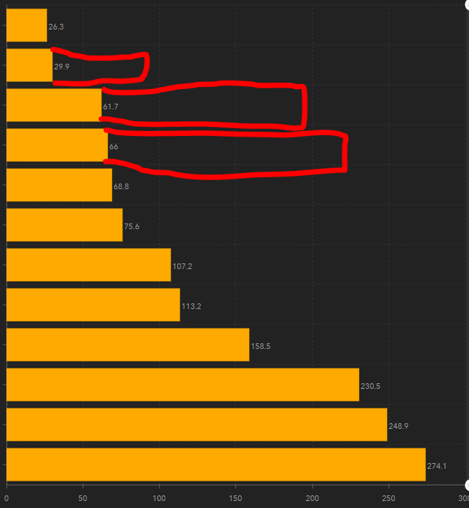
In my table, I've create a new field that I called "Allowed DG (KW)" and then I added the maximum KW to each circuit. I went to one record for each circuit and added the "Allowed DG (KW)" maximum for each. Then I followed the solution provided here but can't get the results I want.
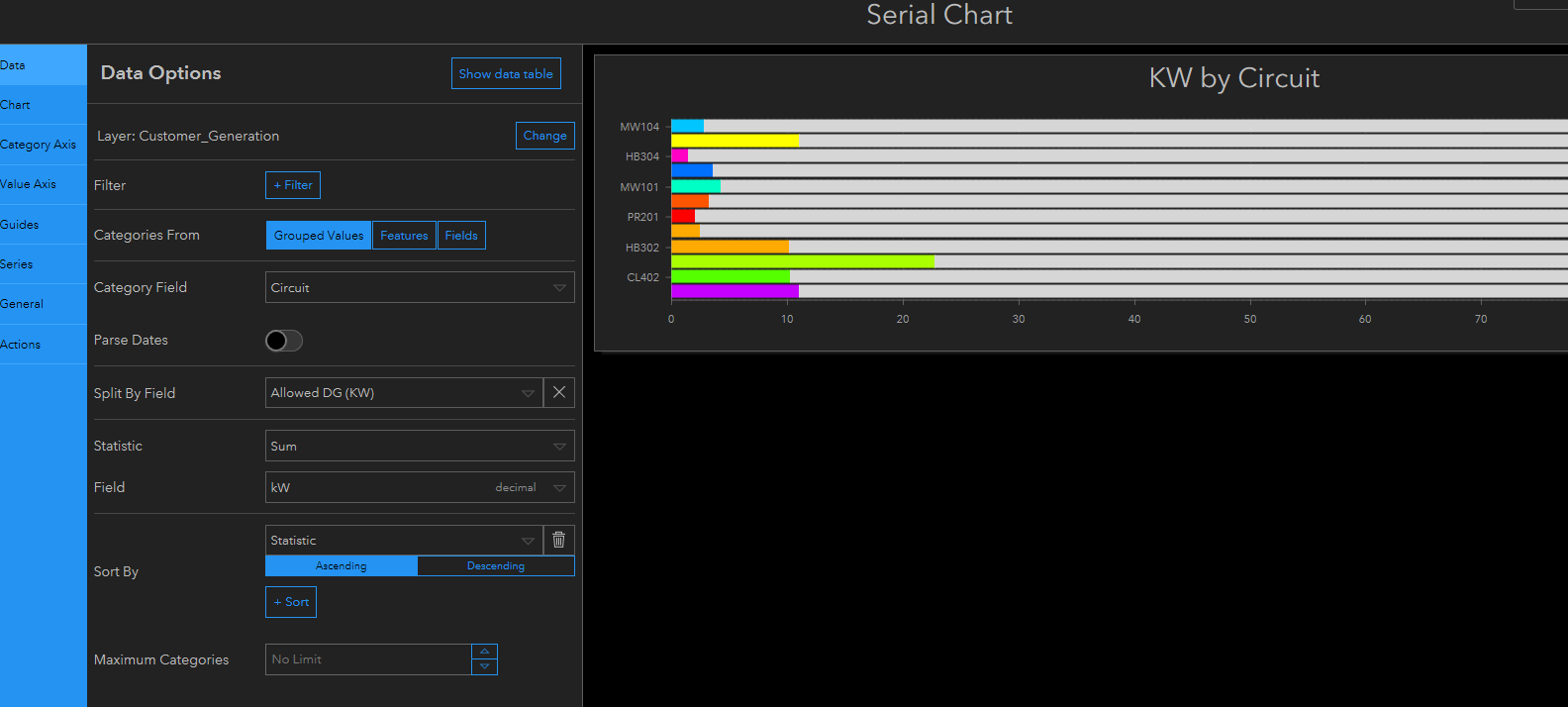
In my Data Options for the Serial Chart, I selected "Grouped Values" on my Circuit field. Then "Split By Field" on "Allowed DG (kW)". For Statistic "Sum" is selected and for Field I've got "kW".
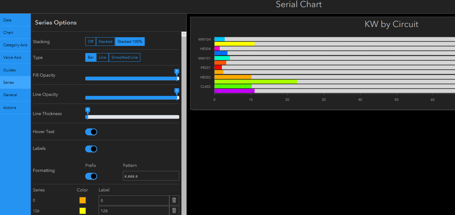
In the Series tab for the Serial Chart, I've selected "Stacked 100%". But after doing that, it looks way different than when I was hoping it would.
I have attached the csv of my data that I'm working with.
Does my question make sense or how can I help you understand my problem to help me get to my solution?
Any suggestions?
Thanks!
- Mark as New
- Bookmark
- Subscribe
- Mute
- Subscribe to RSS Feed
- Permalink
Derek Law any idea on this?
- Mark as New
- Bookmark
- Subscribe
- Mute
- Subscribe to RSS Feed
- Permalink
Hi Line Crew,
I am not clear on what you're trying to do, can you please explain in more detail? What kind of data visualization are you trying to do in the Serial Chart element? Can you perhaps draw a "final" chart that you want? Please add labels to explain the different "sections" of the chart data - perhaps cross reference with the data in your CSV file.