- Home
- :
- All Communities
- :
- Products
- :
- ArcGIS Dashboards
- :
- ArcGIS Dashboards Questions
- :
- Re: Increasing the performance of the dashboard wh...
- Subscribe to RSS Feed
- Mark Topic as New
- Mark Topic as Read
- Float this Topic for Current User
- Bookmark
- Subscribe
- Mute
- Printer Friendly Page
Increasing the performance of the dashboard where maps contain a plenty of data
- Mark as New
- Bookmark
- Subscribe
- Mute
- Subscribe to RSS Feed
- Permalink
- Report Inappropriate Content
Hello! I am interested to find different example solutions where dashboard is able to display current data of the day with an option to observe historical data. The main goal is to find a solution where newest data linked to the certain geometry is automatically drawn to the map when the map is opened, with an option to search past days or periods of time.
Currently the problem is that the daily uploading data is always creating a new geometry to the map. When the map/ dashboard is opened, the overlapping geometries are all being loaded at the same time to the map, reducing the performance of the map/dashboard.
I would like to find a way to prevent the formation of multiple overlapping geometries, with the possibility to see past data from geometries by inserting a certain time span to the dashboard. It would be much preferred that only the latest data is added to the map, and the historical data would be loaded only when needed, so that the performance of the dashboard is not harmed by the great amount of historical data.
Please inform me if you happen to know some solutions or executions that may have something in common with my case. Thanks!
- Mark as New
- Bookmark
- Subscribe
- Mute
- Subscribe to RSS Feed
- Permalink
- Report Inappropriate Content
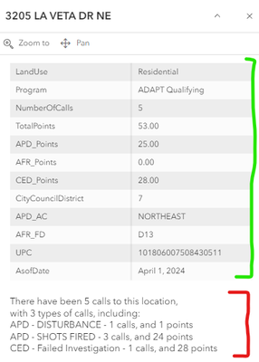
I think the solution is making sure you have your discrete locations that show the most 'current' information and then your historical data presented via one or more related tables and then working some arcade magic to be able to display the historical data as a useful summary. I have a dashboard with a feature layer that has about 30K data points that relate to a table with over 100K records. Clicking on a given location (points in my case) presents current status information, and a summary of specific events in the larger related table. This dataset is updated once a month to create a sort of 'rolling' snapshot of the data over a year's timeframe. So far this approach seems to work pretty well. The screen shot below is what the popup looks like, the data with the green bracket are the feature layer point records and the data within the red bracket are a summary of the related records in the historical data.
- Mark as New
- Bookmark
- Subscribe
- Mute
- Subscribe to RSS Feed
- Permalink
- Report Inappropriate Content
Thank you for your response, this was very helpful!
