- Home
- :
- All Communities
- :
- Products
- :
- ArcGIS Dashboards
- :
- ArcGIS Dashboards Questions
- :
- Re: 'Gauge' widget shows all decimals
- Subscribe to RSS Feed
- Mark Topic as New
- Mark Topic as Read
- Float this Topic for Current User
- Bookmark
- Subscribe
- Mute
- Printer Friendly Page
'Gauge' widget shows all decimals
- Mark as New
- Bookmark
- Subscribe
- Mute
- Subscribe to RSS Feed
- Permalink
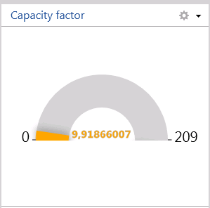
I have an annoying problem working with Gauge Widget. The problem is that the gauge widget is showing lots of decimals as show below.
The web map is set to only show two decimals but the Gauge Widget is not honouring the setting as shown below:
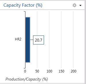
A workaroud is rounding the values in the database but it would be nice if the cauge was working like the bar chart widget.
Showing the same data in the bar chart the decimals are shown as expected.
- Mark as New
- Bookmark
- Subscribe
- Mute
- Subscribe to RSS Feed
- Permalink
Hi Andreas,
I tested my data but so far have not been able to reproduce the gauge widget issue you mentioned above. Could you list out the steps to reproduce the problem in details so I can retry? In particular, can you elaborate how you did the decimal places settings in webmap, and in Dashboard how you set up your gauge widget?
I can also take a look at your data if you can share your op. view + webmap + services to me. To do so, you can invite tif.geonet to a group in your organization then share your data to that group.
I have attached a screenshot of my test result below FYI
Thanks
Tif
- Mark as New
- Bookmark
- Subscribe
- Mute
- Subscribe to RSS Feed
- Permalink
Hi Tif,
Thanks for your answer. I found a simpler way to reproduce the problem.
1. Add layer from web
2. pull in a map service.
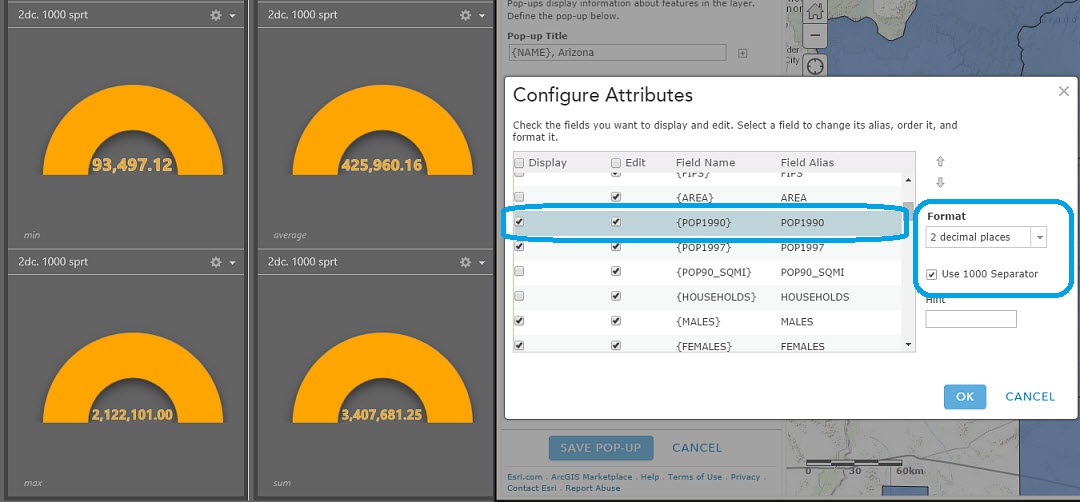
The one i have below has the following attributes
and looks like below in the DB (The data keeps getting updated that the reason why the table below and this one is not identical)

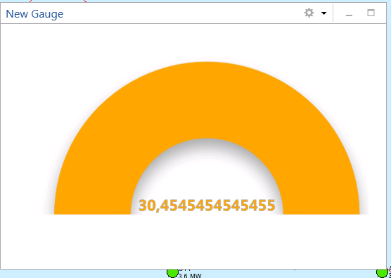
The web map is set only to show 1 decimal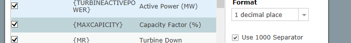
3. Choose gauge where and select map service
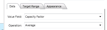
4. Chose value field capacity and operation - Average and click ok
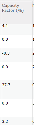
The result is like below - so the one decimal is not getting honoured.
Unfortunately you cannot get access to data since they are marked sensitive.
- Mark as New
- Bookmark
- Subscribe
- Mute
- Subscribe to RSS Feed
- Permalink
Thanks Andreas for the screenshots and the details. Can you please let me know which version of Operations Dashboard you are using? You can find the information by going to the backstage > account tab > look up for "Product Version" as shown below.
Thanks
Tif

- Mark as New
- Bookmark
- Subscribe
- Mute
- Subscribe to RSS Feed
- Permalink
Hi Tif,
I am using the same version as you:

Best regards
Andreas
- Mark as New
- Bookmark
- Subscribe
- Mute
- Subscribe to RSS Feed
- Permalink
I have the same problem with the Summary widget.
- Source is a fGDB
- Have rounded the Double field to 2 decimal places
- Have applied 2 decimal places in the popup
- Operations Dashboard still reports the full length.
My solution does not have a DBMS in the mix.
- Mark as New
- Bookmark
- Subscribe
- Mute
- Subscribe to RSS Feed
- Permalink
Hi Simon,
The issue with decimals in the Summary widget has been logged in our system previously. We are working on a solution for both desktop and web to support decimals in a more unified way.
Thanks,
Chris
- Mark as New
- Bookmark
- Subscribe
- Mute
- Subscribe to RSS Feed
- Permalink
Hi Christopher,
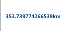
I don't know if this is the same issue for the web based Ops Dashboard, but I couldn't find a way to round decimals in a pie chart legend:
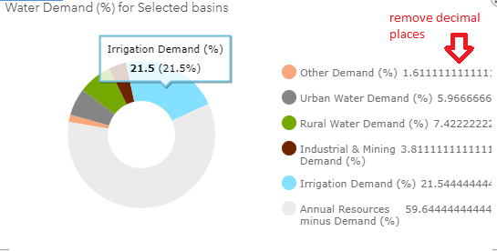
It looks fine in the chart on mouseover, but there are definitely too many in the legend. These decimals appear only when the chart calculates an average in the Statistics field in the Data Options:

Thanks,
Annina
- Mark as New
- Bookmark
- Subscribe
- Mute
- Subscribe to RSS Feed
- Permalink
HI Annina,
Unfortunately this is a limitation in the current pie chart implementation. I have submitted an enhancement request into the system to request for the change. As a workaround, you might want to enable labels (the setting is on the Chart tab under the pie chart config page) and turn off the Legend. You can also consider using a serial chart instead. Serial chart provides more capability in terms of formatting numeric values on the chart labels (e.g. enabling prefix, setting the number of decimal places).
Thanks
Tif
- Mark as New
- Bookmark
- Subscribe
- Mute
- Subscribe to RSS Feed
- Permalink
Hi Tif,
Thanks for logging the case.
Unfortunately turning the labels on is not an option. My charts are rather small, and with the labels on, you won't see anything of the pie anymore. I use serial charts for other values, but for this one it is important to see the distribution compared to 100%.
But probably I'll get rid of that one, and use a separate pie for each "group". So there will be no need to calculate the average. I'll have to discuss this with the client.
Keep me posted about the status 🙂
Cheers,
Annina