- Home
- :
- All Communities
- :
- Products
- :
- ArcGIS Dashboards
- :
- ArcGIS Dashboards Questions
- :
- Dashboard serial chart - normalize values
- Subscribe to RSS Feed
- Mark Topic as New
- Mark Topic as Read
- Float this Topic for Current User
- Bookmark
- Subscribe
- Mute
- Printer Friendly Page
- Mark as New
- Bookmark
- Subscribe
- Mute
- Subscribe to RSS Feed
- Permalink
I have a COVID-19 dashboard that contains a serial chart showing Active Cases by age cohort (0-9, 10-19, etc.). 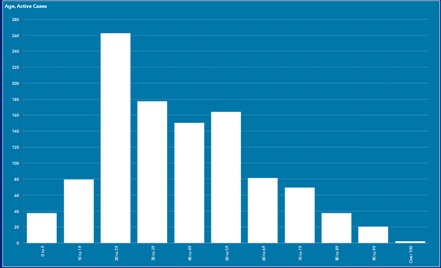
I've been asked to show this same data, but based on Active Cases per 100,000 population in each age cohort (i.e. normalized). I have that population per age cohort data in another table. In the indicator widget, you can use "Value Conversion" to normalize the indicator by dividing by some factor. I don't see any way to do this in a serial chart.
Is there some other way in AGOL to do an on-the-fly conversion of values by a factor in a serial chart?
Jay
Washoe County GIS
Solved! Go to Solution.
Accepted Solutions
- Mark as New
- Bookmark
- Subscribe
- Mute
- Subscribe to RSS Feed
- Permalink
Reporting back - apparently there is currently no way to do this in a Serial Chart.
However, this idea by Olesya Powers is appropriate - go upvote it!
Value Conversion for Charts - Dashboards
Washoe County GIS
- Mark as New
- Bookmark
- Subscribe
- Mute
- Subscribe to RSS Feed
- Permalink
Reporting back - apparently there is currently no way to do this in a Serial Chart.
However, this idea by Olesya Powers is appropriate - go upvote it!
Value Conversion for Charts - Dashboards
Washoe County GIS