- Home
- :
- All Communities
- :
- Products
- :
- ArcGIS Dashboards
- :
- ArcGIS Dashboards Blog
- :
- Try some dashboards
Try some dashboards
- Subscribe to RSS Feed
- Mark as New
- Mark as Read
- Bookmark
- Subscribe
- Printer Friendly Page
With the December 6th update to ArcGIS Online, the completely new, web-centric experience for Operations Dashboard is out of beta and released! Let’s look at some of the stunning, interactive dashboards that have been built with it, and some tips for using them. Click the image of a dashboard to open a shared version you can take for a test drive.
Snow Plow Dashboard
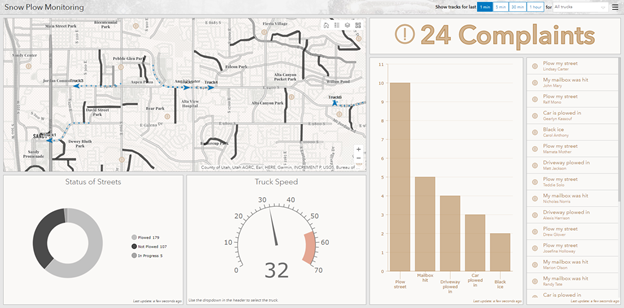
The Snow plow dashboard monitors snow plowing: what streets are plowed, where trucks are, have been, and are going, and complaints about the plowing efforts. Using the dashboard, you can restrict the truck tracks in the dashboard to time intervals, such as the last 5 minutes or last hour, as well as to a particular plow. All this can be used to inform decisions about what happens next.
Use this dashboard to answer questions like:
- How many current complaints are there?
Hint: Read the text.
- What percentage of roads have been plowed?
Hint: Hover over the “plowed” section of the “Status of Streets” chart. - Where is Truck2, and how fast is it going?
Hint: Select Truck2 in the drop-down list in the upper-right corner. - What mailbox was recently hit?
Hint: Click the compliant to center the map on it. - Are there areas that haven’t been visited in the last hour?
Hint: Show the tracks of all trucks over the last hour.
Water Quality Dashboard
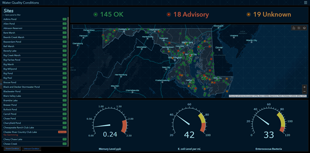
The Water Quality dashboard shows the current water quality as reported by sensors at various locations. It includes detailed mercury, E. coli, and enterococcus bacteria levels, as well as ratings of OK, Advisory, and Unknown for each sensor. This information provides an understanding of the water quality for the region.
Use this dashboard to answer questions like:
- What is the water quality in my county?
Hint: Expand the left-hand panel and choose your county. - What sites currently have mercury levels of .2 or higher?
Hint: Expand the left-hand panel and restrict mercury level to .2 and higher. - How many creeks have advisory water quality?
Hint: Expand the left panel and restrict the Site Type to Creek and the Status to Advisory.
General tips for using dashboards
The exact functionality of a dashboard is up to the author: they can add elements and actions to present the information they need to communicate. However, there are some things common to using the features when they are enabled:
- Hover over sections in a chart to see details.
- Select entries in lists. Authors can configure various actions to occur, such as zooming to them or filtering other elements.
- Use selectors in the left panel or header to choose subsets of the data that you want to focus on. When the left panel is collapsed, you can show it by clicking on the expand arrow in the middle of the left edge of the dashboard. Once shown, you can pin it to easily toggle values.
- Use Select
 to take configured actions with selected features, including flashing them or using them to filter other elements.
 - Elements can be stacked, and you’ll use tabs to view the different elements.
- Use the full screen to view an element in detail by clicking Expand
 . Clicking it when full-screen returns you to the full dashboard.
 - Return to the default extent of the map by clicking Home
 .
. - Access more information through the header: the logo can be linked to a website, or links can be added to a menu in the upper-right corner. If a help link was provided for the dashboard, it is accessible through the menu.
You must be a registered user to add a comment. If you've already registered, sign in. Otherwise, register and sign in.