Back in December 2018 we released the following sample dashboard related to local law enforcement.
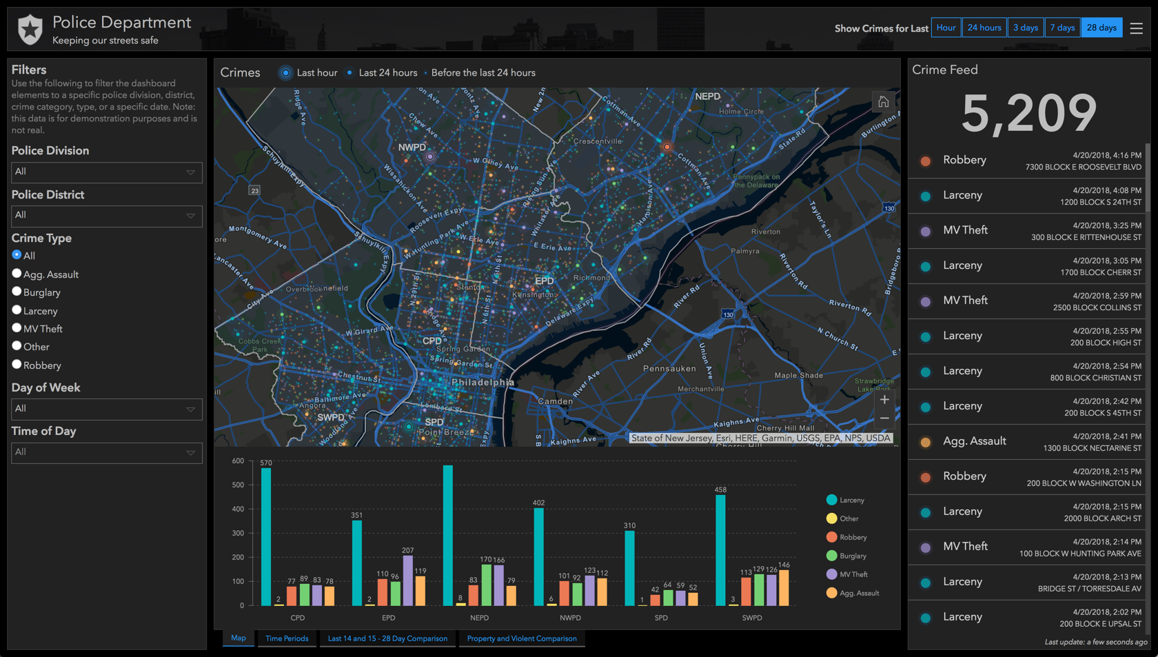
We leveraged selectors that enabled the end user to easily filter down the dashboard to a specific time window, police division and/or crime type. With the latest April 2018 update to Operations Dashboard for ArcGIS, we’ve added the ability to drive actions from selections on charts.
The following dashboard contains charts that summarize crimes by date, division, and type. The charts are configured so that when a selection is made, they apply a filter action to the layer in the map and to each of the other charts. Charts can be configured to allow end users to make single or multiple selections at once. For example, on the date-based serial chart, you can click and drag to select a range of time.
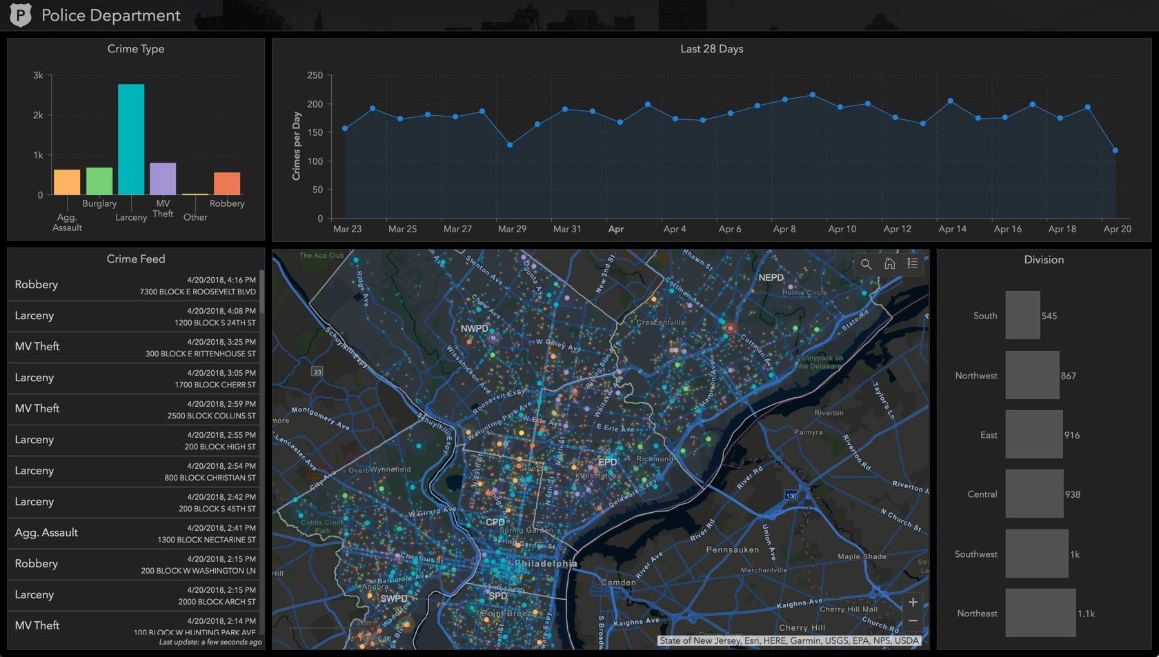
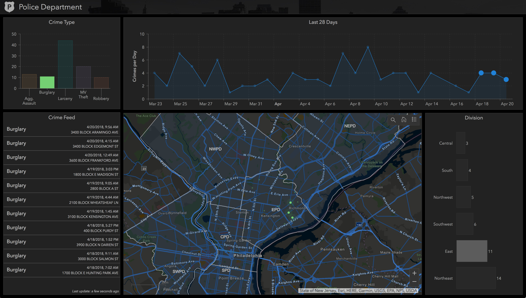
By making a few selections on the charts, we can filter the dashboard to show burglaries that have occurred today in the central police division.
You will also notice several other new features in this dashboard: a search map tool, a scale bar, custom text when there is no data, and an icon in the header. Try the dashboard yourself: Philadelphia Crime Dashboard - Featuring Selection on Charts.
We are excited to see how you utilize these new capabilities in your own dashboards.
If you are new to Operations Dashboard, here are a couple links to get you started: