- Home
- :
- All Communities
- :
- ArcGIS Topics
- :
- Applications Prototype Lab
- :
- Applications Prototype Lab Blog
- :
- Distributive Flow Maps – More Raster, More Faster
Distributive Flow Maps – More Raster, More Faster
- Subscribe to RSS Feed
- Mark as New
- Mark as Read
- Bookmark
- Subscribe
- Printer Friendly Page
- Report Inappropriate Content

NOTE March, 2019: An even newer and easier to use version of the this tool is now available for ArcGIS Pro and an updated blog post about using the tool has also been posted.
NOTE: The Distributive Flow Lines tool was updated March 1, 2017. Please download the latest version. The interface has changed a little since the original post so some of the description below will be a little off but the concepts are still very close so I have left the graphics and captions alone for now.
Based on comments and feedback from the first version of the Flow Map tool and blog post we gave it a second look and have released an update. As you can see in the screen capture above, the output is similar to the original tool but we have switched to an all raster approach which provides more control over the lines and reduces processing time.

A distributive flow map made by Charles Joseph Minard showing coal exports from England in 1864.
I have pasted the introductory text from Brad Simantel’s original post below to provide a concise introduction to the history and use of Flow Maps.
“Flow maps are used to show the movement of goods or people from one place to another. These maps use lines to symbolize the movement, often varied in width to represent the quantity of the flow, and fall into one of three categories: radial, network, and distributive. Radial flow maps are used to show relationships between one source and many destinations. If there are more than a handful of destinations and you still want to show the quantity of flow, however, the lines overlap too much to discern individual values. Network flow maps are used to show the quantity of flow over some existing network — transportation and communication networks being the most common. Distributive flow maps are similar to radial flow maps, but rather than having individual lines from the source to each destination, lines are joined together, only forking once they get close to their destinations”.
If you would like to try it out as you read this post, you can access the new Distributive Flow Lines tool (DFLT) on ArcGIS Online. If you do not have data handy, the English Coal export data, used to create the first map in this post, is also available for download on ArcGIS Online.Tip: The DFLT requires the Distributed Quantity Field to be of type Integer. If you use the British Coal sample data a new integer field will need to be added and calculated based on the existing CoalTonnage field. The current field represents thousands of tons so multiplying by 10 and rounding to the nearest integer would represent hundreds of tons rather than thousands.
Like the first Flow Map tool, the Spatial Analyst extension is required to use the new DFLT. In fact, the new tool is completely raster based until the end when the flow line feature class is created as output.
The DFLT will accept polygon or point features as input for the Source and Destinations, however, point features are recommended. If polygons feature classes are used as input for either Source or Destinations they will be converted to points for internal use but these intermediate point datasets are not saved as part of the tool output. After the Destination feature class is selected the user will need to select an integer field from this dataset representing the quantity that will flow to the destinations from the source.
The DFLT provides an option for the user to specify a feature class to use as impassable features. These features will be buffered by 1.4 times the Cell Size parameter. The area inside this buffer will be NoData and will be used as a processing mask within the tool. A second, slightly larger buffer, 3 times the Cell Size parameter, is also created. The area between the inside buffer and this larger buffer is given a very high cost so Flow Direction will not calculate routes that go into the NoData area (most of the time).
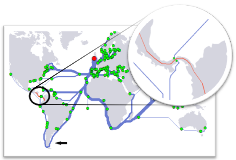
The second optional parameter is a Impedance feature class. These polygons represent features in your map that you would like flow lines to avoid as much as possible. How much these features are avoided is controlled by the Impedance Weight slider. When impedance features are specified, they are given a high cost; but may still be crossed in extreme cases where there is no alternative or where they can be crossed in a narrow location as shown in the example below.Tip: One common effect of the DFLT is that it will often skirt Impedance features too close. This can be avoided by buffering the Foreground features and then using this new feature class as the Foreground features in the tool.
Since the primary use case for the DFLT is to create pleasing flow lines, the user will most likely run it several times using different values for the weight sliders to achieve a good starting point for the effect they are looking for. Using an all raster approach makes this process a bit easier and faster. In raster processing, cell size has a major effect on processing time. The DFLT calculates a default cell that size works well for the final product. In most cases it will not be necessary to use a smaller cell size than the default. We recommend using a much larger cell size during initial iterations to reduce processing time until you start getting results close to what you want. Tip: It is a good idea to make a note of the default cell size for final processing. For initial runs of the tool, multiplying the default cell size by 5 or 10 works well to get a feel for how the various weights and optional parameters effect the output flow lines. More drastic changes in cell size may have a significant effect on how the lines are routed around Impassable and Foreground features.Tip: If you use the post 10.1 sp1 version of the tool you will notice the tool dialog has been simplified. Source Weight and Destination Weight sliders have been replaced by a single slider to control how close to the Source or Destinations the flow lines branch. Also processing extent options have been reduced to "Same as Display" and "Same as Destinations plus Source." This was changed to prevent most of the cases where no solution is possible.
Cell size is so important in the DFLT because the tool calculates Euclidean distances from source and from all of the destination features. These two distance rasters are then Sliced into an equal number of discrete cost classes. The number of classes is determined by dividing the maximum processing extent dimension by the cell size. This acts to normalize the effect of the Source and Destination cost rasters and provide a basis for the cost of the Impedance raster. By normalizing these costs the tool provides the user more control over the shape of the final flow lines through the Source and Destination Weight sliders.
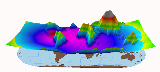
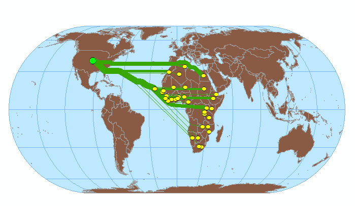
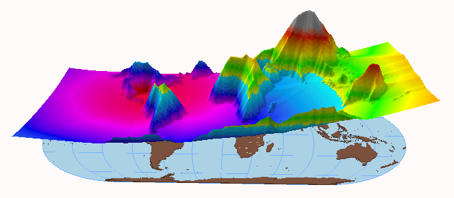
To understand how cell size affects the total cost surface it helps to see a few examples. In the following ArcScene screenshots we are using a Source location in the center of the US and the destination features are the centroids of a several countries in Africa. The CostDistance surface is shown floating over the “flat Earth” to provide a means of comparing the effects of the weight parameters and cell size. In each example the perspective and Z exaggeration are the same.

Source Attraction = 10 Destination Attraction = 1 Foreground Weight =8 Cell Size = 100,000 meters

Source Attraction = 10 Destination Attraction = 1 Foreground Weight =1 Cell Size = 100,000 meters

Source Attraction = 1 Destination Attraction = 1 Foreground Weight =10 Cell Size = 100,000 meters

Source Attraction = 1 Destination Attraction = 10 Foreground Weight =8 Cell Size = 100,000 meters

Source Attraction = 1 Destination Attraction = 10 Foreground Weight =8 Cell Size = 30,000 meters
In this last example, it was necessary to reduce the elevation exaggeration and to zoom out so the cost surface would display in a reasonable way. The only difference between the two results is that the cell size has been reduced from 100,000 meters to just 30,000 meters. The effect is that the number of “cost slices” is larger and so the CostDistance “elevation” is increased.
As previously stated, the new DFLT processes the Impassable features separate from Impedance features. Impedance features are treated much the same as Impassable features in the first tool. They are features the user would like the flow lines to avoid if possible but the flow lines will cross them if necessary to reach a destination location. Impassable features represent a hard barrier in the cost surface and can be used to control the shape of the flow lines as in the example below.

Flow lines representing distribution of Coal by ship are crossing Central America regardless of Impedance weight

With the red barrier added flow lines now go around the tip of South America
As with the previous Flow Map tool, the output of this new tool will usually be the starting point to produce a final flow map with smoother more organic looking flow lines. Once the lines are roughly where you want them the next step is to use Graduated Symbols to display the Distributed quantity. The “GRID_CODE” field will contain values based on the input Distributed quantity field. The values in this field will be equal to the Distributed quantity field for the smallest lines nearest to the destinations. Each time a tributary flow line meets another line the combined line closer to the Source feature will have a GRID_CODE value equal to the sum of previous two tributaries. Temporarily placing labels on the lines and destination points makes this clear. In the examples above the lines are represented using 10 classes of line weights ranging from 1 – 10. Using rounded joints and ends on the lines also improves the output. After setting up graduated symbols many users may also prefer to run the Smooth Line tool on the flow lines. This will also add some curve to the flow lines which is often desirable. A good starting point is to use a tolerance value approximately four times the Cell Size used to create the flow lines. It is also recommended to select the PEAK algorithm and FIXED_CLOSED_ENDPOINT options. Even after these steps it may be necessary to make manual adjustments to the shape of the line. Installation instructions:
After downloading and unzipping the Distributive Flow Lines tool you should see the following in the ArcMap catalog window.
Expanding python toolbox will reveal one script tool as shown below:
By default, python toolboxes do not display the “pyt” file extension. To display this and other known extensions in ArcCatalog (or the catalog window in ArcMap) check the following:
This dialog is accessible in ArcCatalog by clicking Customize > ArcCatalog Options. Unchecking the highlighted option will show the following:
We hope you find the new tool useful and the tips above help get you started experimenting with the tool. We look forward to you comments.
NOTE: The Distributive Flow Lines tool was updated Oct 22, 2013 to address a backwards compatibility issue. If you are using ArcGIS 10.1 please download the latest version here.
NOTE: The Distributive Flow Lines tool was updated Jan 10, 2014. If you are using ArcGIS 10.1sp1 or 10.2 please download the latest version.Contributed by Bob Gerlt.
You must be a registered user to add a comment. If you've already registered, sign in. Otherwise, register and sign in.