- Home
- :
- All Communities
- :
- Products
- :
- ArcGIS Dashboards
- :
- ArcGIS Dashboards Blog
- :
- Percentages & More in Ops Dashboard
Percentages & More in Ops Dashboard
- Subscribe to RSS Feed
- Mark as New
- Mark as Read
- Bookmark
- Subscribe
- Printer Friendly Page
The Feature:
I was looking through David Nyenhuis 's blog post, Operations Dashboard: Provide Context to Your Dashboard Indicators, and I noticed that he quietly used an interesting feature in the second step of his second example.
Specifically, he set his bottom text to {difference} from last year ({percentChange}%). At first I assumed {difference} and {percentChange} were fields in his feature service, but then I got curious and tried them in my data. Lo and behold, they calculated the difference and percent change in my data!
I did some digging and found this help page that explains: Indicator—Operations Dashboard for ArcGIS | ArcGIS. You can calculate difference, absolute difference, percentage, percentage change, ratio and ratio change. All of these relate your {value} to field to your {reference} field, but you have some flexibility in what these fields are, including combining different filters on each. You can also combine the results of your calculations with text, which is what David does in his examples.
In use:
Here's what some of my indicators looked like beforehand:
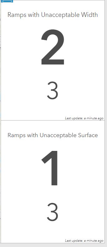
These compared the number of unacceptable ramps to the total ramps underneath. It could have been made more clear by adding more text, but it still wouldn't have been as intuitive as the percentages we're used to seeing. Here's what it looks like with a percentage:
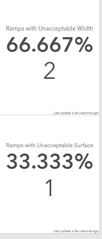
Much more intuitive! No the percent is displayed clearly, and the number of assets that are unacceptable is displayed below for context. This is much more intuitive, and since the total number of ramps is displayed elsewhere on the dashboard, it's less repetitive.
Great, but why so many decimals? That's the default, but you can easily format to get rid of the decimals. Here's what that setting looks like:
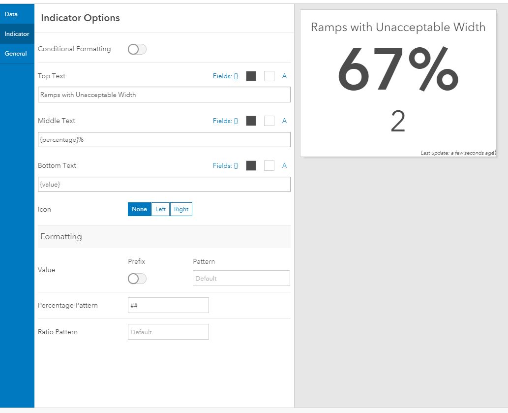
You can find more on number formatting here: Format numbers—Operations Dashboard for ArcGIS | ArcGIS.
The Takeaway:
Differences, percentages, and ratios are powerful ways of representing your data. They're often more intuitive than just showing numbers, and allow your dashboard user to quickly take in information. Furthermore, they can be used to give context to numeric data.
These features have been hiding in plain sight. All the information is right there in the help guide, but it doesn't come up in the top results on either Google searches or the help search bar. Hopefully this blog can help users find the information more quickly, or at least inspire some one to read the help documentation a little closer.
You must be a registered user to add a comment. If you've already registered, sign in. Otherwise, register and sign in.