- Home
- :
- All Communities
- :
- Events
- :
- User Conference
- :
- User Conference Questions
- :
- Re: UC 2016 Agenda -- Working Much Better (6/22/20...
- Subscribe to RSS Feed
- Mark Topic as New
- Mark Topic as Read
- Float this Topic for Current User
- Bookmark
- Subscribe
- Mute
- Printer Friendly Page
UC 2016 Agenda -- Working Much Better (6/22/2016) In my opinon
- Mark as New
- Bookmark
- Subscribe
- Mute
- Subscribe to RSS Feed
- Permalink
- Report Inappropriate Content
My editorial, and a few tips...
UC Agenda - Latest updates (06/22/16) seemed to have helped with the speed, syncing between a web version and the (iOS) app, etc. Now that the extreme load time and log-in issues seem to have been resolved, for the most part, if you haven't tried it in the past couple days, I would give it another chance.
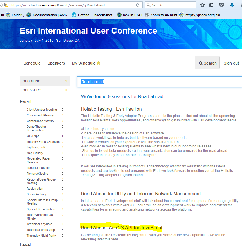
One tip (semi-annoying, but workable), if you are searching for multiple words, for example "Web AppBuilder", the Search box (in Firefox anyway) seems to lose focus after the space or the A. Keep this in mind, and after each letter, just click in the search box to give it focus again, type in the next letter, repeat. It is filtering as you go, so at least that is a plus.
After I let the ios app download the latest agenda, the app showed my "favorites" that I had edited on the browser version. If I had both machines logged in, the sync was pretty instantaneous, so that was nice.
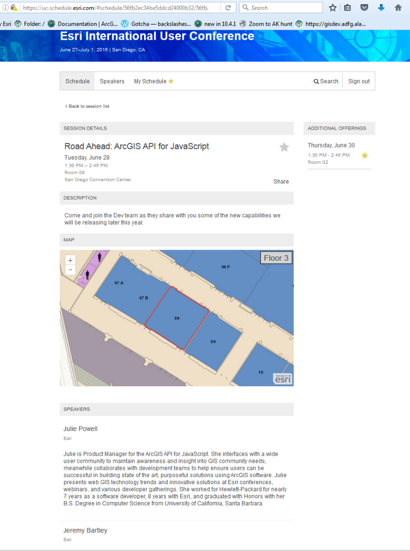
If you click on the title of the session that interests you, it provides description, speakers, room-map, and the optional times and lets you tag them. I think the layout has improved from the first few releases....but we are an impatient bunch when it comes to planning for the UC, and I'm sure they wanted to get something out for us to start with why they were still developing this. BTW - I view mine on a esktop or iPad, so not sure how it will be on a phone/smaller screen.
If you click on the title of the session that interests you, it provides description, speakers, room-map, and the optional times and lets you tag them.
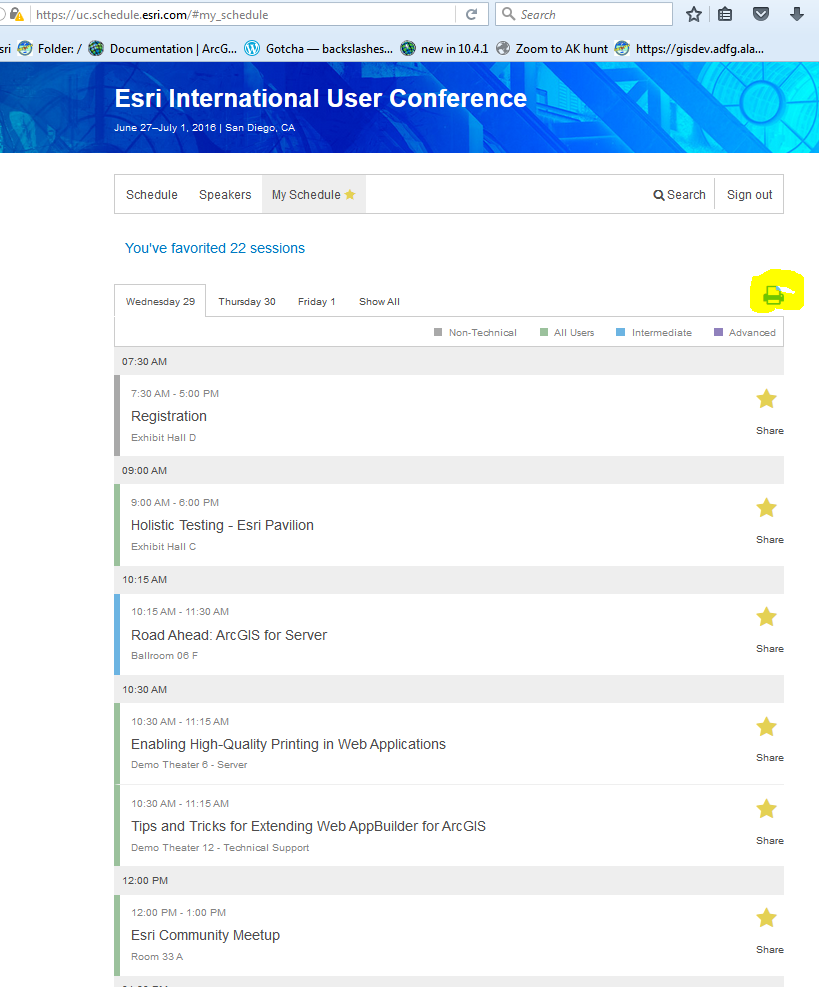
They do have a print option for "My Schedule" and it worked to print to a PDF. Still not an export to Excel, but I think for most this will be workable. The are not printing/providing a pocket agenda this year, so keep that in mind and have a browser/app version or pre-printed version handy.
For those attending, the mobile apps have the "tech session survey" available to make rating a session quick and easy. So as a user myself, this is my plug for that. Providing feedback, good or bad, helps improve the sessions for all of us in the future.
One feature that was available a half dozen years ago that I miss, is being able to add a "personal appointment" to the "My Schedule" Any chance of bring that in the future? Margaret Ohayon
Another tip, for those that look for the tech session recordings.. It's been mentioned that that only a handful of the sessions will be available online for free, but.I know the 3rd party Sound of Knowledge is recording most again. However, the Road Ahead sessions are not taped, and the "demo theatre" sessions typically are not either....so keep that in mind as you plan you schedule.
All this is just my opinion and experiences today, but since I was pleasantly surprise, thought I would pass it on. Then again, maybe it's just the pre-UC anticipation starting to kick in.
Feel free to add tips or comments to this discussion...but if you are still having any issues, post as a question so someone can maybe give direct feedback. Enjoy the UC!
- Mark as New
- Bookmark
- Subscribe
- Mute
- Subscribe to RSS Feed
- Permalink
- Report Inappropriate Content
RE: website search page
It would be nice if you could search by time. When you search for something the resulting display of sessions doesn't even show when or where they will be 8-(
Using it some more I see that there are very few indications of the technical expertise required. There is an option to pick LEVEL
(27 Advanced out of a total of 1129 Sessions - Double 8-( )
Which i guess isn't really needed with only 27 Advanced sessions.
- Mark as New
- Bookmark
- Subscribe
- Mute
- Subscribe to RSS Feed
- Permalink
- Report Inappropriate Content
Time might be hard since there can be so many variables, but being able to add "Thursday" in the search string would be nice, so you could see those topics. Then maybe more filter boxes on the side for dates and/or ranges of time. I think this is version 1 of this style. Maybe they can add something like that in the future?? That is if they build on this and don't start from scratch again.
i would still like to see better download options too. Not everyone has the ability to use the apps and I would like to see an excel friendly version of the personal planner so we could further modify, add highlights for our preferred choices (since typically there are multiple sessions that we want to attend at one time), and a real wish list, letting us do routes (and avg walk times) of our personal planner for our choices.
All just wishful thinking, (maybe things for next conference?) but for those first attendees, I bet that would help them between sessions, with the ability to maybe change their schedule if rooms are too far apart. the technology is probably all there, but how easy that would be, I don't know. And although the UC is our conference, and I know a LOT of there efforts go into making a great experience for us, there is a trade off on extra tweak for the schedule for one week of the year vs. Improvements to the software that we use everyday.
- Mark as New
- Bookmark
- Subscribe
- Mute
- Subscribe to RSS Feed
- Permalink
- Report Inappropriate Content
Some addition features (new or I just noticed) in the iOS version of the app, just FYI: (suggested improvements in bold)
- Ability to view and change "favorites" selection offline, even when in airplane mode (for reviewing your schedule on your flight to the UC)
- default agenda changes to current date, as the week goes by, instead of the old default to the first day. Also, the full schedule filters for "what is going on now" It would be nice if the "my schedule" would do the same
- When in "my schedule" there is now an email/envelope icon on top that allows you to email yourself a copy. That is nice, but is seems to be in the order you marked them as favorites. That would be hand if anyone actually looked at the schedule in linear fashion, but typically I search topics, mark those, then search other topics or types so not in chronological order At all. fIt would be nice if the list was in chronological order....and also to have it be an option comma-delimited csv format so it could be read into Excel.
I havent been been using the browesr version at the UC, so no other comments. But I have heard from several other users that they miss the printed format, with the long descriptions, and would at least like the option of seeing the agenda in a PDF format to download and print if they want before the UC. I miss the pocket agenda a little, but getting to like the app more and more, but also viewing it on an iPad, not phone, which others have mentioned is hard due to screen size.
Just some feedback in case the agenda/app staff are seeing this. Maybe Timothy Hales can pass this link along after the UC so add constructive suggestions if you have any.
- Mark as New
- Bookmark
- Subscribe
- Mute
- Subscribe to RSS Feed
- Permalink
- Report Inappropriate Content
Suggestions
1) I signed on to the web based Agenda application when if first came out. I noticed that several sessions that I had favorited disappeared so I assume they were canceled. One of the canceled ones disappeared just days before the UC and since it was very important for me I did not have any alternatives plans. Could there be an email alert when favorited sessions are deleted? Or, append something like the word "Canceld" to the title: (Canceled) Best Practices Converting Workflows from SDE Command Line UI
Email alters for time / room changes would also have been nice.
2) Two years ago there were areas where attendees could sit down and recharge their mobile devices with multiple cords available. This year that wasn't the case so when my phone died I was disappointed that option was gone. Also, unlike two years ago, there were no PCs or iPads to available for checking email and agenda. If the agenda is only available online then please have some PCs or iPads available for users whos phones may have died or too small to work the agenda application.
3) At the various islands there are wonderful printouts listing all the technical sessions related to that subject like ArcGIS Server. It would be great if these were available on the website for the attendees to print out or copy to their devices.
- Mark as New
- Bookmark
- Subscribe
- Mute
- Subscribe to RSS Feed
- Permalink
- Report Inappropriate Content
1 - I agree it would have been nice to know ahead of time when sessions were cancelled or changed.
2 - There were several areas in the Young Professionals Lounge and the Exhibit floor that had seating with connections for recharging your device. It would have been nice to have something more along the lines of the geolounge from previous years.
3 – Great idea.
Deb
Deborah Wilson, GISP
GIS Analyst II
City of Thornton
12450 Washington St
Thornton, CO 80241
720-977-6261
<http://www.linkedin.com/pub/deborah-wilson-gisp/13/374/748/>


