- Home
- :
- All Communities
- :
- Products
- :
- Spatial Statistics
- :
- Spatial Statistics Questions
- :
- Geostatistical Analyst Layer-To-Contour results wa...
- Subscribe to RSS Feed
- Mark Topic as New
- Mark Topic as Read
- Float this Topic for Current User
- Bookmark
- Subscribe
- Mute
- Printer Friendly Page
Geostatistical Analyst Layer-To-Contour results way too generalized
- Mark as New
- Bookmark
- Subscribe
- Mute
- Subscribe to RSS Feed
- Permalink
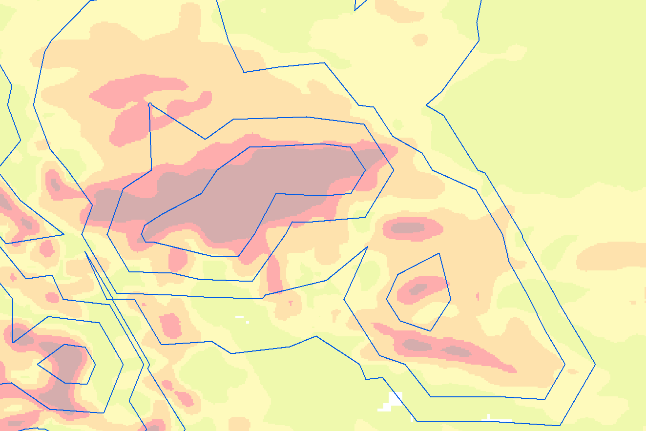
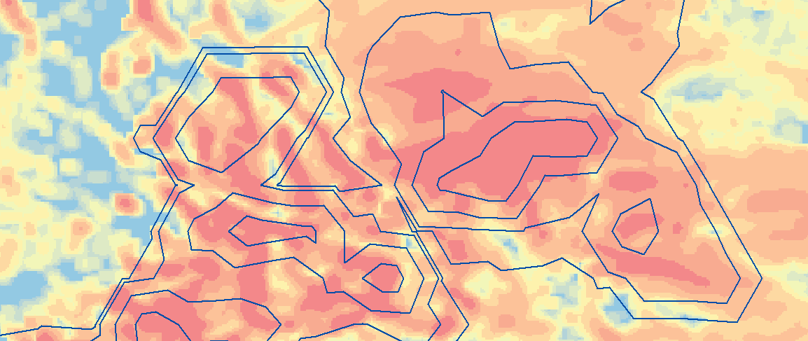
Hi - I'm trying to produce contour polygons out of a Geostatistical Analyst layer. The contour polygons (GALayerToContour_ga tool) are super-generalized and look terrible. This screenshot shows is the resulting contour polygons in blue lines (transparent fill). The grid in the background was exported from the GA Layer (using the GALayerToGrid_ga tool), with the colors classified at the same cut-off elevations used to generate the contours:
My question is: How do I generate contour lines that really follow the data much more closely? Is there some kind of scale or generalization setting in the environments that I'm missing? Here is what I am running:
arcpy.GALayerToContour_ga(
    in_geostat_layer="output_geo_lyr",
    contour_type="FILLED_CONTOUR",
    out_feature_class=output_path,
    contour_quality="PRESENTATION",
    classification_type="MANUAL",
    classes_count="5",
    classes_breaks="5;20;75;150;999999")
Here is how I created the GA layer. It actually came from a raster-to-point export. For that reason, I set the min and max number of inputs to 1, to basically just make it a nearest neighbor interpolation:
arcpy.IDW_ga(
    in_features=in_features,
    z_field="grid_code",
    out_ga_layer="output_geo_lyr",
    out_raster="",
    cell_size="0.01",
    power="2",
    search_neighborhood="NBRTYPE=Standard S_MAJOR=1.1 S_MINOR=1.1 ANGLE=0 NBR_MAX=1 NBR_MIN=1 SECTOR_TYPE=ONE_SECTOR",
    weight_field="")
When I check the GA Layer with the GALayerToGrid_ga, it looks correct.That is the background in the screenshot above.
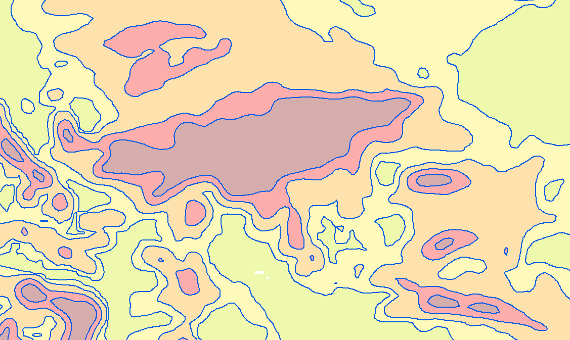
If I run the Spatial Analyst Contour List tool, that creates something much more reasonable. Of course, these are just lines, so they don't meet my needs, since I'm trying to create polygons. Here is a view of those:
Any ideas on how I can create polygons with boundaries that look like the lines in this screenshot? thanks!
The Python script I'm using is attached. It runs and produces the grid background and polygon foreground in the first screenshot, above. I'm using ArcGIS Desktop 10.5 with its arcpy 2.7.
- Mark as New
- Bookmark
- Subscribe
- Mute
- Subscribe to RSS Feed
- Permalink
within the tool's help there is a suggestion...
The output polygon or polyline features will contain slightly different geometry depending on the number of CPU cores of your machine. This is due to a different number of tiles that will be used in the contour algorithm (more cores allow for more tiling and, hence, more refined contours in the output). For reproducible results on machines with different numbers of CPU cores, use the Parallel Processing Factor environment to control the number of cores that the tool is allowed to use.
So if you have an amped up machine, you might want to take advantage of it to improve quality, or at least see if it makes a difference.
- Mark as New
- Bookmark
- Subscribe
- Mute
- Subscribe to RSS Feed
- Permalink
I saw that, but it says "slightly different"... What I'm after is a night & day difference. I'll try it on a better machine tomorrow.
- Mark as New
- Bookmark
- Subscribe
- Mute
- Subscribe to RSS Feed
- Permalink
David
The first image that you show, please can you show the contour lines on the GA layer and not on the exported raster. From what I see is that he lines and the raster don't line up.
Make sure that the GA layer is rendered in presentation mode and that the contours are also exported with presentation quality.
Also, have you looked at Create Filled Contours?
-Steve
- Mark as New
- Bookmark
- Subscribe
- Mute
- Subscribe to RSS Feed
- Permalink
Hi Steve - I would be happy to, if only I knew how! In the python script, the arcpy.IDW_ga function has a parameter "out_ga_layer", to which I supply a string name. I named mine "output_geo_lyr" and I am able to work with this as an in-memory object in python, but can you tell me how to draw it in ArcMap? I suppose I need to persist it to disk somehow.
I did try the script a while back and it crashed, which actually led me to this approach.
- Mark as New
- Bookmark
- Subscribe
- Mute
- Subscribe to RSS Feed
- Permalink
The initial screenshots were done on my 2-core laptop. I ran the same process on a 4-core machine, and it was the same result. It might have been a pixel different here or there, but it wasn't anything I could discern with them side by side.
- Mark as New
- Bookmark
- Subscribe
- Mute
- Subscribe to RSS Feed
- Permalink
David
After you create the geostatistical layer you can persist it using SaveToLayerFile. Or you can run your script from the Python window and then all outputs will be added to the map.
Then open ArcMap and load the layer file and change it to presentation quality via the Symbology tab.
BTW, which version of ArcGIS are you using?
-Steve
- Mark as New
- Bookmark
- Subscribe
- Mute
- Subscribe to RSS Feed
- Permalink
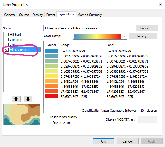
Thanks for the explanation on creating the layer file. I am using ArcGIS Desktop 10.5.
When I add that layer file to my map, I am starting to get a better sense of the problem. Here is the default "Filled Contours" symbology, with the contour lines borders drawn in blue (transparent fill) over top:
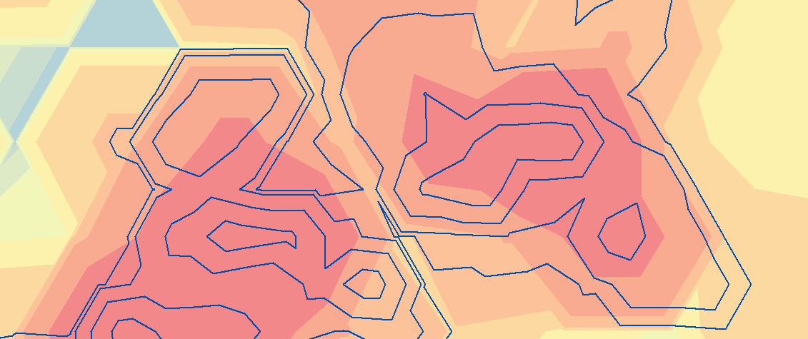
They don't really line up, but I'm seeing the problem. If I switch to Grid symbology, it gets closer:

If increase the number of grid cells it uses to draw, it gets closer to looking like the grid I saved out, but doesn't really explain the contours generated:
In the end, I'm not sure this really gets me any closer to creating beautiful contour lines. Any idea where to go next? Is there some kind of cell size, resolution, or tolerance setting that I can adjust to make the contours higher resolution?
Please note that my input was a raster. I converted it to points, and created my surface using IDW. Is there a way to create a Geostatistical Analyst layer starting directly with a raster?
thanks!
- Mark as New
- Bookmark
- Subscribe
- Mute
- Subscribe to RSS Feed
- Permalink
David
In the first image - you also need to check the presentation quality checkbox.
If you're using the Wizard you can use a raster as input. However, from scripting you'll first have to create a template layer and then use the CreateGeostatisticalLayer tool to modify the input if necessary. See Automating geostatistical interpolation using template layers
Can you copy your raster to .tif format using the CopyRaster tool and zip it and send it to me at [email protected]?
-Steve