- Home
- :
- All Communities
- :
- Industries
- :
- Natural Resources
- :
- Renewable Energy
- :
- Renewable Energy Questions
- :
- Calculating statistical correlation between featur...
- Subscribe to RSS Feed
- Mark Topic as New
- Mark Topic as Read
- Float this Topic for Current User
- Bookmark
- Subscribe
- Mute
- Printer Friendly Page
Calculating statistical correlation between features and upstream or downstream position on a river
- Mark as New
- Bookmark
- Subscribe
- Mute
- Subscribe to RSS Feed
- Permalink
Hello and thanks for not getting deterred by the aweful title - it's difficult to put the issue in one sentence.
So this is what I want to do: I am working on aproject about the interaction of people and urban rivers in Nairobi. I want to show on a map how wealthy areas tend to be located upstream of the river, where they are still clean, while most slums are located downstream - and I want to have statistical proof for the correlation. I have traced the rivers (polylines), slums and wealthy areas (polygons). Now, is there any statistical analysis tool, which I can use to calculate a correlation between the "age" of the river (i.e. how many meters it has "spend" in the city area of Nairobi?
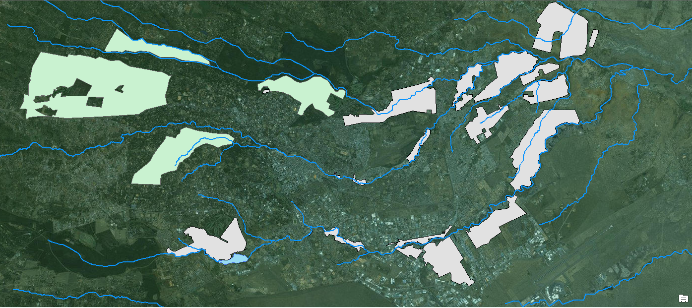
To make it easier to understand, here is a picture of the map so far. Green are welathy areas; gray are informal settlements; the rivers flow from West to East.
If this is not possible I would let the map speak for itself, I think I can make the point without statistical analysis, but it would be really neat "proof" it.
Any suggestions?
Thank you very much!
/Theo
Solved! Go to Solution.
Accepted Solutions
- Mark as New
- Bookmark
- Subscribe
- Mute
- Subscribe to RSS Feed
- Permalink
Great question Theo!
To compare the data I would start making sure each polygon on the river had a unique ID, such as a
"neighborhood" name.
Then you can set up a scale for the wealth either income per capita or wages....I'm not sure how they track it in Nairobi in the United States we have a Census we can go to for income data.
Next you could add up the total meters of the river in each polygon, this is the more difficult because how do you track the "age" of a river? Is that in terms of distance from the source? You could create station points along the river, or maybe generate a distance raster from a point layer identifying the "point of origin" on each river.
SpatialEcology.com has some good tools for calculating line distance in a polygon.
sumlinelengthsinpolys; |
sumlinelengthsinpolys(line, poly, field, [weight], [where], [update]);
Example 2: sumlinelengthsinpolys(line="C:\data\roots.shp", poly="C:\data\plots.shp", field="LINESUM", weight="WIDTH"); WARNING!: this command may take a long time to run. |
Once you get those two data types you can add the new fields to each polygon layer so you have a "neighborhood" with the wealth and river age in the same polygon feature class.
The next step is to use the chart tools to do a scatter plot and to see if the relationship is linear. If the data has a positive linear relationship then you could say as the river age increases the wealth decreases.
Hope this at least gets you pointed in the right direction. To my knowledge there is no "correlation" tool in ArcMAP. I think you can make correlations in the Geo-statistical analyst extension but i'm am not positive.
Thank you again for this challenging question!
Dan
- Mark as New
- Bookmark
- Subscribe
- Mute
- Subscribe to RSS Feed
- Permalink
Hi Theo,
I think that if you could obtain water quality data from different points along the river systems, then it would support the correlation between clean water vs affluency, rather than stream length. While you might assume that water quality is reduced as stream length increases, its not always evident and not always true, a confluence of a "dirtier" branch with a "clean" branch of a stream can result in better water quality downstream of the "dirtier branch" even if its stream length is lower.
Also, while there might be correlation between affluency and water quality, that does not mean that water quality is a cause of affluent areas developing in these regions. A cursory look at the Nairobi area shows that slums generally look to be in flatter terrain areas, which are easier to widespread cheap development and are closer to the city center, while affluent areas tend to have rougher terrain, indicating an increased cost of development that only wealthier people could afford. It also follows trends in urbanization where in many cases a cities elite will move to the outskirts of a city to undeveloped areas, or areas that are not as cheap to develop in order to avoid the incursion of lower income in their communities. What criteria are you using for defining slums and wealthy areas that you used to digitize out features?
- Mark as New
- Bookmark
- Subscribe
- Mute
- Subscribe to RSS Feed
- Permalink
Hi Ian,
Thank you, these are valid points you raise!
Of course it is really difficult to establish causalities - this is also not what I intend to show with the map. The reaons for the specific patterns of segregation in Nairobi are of course multi-causal and have to do not only with topography, but also with colonial dominance, climate, wind directions and probably much more. For my purpose it is rather about the effect of these physical patterns and how they reproduces the power strucutures that helped forming them in the first place. Due to the downstream location of many slums people face environmental hazards caused by the polution that also translate into financial pressure (cost for medicine, unpaid inability to work, etc.). The correlation between "age" of the river and pollution levels will be established by other studies I did not include in the map.
Cheers!
/Theo
- Mark as New
- Bookmark
- Subscribe
- Mute
- Subscribe to RSS Feed
- Permalink
I figured this was part of a larger project, but I only had what you mentioned to work with so I responded based on that. Since you are probably working on this for a paper, you couldn't post everything so its understandable. I am by no means an expert on anything Africa, so I'm sure you have a much greater understanding of the factors that are driving this than I.
Best of luck on your research, and I would love to see your finished paper/project once its completed.
- Mark as New
- Bookmark
- Subscribe
- Mute
- Subscribe to RSS Feed
- Permalink
Thank you very much! As I said - these were very valid points you raised!
- Mark as New
- Bookmark
- Subscribe
- Mute
- Subscribe to RSS Feed
- Permalink
Great question Theo!
To compare the data I would start making sure each polygon on the river had a unique ID, such as a
"neighborhood" name.
Then you can set up a scale for the wealth either income per capita or wages....I'm not sure how they track it in Nairobi in the United States we have a Census we can go to for income data.
Next you could add up the total meters of the river in each polygon, this is the more difficult because how do you track the "age" of a river? Is that in terms of distance from the source? You could create station points along the river, or maybe generate a distance raster from a point layer identifying the "point of origin" on each river.
SpatialEcology.com has some good tools for calculating line distance in a polygon.
sumlinelengthsinpolys; |
sumlinelengthsinpolys(line, poly, field, [weight], [where], [update]);
Example 2: sumlinelengthsinpolys(line="C:\data\roots.shp", poly="C:\data\plots.shp", field="LINESUM", weight="WIDTH"); WARNING!: this command may take a long time to run. |
Once you get those two data types you can add the new fields to each polygon layer so you have a "neighborhood" with the wealth and river age in the same polygon feature class.
The next step is to use the chart tools to do a scatter plot and to see if the relationship is linear. If the data has a positive linear relationship then you could say as the river age increases the wealth decreases.
Hope this at least gets you pointed in the right direction. To my knowledge there is no "correlation" tool in ArcMAP. I think you can make correlations in the Geo-statistical analyst extension but i'm am not positive.
Thank you again for this challenging question!
Dan
- Mark as New
- Bookmark
- Subscribe
- Mute
- Subscribe to RSS Feed
- Permalink
Hi Dan!
Awesome, thank you very much!
I proxy the wealth of an area by average apartment prices for each neighborhood, because this data is most easily available and, I guess, rather robust.
Your suggestion looks very interesting indeed - this is exactly what I was looking for! I'll try to implement it this week and will post any progress here, in case others have a similar problem.
I like the idea with the distance raster. maybe I try to create one not from the source of each river (because these are quite hard to locate) but maybe (to keep things simple) originating from the city boundary. Before the rivers enter Nairobi the environment is mostly rather natural and I don't expect much pollution before they enter settled areas. But I'll think about that...
Thank you very much, this is really, really helpful!
/Theo
- Mark as New
- Bookmark
- Subscribe
- Mute
- Subscribe to RSS Feed
- Permalink
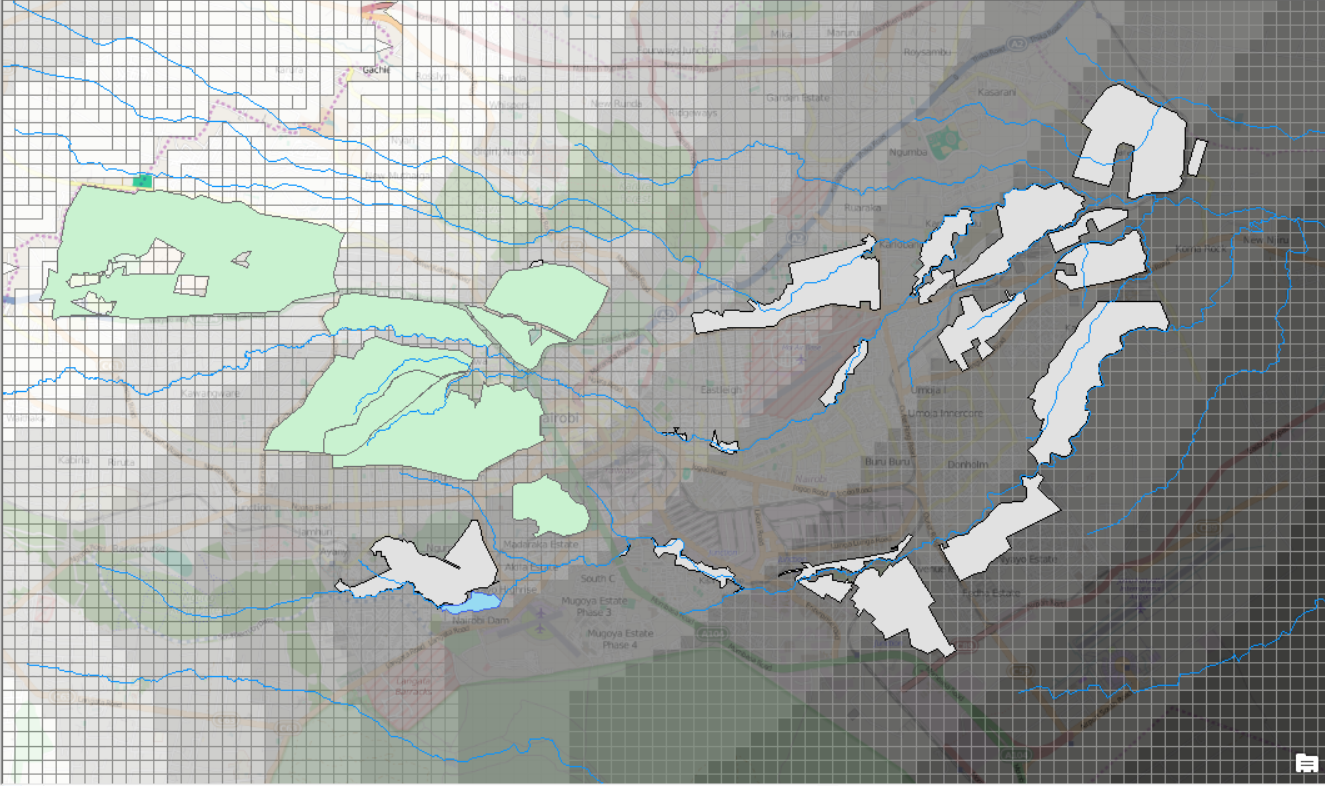
Ok, I couldn't stop working on this, so no here is my work-around:
1. Create distance raster based on the city boundary (here is the weakest point, since the start of the pollution does not coincide with the city boundary.
2. Convert Distance raster to polygon-feature ("distPol")
Now I have something that looks like this:
3. Intersect rivers mit "distPol". Now I have a multitude of microscopic lines along the rivers, each carrying information about the distance it as to the city boundary ("riverInt")
4. Create a 500m (arbitrary) buffer around the features for wealthy areas as well as slums. This is in order to account for influences the river may have on these areas even when not directly crossing them.
5. Spatial Join of these buffers with the micro-rivers I created before ("riverInt") and summarise by average.
6. Now I have polygons carrying information about the respective average distance of rivers crossing them.
7. Quickly analyse the correlation and, tadaa, Pearson of 0,69, and p-value of practically 0. Wealthy areas tend to be upstream of rivers while slum areas tend to be downstream. Qed.
I am now thinking about improving the city-boundary solution. I decided not to take the source of each river, because a) some sources are many kilometers away, i.e. not on the map; b) it assumes that each river has the same pollution-gradient, which is not true. A river that starts near an industrial area is probably highly polluted to start with, since its source is mainly sewerage and waste water. I think the only think that could help is detailed data about the pollution of each river, which is not available. Keeping in mind that this is just a small part, more like an introduction to a small project (master thesis) I think am content with what I have.
Kudos again @Daniel Amrine for his help!
Cheers!
/Theo
- Mark as New
- Bookmark
- Subscribe
- Mute
- Subscribe to RSS Feed
- Permalink
Theo,
Thank you for the opportunity and without Geo net this would not of been possible.
Just be careful @ Theo, I helped with a quick work around but more data needs to be taken into account. A correlation of 0.69 is not very strong...you want a correlation of 0.8 and greater to really say "It's a strong correlation"
I feel if you did some field work and collected a database of pollution source points as well as a database of measure DO (Dissolved Oxygen) at strategic points along the river, you can base your distance analysis on those points and then weight the results with the dissolved oxygen.
If this is for a thesis make sure to make it as professional as possible and gather as much data as possible. In the united states we like to say:
"Cross all of your t's and dot all of your i's."...something like that.
Work hard and keep it up!
Dan Amrine
- Mark as New
- Bookmark
- Subscribe
- Mute
- Subscribe to RSS Feed
- Permalink
I will defenitely look into the DO-thing - if it is accessible I try to implement what you have suggested!
Personally, I am very happy with the .69 Pearson - I think it really depends in what field you work. In my experience a correlation of >.5 is good for everthing involving human society. Honestly, I never came across a correlation of something like .9 in social scientific studies...
Thanks again for your helpe!