- Home
- :
- All Communities
- :
- Developers
- :
- Python
- :
- Python Questions
- :
- Same script and data but different results
- Subscribe to RSS Feed
- Mark Topic as New
- Mark Topic as Read
- Float this Topic for Current User
- Bookmark
- Subscribe
- Mute
- Printer Friendly Page
Same script and data but different results
- Mark as New
- Bookmark
- Subscribe
- Mute
- Subscribe to RSS Feed
- Permalink
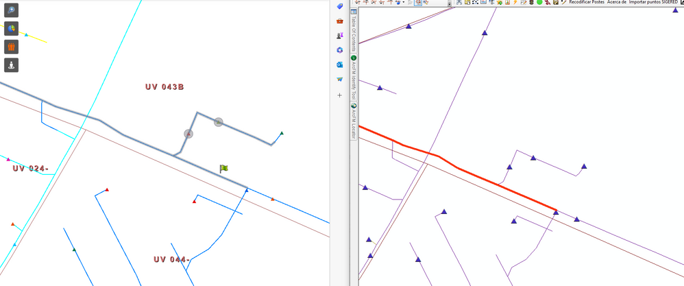
I wrote a python script that trace upstream a geometric network. I had publish it as geoprocessing service, but on my web app I have different result than my result at ArcMap.
Why could it be ? The data is the same and the script too.
As can see at the image, the correct result is the right side from ArcMap.
Any idea or help will be appreciated.
- Mark as New
- Bookmark
- Subscribe
- Mute
- Subscribe to RSS Feed
- Permalink
The colors are different in both maps. The left image has light blue, grey blue, royal blue, and maroon lines. The right image has purple, maroon, and red lines. What are the results you'd like us to compare?
- Mark as New
- Bookmark
- Subscribe
- Mute
- Subscribe to RSS Feed
- Permalink
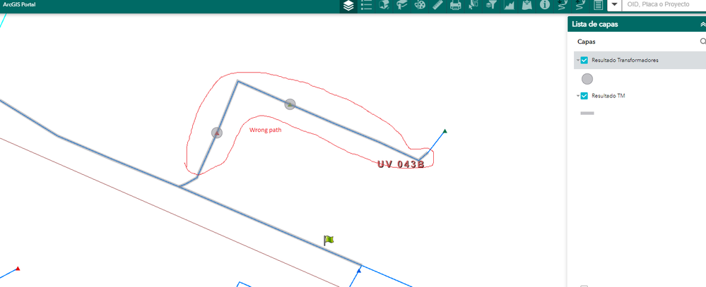
Hi Roger, on the left part, you can see the result from my web app. With light black is the trace result of my geoprocessing service. The result is wrong because the upstream trace goes to a path that is downstream.
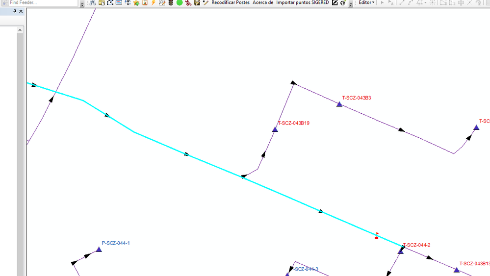
The same script at ArcMap, show the correct result in cian color. At the next image you can see the result (cian color) and the geometric network flow (blacl arrow).
The script is the same and the data too. I don't know why the result is different and wrong at my web app


