- Home
- :
- All Communities
- :
- Products
- :
- Mapping
- :
- Mapping Questions
- :
- Re: Dipslay graduated quantities from relate table...
- Subscribe to RSS Feed
- Mark Topic as New
- Mark Topic as Read
- Float this Topic for Current User
- Bookmark
- Subscribe
- Mute
- Printer Friendly Page
Dipslay graduated quantities from relate table?
- Mark as New
- Bookmark
- Subscribe
- Mute
- Subscribe to RSS Feed
- Permalink
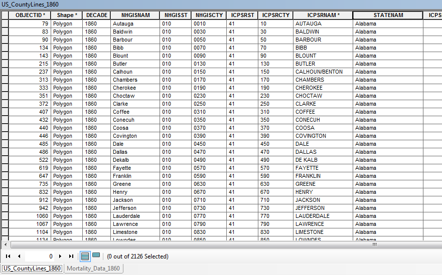
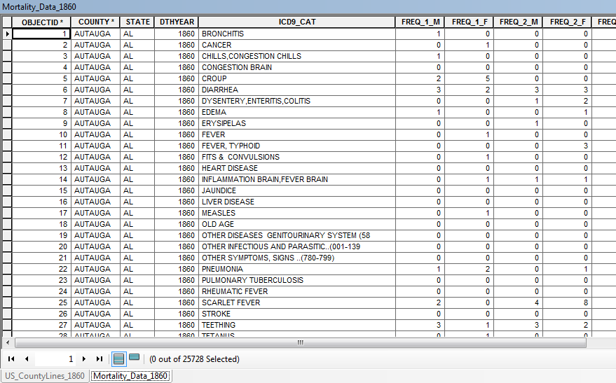
Is there a way to display graduated quantity data from a 1:M relationship? I have an 1860 U.S. county map from NHGIS (attribute table below) and a table of mortality data from the same decade (second attribute table below). The mortality dataset describes different age groups who perished from different diseases in every 1860 U.S. county.
I would like to display each disease and age group by graduated colors for the entire U.S. county map. Is there a way to do this through a table relationship or does anyone have any tips for how I could reorganize these datasets to achieve my desired display? Thank you!
Solved! Go to Solution.
Accepted Solutions
- Mark as New
- Bookmark
- Subscribe
- Mute
- Subscribe to RSS Feed
- Permalink
This question comes up frequently and the answer is, Not easily. Some people have success with putting the data in a single geodatabase and using the Make Query Table tool. Personally, I have no use for that tool given it has consistently performed horribly and it does not support an outer join.
Since ArcGIS version 10.1, I prefer creating a 1:1 feature class by using a standard join and exporting the data (both the feature class and table should be in the same geodatabase to do this). The export duplicates the polygons to match the record set in the table and also retains features that are unmatched by any table records (Make Query Table drops all features that have no match in the table, which is why it does not support an outer join).
Both approaches create overlapping polygons. It is nearly impossible to display simultaneously all the categories in your table with overlapping polygons. Hatched symbols are best, transparent symbols won't work at all unless you divide the categories into separate feature groups and even then the merging together of the transparent colors results in a meaningless legend.
Potentially you should use a pie graph for the groups if that fits your analysis needs. However, for that you do not want to duplicate your County features, instead you need to create a pivot table of the data to change the many rows associated with each county into table columns of a single row per County that would match 1:1 with your feature class. The Pivot Table tool can do this, but it takes about 5 steps to create the new table and a separate table has to be created for each attribute of the group sets. So for each column of FREQ_1_M, etc. you would have to create a separate pivot table to get one row for each county and set of disease groups and have to combine all of the tables to do all of the age groups.
A fourth option is to write a custom cursor and dictionary routine to do the double pivot in one go. You are doing a double pivot because you want to convert to columns all grouping on disease together with all groupings of age breaks for your incidents. The technique is an extension of the process I describe in this blog. However, although I have created 1:M dictionaries to do this, I did not really go into that option in the blog. My best post on that subject is here, although rather than doing a pivot I did a duplication of features. However the technique illustrated in my second link could be used to do a multi-group, multi-column values pivot in one pass with a bit of reworking. Mainly rather than creating a new feature I would create a new column and have to map each pivoted value to the appropriate column. It is an interesting enough task that I would be willing to help write the code for that if you are interested. Let me know if that last option sounds interesting to you.
I don't know of any way to use such data to control color graduation across a polygon. Additionally, gradient fills on each County polygon has no real relationship to the statistics you are dealing with, since the geographic sizes and population densities of each County can vary widely. A larger band of color on a larger county could mean the same thing as a smaller band of color on a smaller county, which would not be apparent to the reader of your map and therefore would be misleading. Unless you are correcting your statistical data to account for the relative population densities of each County, a Pie chart should give a much more standardize presentation of the relative sample sizes between the various Counties for comparison if all you are presenting is actual disease incident count data.
- Mark as New
- Bookmark
- Subscribe
- Mute
- Subscribe to RSS Feed
- Permalink
Richard, thanks again for the quick reply. I really appreciate it. I should have mentioned that I will not need to view any of the data simultaneously, so overlapping polygons shouldn't be a problem. Given your resentment towards the Make Query Table tool, it seems the best option is the second one you mention: to join the 'US_CountyLines' feature class to the 'MortalityData' table and export the resultant attribute table to Excel. (I'll then have to do some clean-up as multiple states have the same county names.)
My next question is, if I then import the newly-created table into ArcMap, how would I display its data? 'Display XY data' creates a point feature class... I'm unsure how to proceed from here.
- Mark as New
- Bookmark
- Subscribe
- Mute
- Subscribe to RSS Feed
- Permalink
I would actually not export to Excel. I would export to a shapefile or feature class as polygons, which is what I assume the "US_CountyLines" feature class is. If that layer is a polyline feature class then that may complicate things. Presumably you have a state field in both the feature class and the table, so clean up should involve selecting the set or features where the two state fields contain the same value and reexporting that set, or selecting where the two state fields are different and deleting that set of features.
It sounds like you will only be showing a single disease at a time on any given map and just have to figure out how to display the different proportions of numbers for each age group. The pie chart should still be the best option for that display. See this help file on how to set that up.