- Home
- :
- All Communities
- :
- Products
- :
- ArcGIS Image Server
- :
- ArcGIS Image Server Questions
- :
- Comparison of LiDAR data in different years
- Subscribe to RSS Feed
- Mark Topic as New
- Mark Topic as Read
- Float this Topic for Current User
- Bookmark
- Subscribe
- Mute
- Printer Friendly Page
- Mark as New
- Bookmark
- Subscribe
- Mute
- Subscribe to RSS Feed
- Permalink
- Report Inappropriate Content
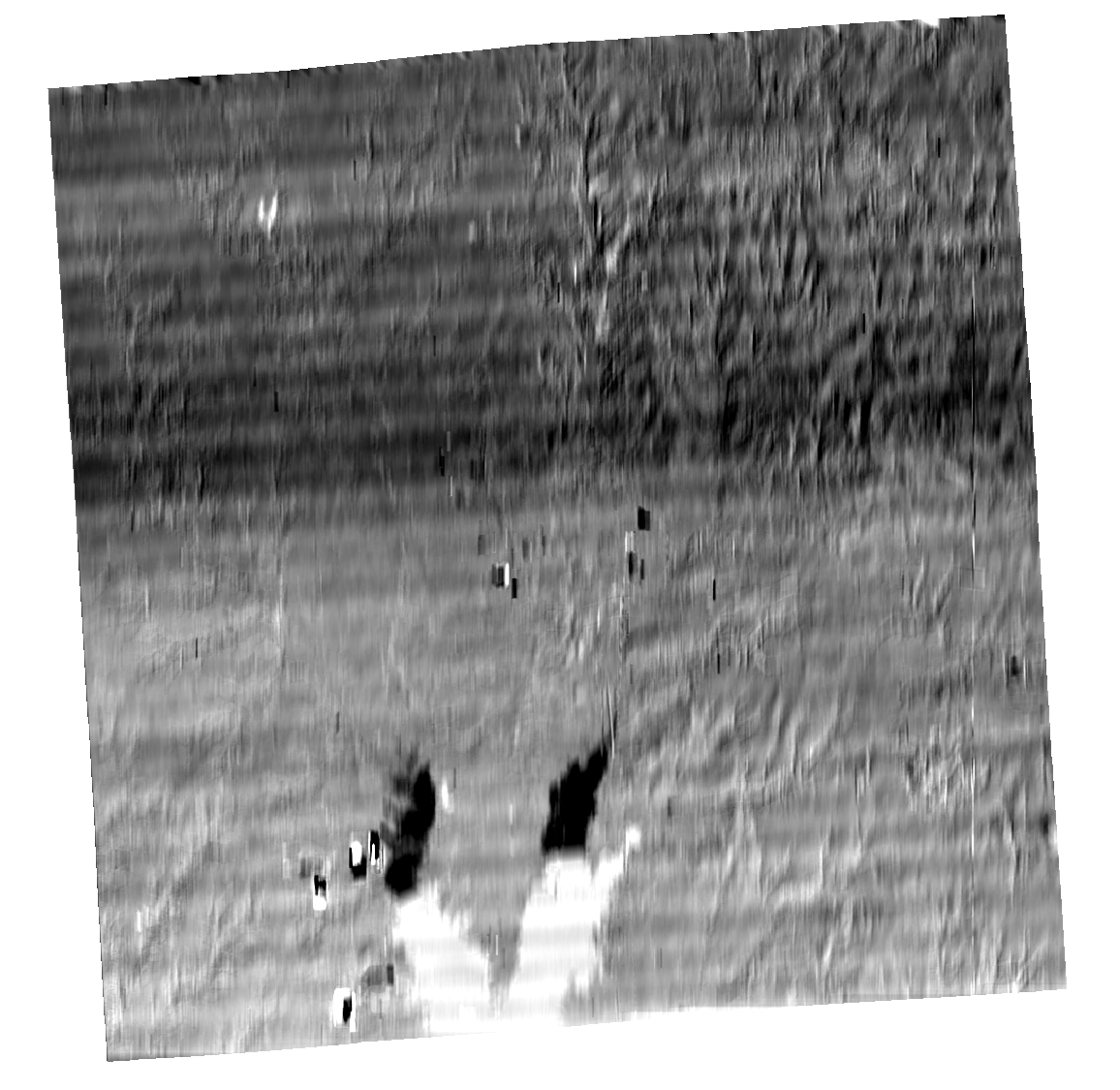
I'm analyzing the change in elevation in terms of soil erosion using LiDAR in different years. To see the difference between two different year's LiDAR, I used the raster calculator tool in ArcGIS and subtracted them. However, in a result map, strip lines (or bands? I don't know how to call them) appeared while they are not seen in the original DEM data. I guessed that these are not the erosion effect in reality, but the things caused by processes I had done to make it. To remove these bands, I tried to somethings I found through googling such as filtering and 'fix Landsat data tool'. Regardless, these lines were not removed. I hope someone knows about a solution or a reason of this problem.
For your information, I used ArcGIS 10.7, and DEM data that were the derivative product based on LiDAR from Illinois Geospatial Data Clearinghouse web site. The target county is Jefferson county in Illinois state. In the figures below, the left one is the 2012 year DEM and the right one is the 2015 DEM. The third one is the result when I subtracted these two DEM.


Solved! Go to Solution.
Accepted Solutions
- Mark as New
- Bookmark
- Subscribe
- Mute
- Subscribe to RSS Feed
- Permalink
- Report Inappropriate Content
What you are seeing is an inaccuracy in one or both of the datasets. It is apparent that the data was flown in strips in the West/East orientation. The pattern is due inaccuracies in the strip based in rectification in height. These errors may be in tolerances for the the provided data. By subtracting one dataset from the other you are significantly enhancing any such difference. If your interest is in identify change in a micro level in comparison to the strips what you can do is create an image of the mean differences and subtract thisfrom the difference. What you want in this case is a mean filter that is very wide and narrow and then subtract this from the result. The way to create this is to use the convolution filter raster function. If you set the type to UserDefined you can set the number of rows and columns. What you want to do is create say a filter that has 20 columns and 1 row and set the value in each value to 0.05. The wider you make the filter the more averaging you will get, but process may get a bit slower. It may be better to create a filter that has more breadth eg 40 Cols and 4 row with all value as 0.00625.
Note In checking this I appear to have found an bug that would suggest that Cols/Rows are flipped in the function. (So you may want to set it as 1 row and 20 cols). If you look at the result image you should see that it appears blurred in the x direction.
- Mark as New
- Bookmark
- Subscribe
- Mute
- Subscribe to RSS Feed
- Permalink
- Report Inappropriate Content
Thank you for the comment. To be honest, while I couldn't understand the theoretical concept of your comment, I tried to apply for a convolution filter and there are the results (left is the one with 40 Cols, right is 20 Cols). While doing this process, I was thinking that although these filters can remove the strips lines, the value of each cell would be changed due to the filtering. What I want to see through this is the soil erosion based on the difference in each cell. Thus, is there any way to remove or correct the strips (as know as inaccuracy following your comment)?