GIS Life Blog - Page 6

cancel
Showing results for 
Show  only  | Search instead for 
Did you mean: 

Latest Activity

(463 Posts)
BernSzukalski
Esri Frequent Contributor

All of us have seen web pages that introduce staff - a collection of photos, background information, contact info, and even interesting fun facts that bring the faces and personalities behind a corporate logo or company website to the forefront. Look at a few examples, and it becomes clear that these not only reflect the personality of the individuals that are the company, but collectively reflect the personality of the company itself. Some random examples:

You'll find lots better (and worse) examples than the quick picks I've listed, but they're fun and (sometimes) interesting, with facts like "I have a tattoo of my rescued Pomeranian."

But you're a GIS or mapping company, consultant, or a GIS department. Why not eat your own dog food and put some mapping and geography into your "About Us" pages?

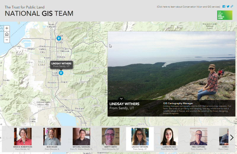
Here's recent example that came to my attention from Trust for Public Land. It uses a Story Map Tour.

tpl.jpg

If you've got an example of your own, why not share it by adding it to the comments on this post.

more
0 0 1,837
BernSzukalski
Esri Frequent Contributor

Story Maps have become very popular for presentations, used as an alternative to PowerPoint when you may want to include live maps and apps without having to toggle between PowerPoint and your browser. See Story Map Presentations instead of PowerPoint.

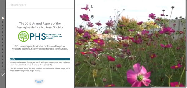
Recently someone brought to my attention a great example of an Annual Report that is crafted using a Story Map. I think this is a great idea, and a fine example, from the Pennsylvania Horticultural Society.

ar-1.jpg

The Annual Reports has been created using the Story Map Journal, a very versatile and effective choice when lots of of text, media, and maps are needed to tell the story.

more
1 1 3,840
BernSzukalski
Esri Frequent Contributor

Last February I was preparing for a presentation at a conference. I intended to use a few PowerPoint slides to introduce the topics I wanted to cover, then switch to live web maps and apps to underscore the points I was going to make. There were about 10 topics I wanted to introduce and demonstrate, so this meant having to exit PowerPoint (or use the clumsy Alt-Tab) to switch back and forth between the slides and the demonstrations.

Then I realized that in this case a Story Map would be the perfect solution. I could use my PowerPoint slides in the story map, and as I advanced I could include the live web maps and apps without having to switch programs or toggle back and forth from PowerPoint. I chose Story Map Series as the presentation platform of my choice. Below on the left is the PowerPoint slide, on the right a web map, both in the Story Map I used for the presentation.

ppt-5.jpg

While any Story Map can be used to make a presentation, some are better suited to the task than others. My preference is the Story Map Series, specifically the bulleted layout, since it provides sequential access moving left to right. Map Series also doesn't require that you use a side panel for additional text or media - something not needed for most presentations.

Recently, just prior to the Esri 2015 User Conference, the Story Map Series bulleted layout was adjusted to make it well-suited for presentations by allowing more entries (30 is the max) and changing the placement of the bullets to prevent overlapping the main stage content.

Here are several examples from the User Conference that used the Story Map Series bulleted layout:

This example from the Esri UC uses a Story Map Journal:

In general if you are the one doing the presentation, I find the Story Map Series the best choice. If you want others to view and experience the presentation as well, the Story Map Journal might be the one to choose, since the side panel can include text, which can be thought of as the notes section on a PowerPoint slide, and can guide the viewer through your presentation.

Creating your presentation

It's simple to use a Story Map for presentations, just author and store your PowerPoint slides, collect other media, author needed maps and apps, and launch the builder for the Story Map you want to use.

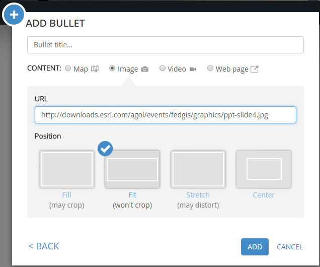
You can export your PowerPoint slides, or just capture them (I use Snagit, but any capture tool can be used). Once captured, place the slides at any URL-accessible location, then add them to your story map. A key consideration is using the proper position for your slides; you don't want text or graphics to be skewed or cropped. In general, Fit is the best all-purpose option that will accommodate any display resolution.

ppt-6.jpg

For several Story Map presentations at Esri events, I knew the exact display resolution (e.g., 1366 x 768). So I calculated the size my slides needed to be to fill the available real estate, added a handful of pixels on all sides to ensure they completely filled the space, then used a Position of Center. This technique only works when you purpose-build a presentation for a specific event, as when you use Center your slides will be cropped at different display resolutions. You can learn more by viewing Add PowerPoint slides to your Story Map.

Adding maps or apps is also very straightforward. Simply add them using their URL, and use Stretch as the Position option. Since the map viewer and most app templates are responsive, they'll fill the entire frame nicely. When embedding apps or other story maps, some templates enable you to minimize the UI. See Embedding a Story Map within a Story Map.

Considerations and Tips

Story Maps are a powerful way to tell a story using maps and media, and Story Maps can be a powerful way to deliver presentations. Some thought and planning will provide the best results. Here's a few things to consider.

  • It's easy to author a terrible PowerPoint presentation, and we've all suffered through our share of them. Crafting a great Story Map is somewhat of an art, and a great Story Map presentation is no different.

  • Limit the text in the Story Map so that the audience listens to you.

  • Story Map presentations work best when they are short. The latest update to Story Map Series allows you to add a maximum of 30 tabs, bullets, or expandable side accordions.

  • Story Maps do not offer the slide transitions and animations available in PowerPoint.

  • Choose the best Story Map for your purpose. Map Journal is ideal for stories that need to be read as you can use the story narration on the left panel to add the necessary level of detail.  However, if you are presenting a live story, the Map Journal narration might be distracting. Instead, try Map Series with its optional text panel.

  • When using a Story Map Series or Journal and adding content via a URL that takes a while to initialize (like a detailed web scene), ensure that Unload when reader navigates away is unchecked. Before your presentation you can "warm up" all your maps and apps, and unchecking this option ensures they do not need to be reloaded when you reach that part of your presentation.

ppt-7.jpg

Additional resources

more
9 3 14K
BernSzukalski
Esri Frequent Contributor

When I'm searching ArcGIS Online I'm always looking for the best content possible. I'm looking for the most authoritative and up-to-date maps,apps, and layers that perform well and have been well-authored with good pop-ups and other tradecraft. I often judge content like the proverbial book - by its cover. I look for a good thumbnail, a good description, a good profile for the author, and lots of other small things that together add up to mean "best." These little things not only tell me the content owner knows and cares about what he is doing, but is also representing a source that I can trust. I often evangelize these details as best practices that should be adopted by everyone, some of this is encapsulated in a recording of a Live Training Seminar you can find at the Esri training site.

Until recently there hasn't been an automated way to evaluate items, but now there is. The Living Atlas includes a new contributor's page with online tools that evaluate your content and provides a score for how well you have documented your items and adopted best practices. Though intended for contributors to the Living Atlas, this is a really useful tool to help you evaluate the quality and completeness of your items, and readiness to share with others.

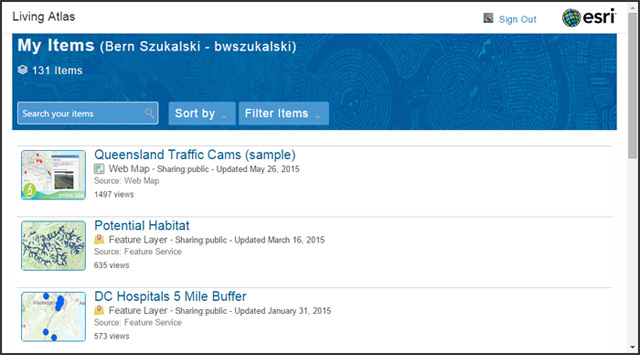
To check your content (or to nominate content to be included in the Living Atlas), go to the Living Atlas contribution page and sign in to your ArcGIS account. You will see a listing of all your items with tools to search, filter, and sort.

la-1.jpg

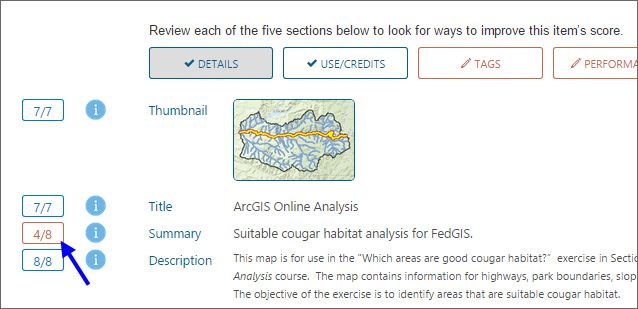
Click any item to see its score. I've done a pretty good job on this item, scoring 78 out of 100.

la-2.jpg

Areas where you should look to improve the item will be highlighted in red. Looks like my Summary could use a little more work.

la-3.jpg

Hovering over the info button will offer some tips for improvement, and how scored.

la-4.jpg

Look for the Edit button to make changes directly from here.

Use this valuable collection of tools to see how well you have done, and to help you put your best sharing foot forward. On top of that, why not think to nominate your best for the Living Atlas?

more
5 0 2,427
BernSzukalski
Esri Frequent Contributor

Earlier this week an earthquake registering 7.8 on the Richter Scale devastated parts of Nepal, with the nation's capital of Kathmandu hardest hit. The quake struck before noon just 50 miles from the city in an area known to be among the most seismically hazardous in the world, according to the U.S. Geological Survey. According to CNN, as of today the death toll has passed 4,600 with at least double that number injured, and is expected to rise. Approximately 8 million people are affected across Nepal, an indication of the enormity and scale of the devastation.

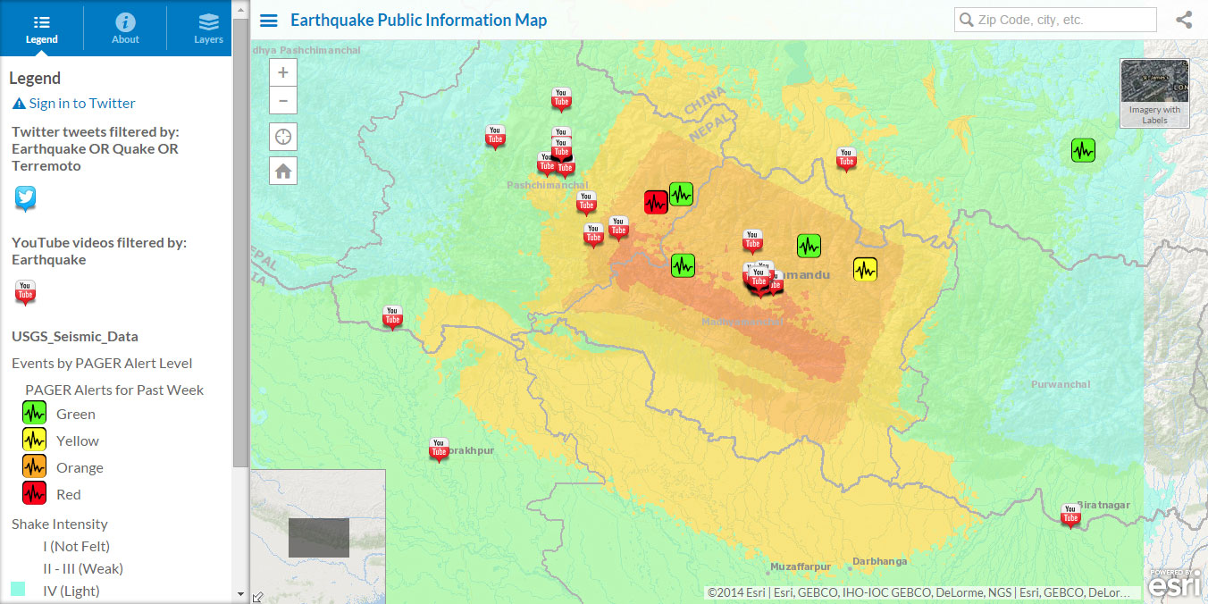
The map shown below is from the Esri Disaster Response organization portal. It's the Earthquake Public Information Map (or PIM) which uses the Public Information Map (PIM) template. The Earthquake PIM currently opens centered on Nepal. It includes social feeds as well as the USGS Seismic Data showing PAGER alerts and shake intensity.

nepal-1.jpg

Other resources are available for those interested in learning more and in assisting with the response effort. The Esri Disaster Response Program website serves as an umbrella site useful to bookmark for responding to any event. You will also find specific maps and information concerning the Nepal earthquake, including the following important resources:

Stay tuned to the Public Safety GeoNet place for additional resources and information concerning the Nepal earthquake response effort.

more
0 0 1,928
BernSzukalski
Esri Frequent Contributor

Here's a couple of posts that cover considerations and tips for embedding story maps in websites, and also embedding story maps in other story maps.

Tips for embedding story maps in websites | ArcGIS Blog

Embedding a Story Map within a Story Map | ArcGIS Blog

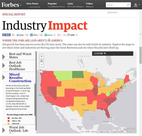
A good example of embedding a story map in a website is this one about where the jobs are (and aren't) from Forbes:

forbes.jpg

It uses Story Map Series with the side accordion layout option, and takes advantage of the &embed URL parameter discussed in the first post.

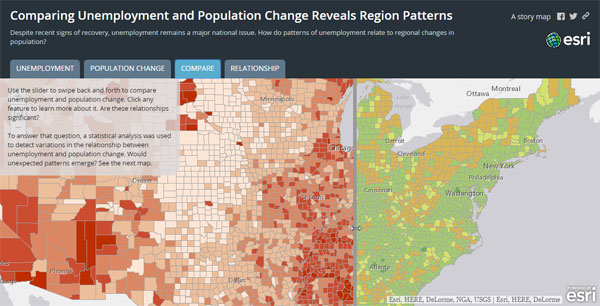
The example below embeds another story map - a Story Map Swipe - inside a Story Map Series (tabbed layout) on the third tab.

Untitled-7.jpg

When embedding story maps inside of story maps, less is often more. Embedding story maps within a story map can complicate your story by providing to many paths to follow, and too much media to look at. The best story is often the simplest, pared down to its essentials. But used sparingly, embedding story maps in story maps can be effective an useful technique.

more
1 0 1,512
BernSzukalski
Esri Frequent Contributor

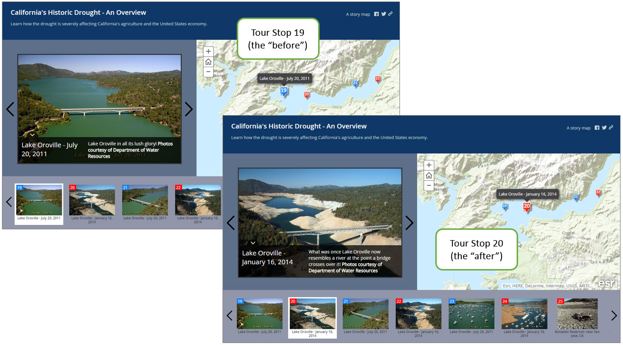
Most story maps are intended to present maps, text, and media in sequence, just like you would read or tell a story. But you might want to share a specific place in your story, like ear marking a chapter or page in a book to share with someone. For example, this story map is about the drought in California:

http://mwd.maps.arcgis.com/apps/MapTour/index.html?appid=d1cbc210bcba4f58b2a859a1d5e7a7d7

http://mwd.maps.arcgis.com/apps/MapTour/index.html?appid=d1cbc210bcba4f58b2a859a1d5e7a7d7But if I wanted to specifically point out the dramatic differences of the "before" and "after" at Lake Oroville to someone, I'd have to have them advance or scroll through the thumbnails to find those of that lake. A pair of dramatic photos is shown at tour stops 19 and 20. If I wanted to share that specific pair with someone I can take advantage of a URL parameter that will open the Map Tour to my desired stop, as shown when you click this link:

http://mwd.maps.arcgis.com/apps/MapTour/index.html?appid=d1cbc210bcba4f58b2a859a1d5e7a7d7&index=19

earmark1.jpg

Three of the most popular story maps are the Story Map Tour, Story Map Journal, and Story Map Series. With each you can open the story map at a specific place in the story using the appropriate URL parameter, as listed below, and where <num> is the number corresponding to the tour stop, journal section, or series entry that you want to open.

  • Story Map Tour: &index=<num>
  • Story Map Journal: &section=<num>
  • Story Map Series: &entry=<num>

These are covered in more detail in the following blog posts:

So while a story map, like a book, is meant to viewed from cover to cover, you can earmark a chapter to share with others.

more
0 0 1,721
BernSzukalski
Esri Frequent Contributor

With the ArcGIS Online update later this week, a new configurable Story Map will be introduced. It's called Story Map Series, and consolidates a couple of other story maps into a single configurable app with multiple layout options—tabbed, side accordion, and bulleted.

dec10-7.jpg

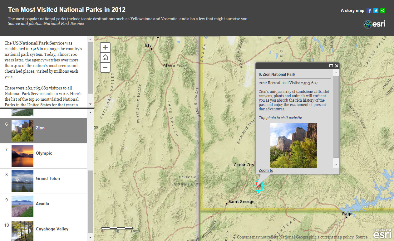
Here's a Story Map of the top 10 visited US National Parks in 2012 I authored over a year ago (update coming soon). It uses the Story Map Playlist.

bulleted-1.jpg

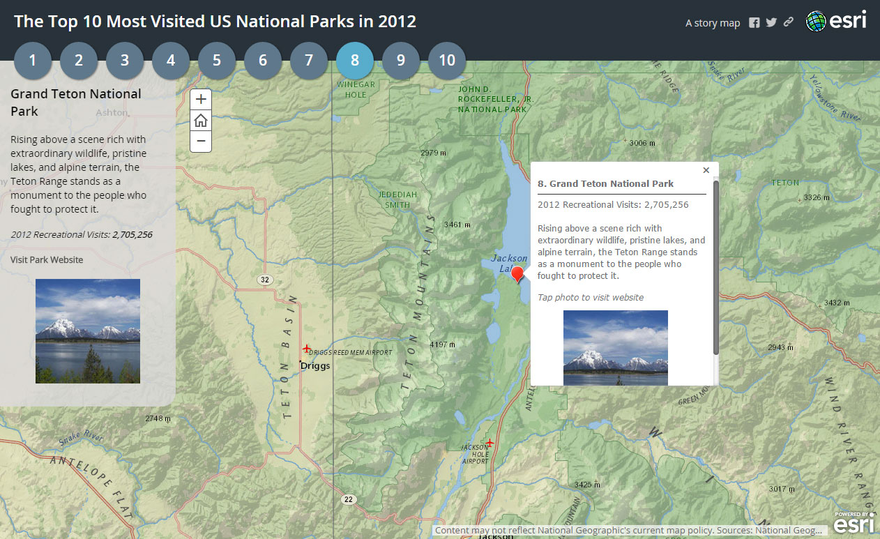
Here's another iteration on the same map done by Rupert Essinger and used for testing during the app development cycle. It's using the soon-to-be-released Story Map Series, and is configured with the bulleted layout.

bulleted-2.jpg

Story Maps continue to evolve in new directions. The consolidation of these formerly separate templates into a single Story Map Series is yet another example of their evolution. With multiple layout options, the new Story Map Series is sure to be one of the more popular choices.

more
3 3 2,301
BernSzukalski
Esri Frequent Contributor

Comet 67P/Churyumov-Gerasimenko could have been just another unknown hunk of galactic stuff traveling through the enormity of space. According to Wikipedia it was discovered in 1969 by Klim Ivanovych Churyumov who identified it by working off of photographs taken by Svetlana Ivanovna Gerasimenko, who was shooting for a different comet. Even so, were it not for the fact that the 2.5-mile diameter comet became the target for the European Space Agency Rosetta mission, it would still have remained in obscurity. The historic mission, launched in 2004 and making its rendezvous with the comment earlier this year, became the first to ever land a space probe on a comet, subsequently creating a fascinated global audience.

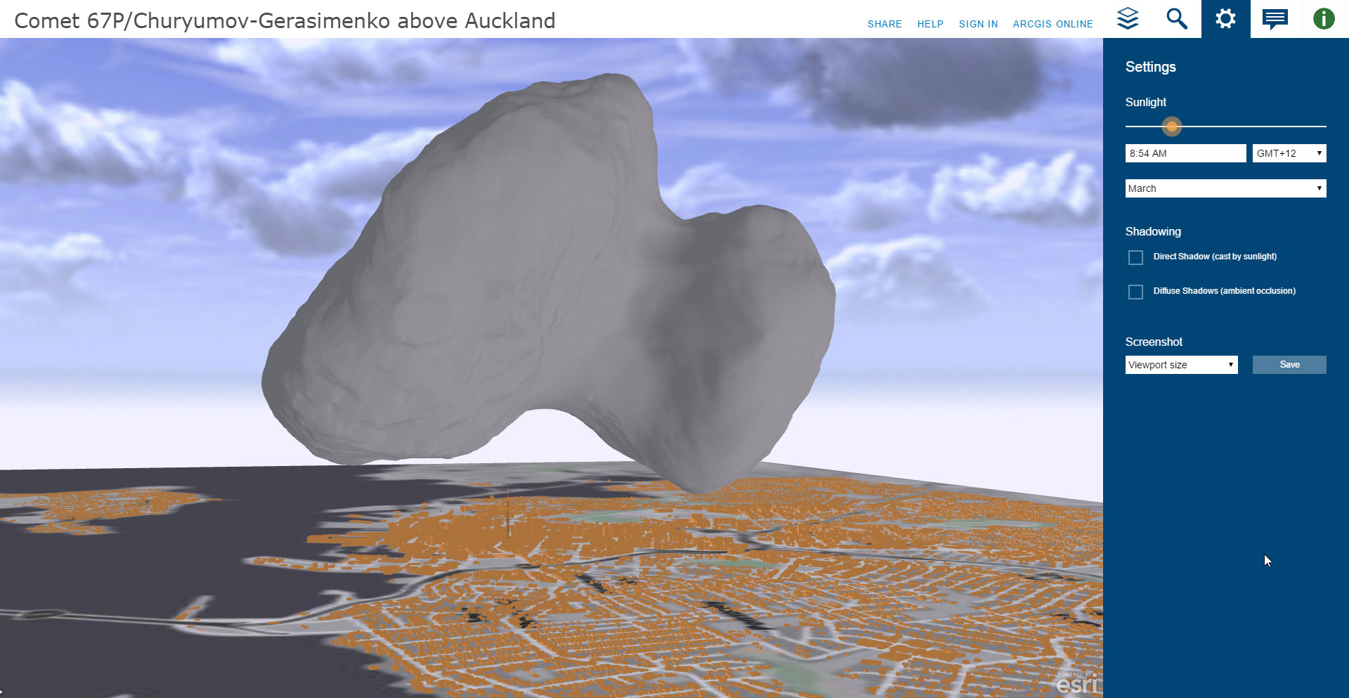
I ran into a blog post about how the comet is being compared to cities worldwide using digital wizardry. But even more interesting is this Esri CityEngine Web Scene authored by Zorko Sostaric of Eagle Technology in Auckland, New Zealand.

67p-1.jpg

The Web Scene takes a few moments to load, but once it does it offers an intriguing interactive perspective of the comet above Auckland. You can also view the ArcGIS Online item details.

more
1 0 2,303
BernSzukalski
Esri Frequent Contributor

A couple of new Story Maps released today are previews of what's to come. Geography Bee: A Global Gallery of Pollinators uses the context of geography to present a spectacular collection of bee photos by USGS scientist Sam Droege. You'll also find his Flickr site USGS Bee Inventory and Monitoring Lab where more of his truly awesome photos can be found.

bee-1.jpg

This particular Story Map is also a prototype of a new layout option for Story Map Tour, currently the most popular story map template. This option will be included in the near future. Also released today, Exploring the Chesapeake in John Smith's Wake, is another story using the same prototype template.

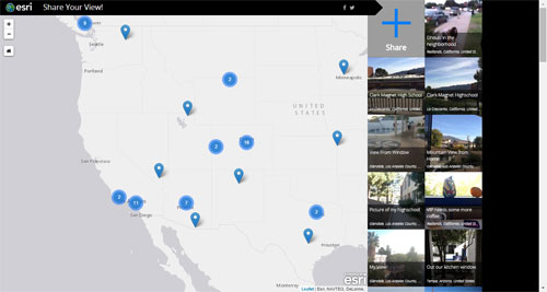
Another new Story Map enables you to Share Your View—take a photo of what you see out your window or anywhere else, and add it to the map. This Story Map will eventually be available as a configurable Story Map crowdsourcing template, that will let anyone create their own crowdsourced map.

share-1.jpg

Stay tuned for more great Story Maps, and browse other great examples at the Story Maps Gallery.

more
4 1 2,556
121 Subscribers