Turn on suggestions
Auto-suggest helps you quickly narrow down your search results by suggesting possible matches as you type.
Cancel
GIS Life Blog - Page 4
Turn on suggestions
Auto-suggest helps you quickly narrow down your search results by suggesting possible matches as you type.
- Home
- :
- All Communities
- :
- ArcGIS Topics
- :
- GIS Life
- :
- GIS Life Blog
- :
- GIS Life Blog - Page 4
Options
- Mark all as New
- Mark all as Read
- Float this item to the top
- Subscribe to This Board
- Bookmark
- Subscribe to RSS Feed
Subscribe to This Board
Showing articles with label Mostly Mapping.
Show all articles
Latest Activity
(464 Posts)
Esri Frequent Contributor
03-11-2019
01:13 PM
2
0
814
Esri Frequent Contributor
02-13-2019
10:34 PM
0
0
947
Esri Frequent Contributor
09-11-2018
01:19 PM


0
0
1,521
Esri Frequent Contributor
08-20-2018
01:59 PM
0
0
852
Esri Frequent Contributor
08-07-2018
11:17 PM
5
0
1,130
Esri Frequent Contributor
08-03-2018
10:03 PM
3
0
2,203
Esri Frequent Contributor
07-30-2018
10:15 PM
4
0
986
Esri Frequent Contributor
07-18-2018
06:04 PM


16
2
14K
Esri Frequent Contributor
09-28-2017
09:59 PM

1
0
538
Esri Frequent Contributor
09-12-2017
10:35 PM


9
0
4,095
131 Subscribers
Labels
-
Finding Sasquatch with ArcGIS Pro
20 -
General
1 -
GeoDev Adventures
57 -
In a GIF
13 -
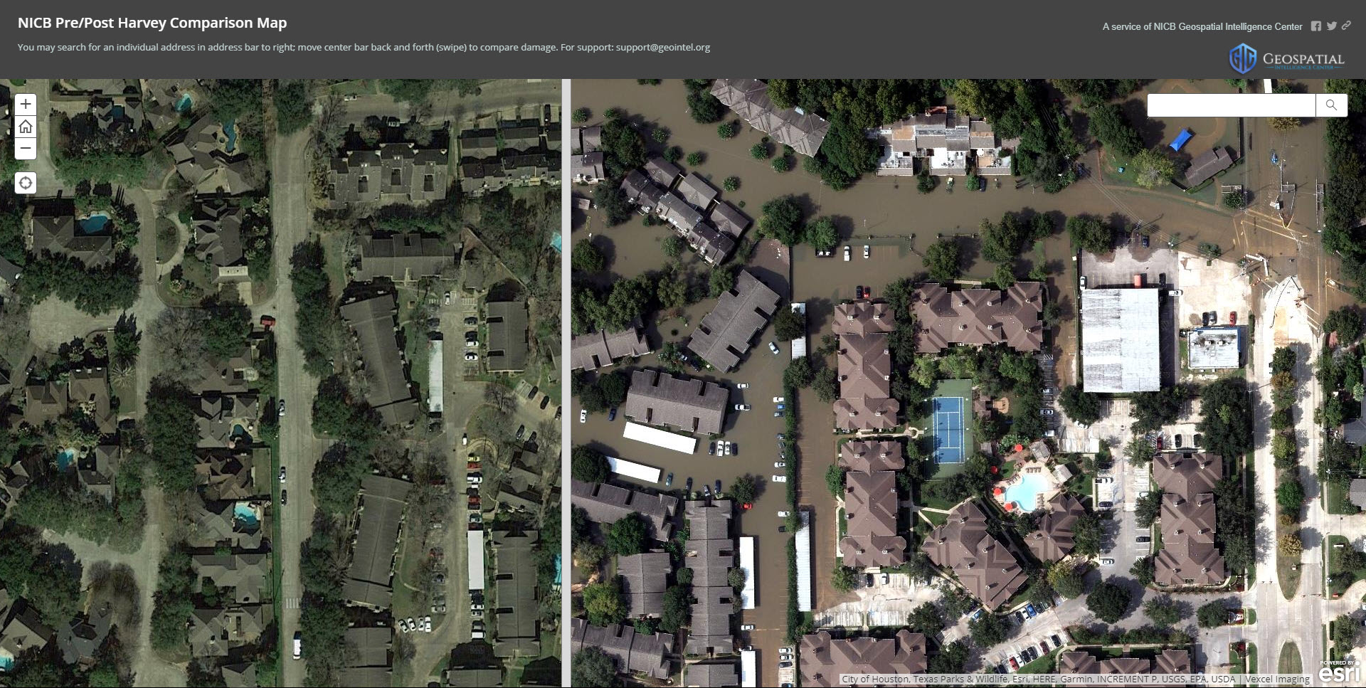
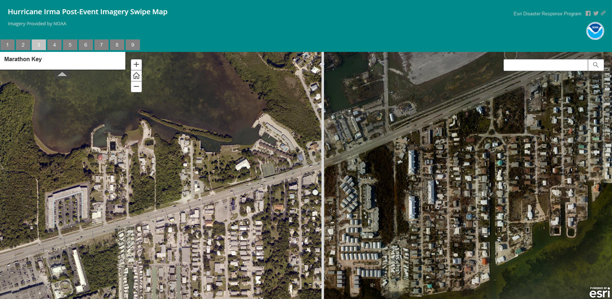
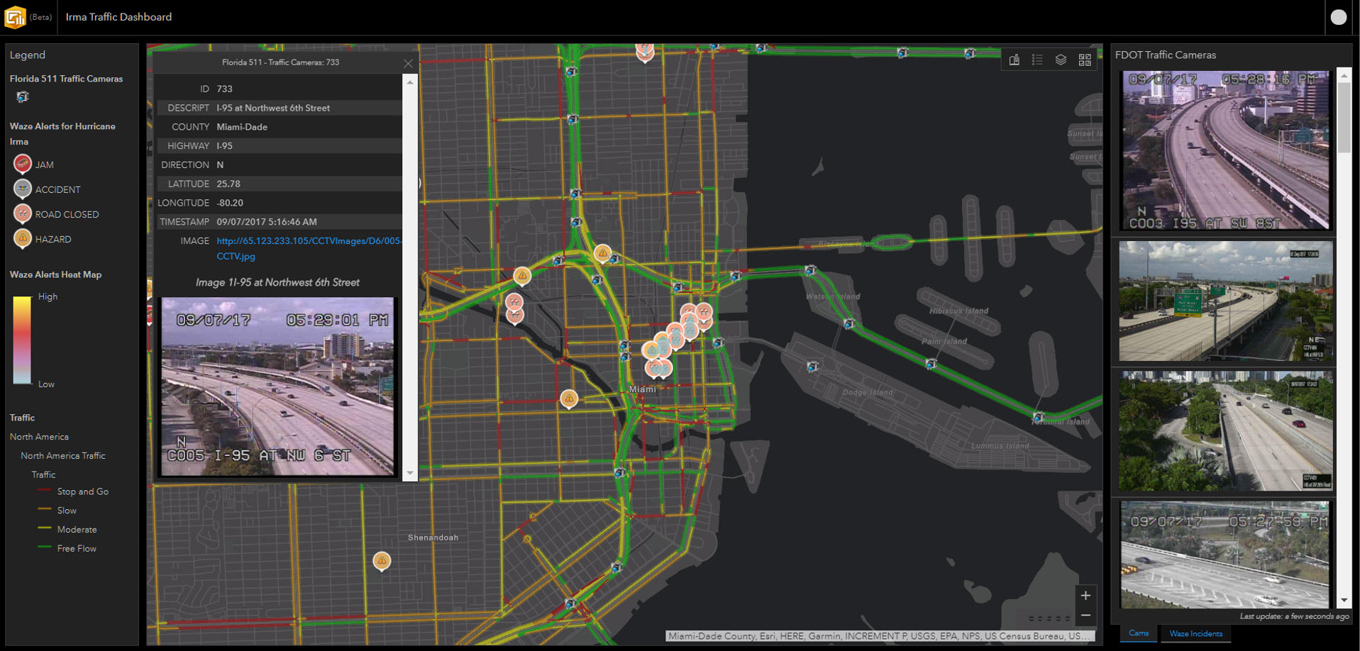
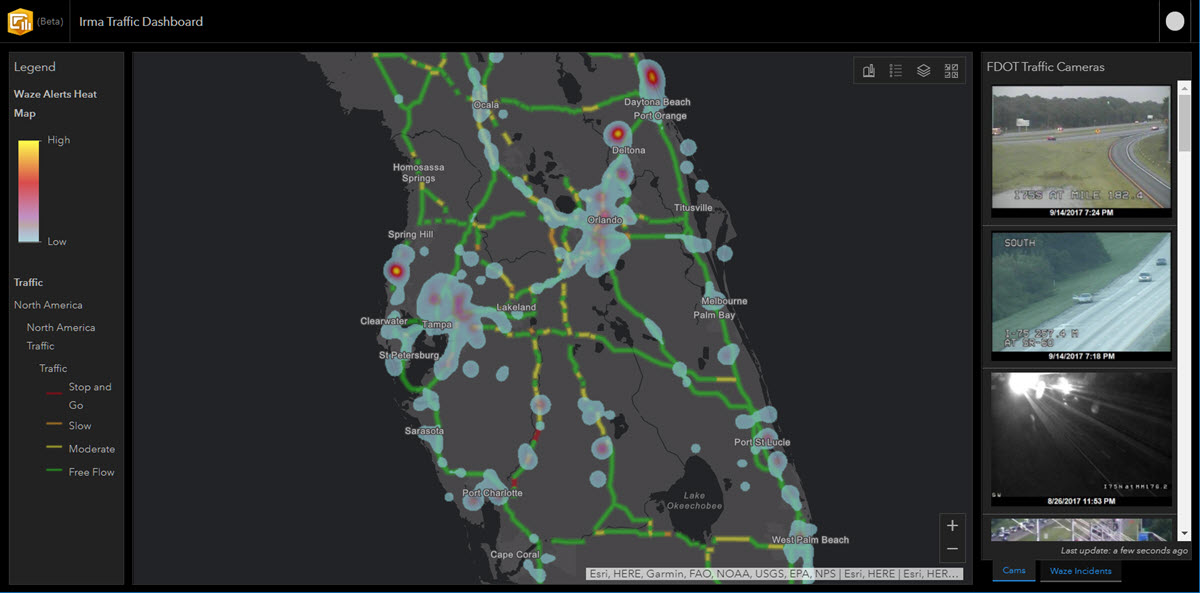
Mostly Mapping
76 -
Resources
1 -
Tilting at Globes
21
Popular Articles
Explain Georeferencing To Me as If I Were a Five-Year-Old
AdrianWelsh
MVP Honored Contributor
77 Kudos
49 Comments
Top Ten Things a Five-Year-Old Would Do at the Esri User Conference
AdrianWelsh
MVP Honored Contributor
21 Kudos
1 Comments
Adrian's thoughts on the 2019 Esri UC
AdrianWelsh
MVP Honored Contributor
17 Kudos
21 Comments