- Home
- :
- All Communities
- :
- Industries
- :
- Gas and Pipeline
- :
- Gas and Pipeline Blog
- :
- Data-Driven Equity Analytics for Utilities
Data-Driven Equity Analytics for Utilities
- Subscribe to RSS Feed
- Mark as New
- Mark as Read
- Bookmark
- Subscribe
- Printer Friendly Page
Data-Driven Equity Analytics for Utilities
By Megan Hendrick and Tom DeWitte
Modern utilities face a wide range of goals and challenges that require strategic allocation of resources. Prioritizing how and where to use these resources requires careful analysis of all available information. Often, the initial focus is on the utility’s physical network. For example, when addressing the replacement of aging distribution assets, critical information includes the age and material of these assets.

Let’s explore a real-world example: replacing aging infrastructure in a natural gas distribution system. We'll use ArcGIS to perform a thorough geospatial analysis to inform this critical decision-making process.
Asking the Right Questions
What are the objectives of this analysis? In this case, we want to determine which mains (pipes) in a natural gas system should be prioritized for replacement. Our goal is to rank these assets based on relevant criteria and present this information in an interactive format that allows decision-makers to explore all the information side-by-side.
Network Data: The Starting Point
Our analysis begins with a network information model, which stores crucial details about gas network assets, including:
- Pipe type (distribution main, service pipe, transmission pipe, etc.)
- Material
- Age (calculated from install date)
For this example, we'll use a sample dataset organized per the Utility and Pipeline Data Model (UPDM).
Equity & Demographic Data
To ensure our decisions are equitable, we need to understand the communities served by the gas distribution network. The ArcGIS Living Atlas provides a wealth of authoritative data layers on hundreds of topics. For this analysis we will use the following layers:
- Justice40 Tracts: This layer assesses and identifies communities that are disadvantaged according to updated Justice40 Initiative criteria in the U.S. and its territories.
- Esri Updated Demographics Variables: This layer shows a subset of popular demographic variables from Esri's Updated Demographics.
Environmental Factors
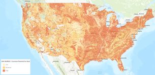
Geological and environmental considerations can significantly impact infrastructure longevity. We'll incorporate data on soil corrosion potential from the ArcGIS Living Atlas to round out our analysis example.
The Analysis: Step-by-Step
ArcGIS Pro provides robust spatial analysis capabilities. A variety of tools can be used to filter network data, summarize information into attributes, identify spatial intersections, and perform a composite index analysis. Model Builder can be used to document the process and allow it to be repeated as needed for different service territories or networks.
- Bring the Data Together: The first step is to bring all the data mentioned above into one map. In this case, we will be using ArcGIS Pro to run our analysis.
- Identify the Relevant Assets: Using ArcGIS Pro's "Select by Attribute" tool, we'll narrow our focus to distribution mains made of corrosion-vulnerable materials. In this case we selected assets that have an asset group of “Distribution Mains” and asset type of “Cast Iron”, “Bare Steel”, “Wrought Iron” or “Ductile Iron”. This initial attribute filter reduces the quantity of records in our analysis and narrows the focus to only relevant assets.
- Export the Data: We'll export this selection to a new feature layer, allowing us to add and modify fields without affecting the source network data.
- Factor in Key Variables: Next, add the fields for factors that will be considered in the analysis. In this example, we will add fields for pipe age, corrosive soil, leak history, population density, and Justice40 status. We will assign numeric values to each field to represent that factor. In the next step, we will use these values to calculate an index score for each asset.
- The “Pipe Age” field can be calculated using the field calculator and using the install date field.
- A numeric value can be added to the “Corrosive Soil” field by using the “Select by Location” tool to select the assets that intersect corrosive soil. Using the field calculator on the selected assets allows you to assign a value of “1” to the assets that intersect corrosive soil, and a value of “0” to the assets that don't.
- The “Leak History” field can be populated using criteria specific to the utility. An example could be calculating a common “leak score” by taking the number of leaks experienced for that asset and dividing it by the length of the pipe.
- The “Population Density” field can be populated using a spatial join with the demographics layer, then using a field calculator to transfer the population density values to the new field.
- The “Justice40 Status” field can be populated with a numeric value by using the “Select by Location” tool to select the assets that intersect disadvantaged communities. Using the field calculator on the selected assets allows you to assign a value of “1” to the assets that intersect disadvantaged communities, and a value of “0” to the assets that don't.
- Create an Index:
The Calculate Composite Index tool (available in ArcGIS Pro 3.2+) combines multiple variables into a single index, allowing us to rank each distribution main based on our chosen characteristics. Changing the weight of each variable allows for certain characteristics to be prioritized in the index. We will use the calculate composite index tool on our analysis layer, using our new fields (Pipe Age, Corrosive Soil, Leak History, Population Density, and Justice40 Status).
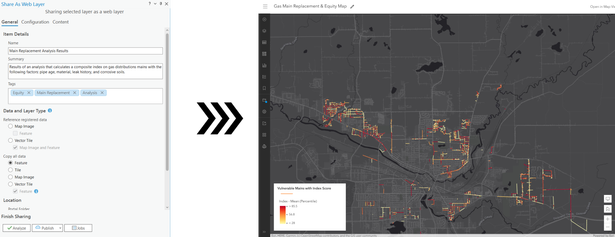
- Visualize the Results: Now we have a layer showing the most vulnerable gas mains by material, with each asset including a score from the composite index tool. By publishing the results to a web map, we can configure styles and symbology for clear visualization & easy sharing of the results.
- Add Demographic & Equity Data: Next we'll add layers from the Living Atlas to our web map to visualize key demographic variables and disadvantaged communities.
- Summarize Key Facts:
Using Arcade expressions in the pop-up, we can summarize key network and demographic data in the pop-up for each asset, adding additional valuable insights to the results.
- Create an Interactive Dashboard:
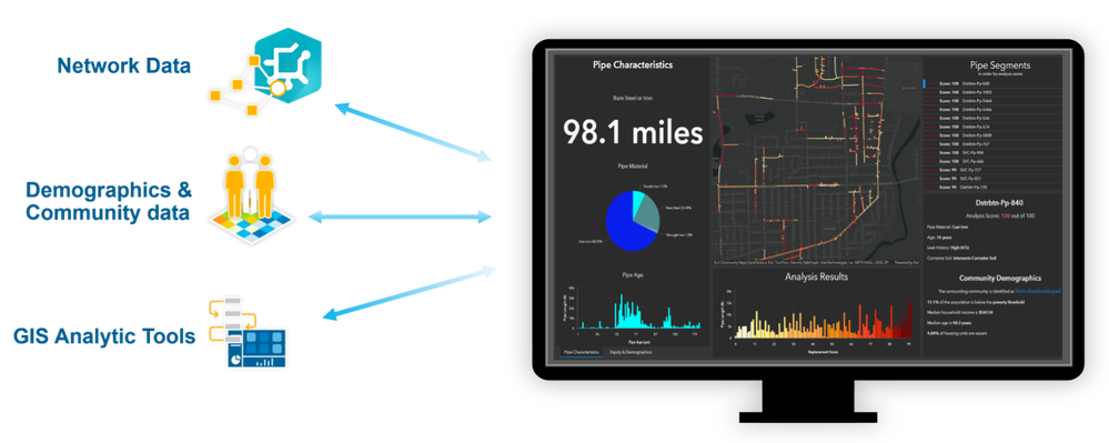
The final step is to highlight our results with an interactive and concise dashboard, allowing stakeholders to understand how network information and community insights work together to inform stronger decision-making. Users can explore the results to identify where vulnerable assets exist in the community, and where the community itself may be more vulnerable.
The Power of Informed Decision-Making
By combining network data, community demographics, and environmental factors, utilities can make more informed and equitable decisions about infrastructure investments. This approach not only optimizes the physical network but also ensures that community needs are considered in every step of the planning process. As we navigate the complexities of energy infrastructure management, data-driven analysis will be crucial in balancing technical requirements with social responsibility. By embracing a geospatial approach, utilities can build and maintain more resilient, efficient, and equitable utility systems for the communities they serve.
PLEASE NOTE: The postings on this site are our own and don’t necessarily represent Esri’s position, strategies, or opinions.
You must be a registered user to add a comment. If you've already registered, sign in. Otherwise, register and sign in.


