- Home
- :
- All Communities
- :
- Services
- :
- Esri Training
- :
- Esri Training Videos
- :
- Re: Leverage the Power of ArcGIS in Microsoft Exce...
- Subscribe to RSS Feed
- Mark Topic as New
- Mark Topic as Read
- Float this Topic for Current User
- Bookmark
- Subscribe
- Mute
- Printer Friendly Page
Leverage the Power of ArcGIS in Microsoft Excel
- Mark as New
- Bookmark
- Subscribe
- Mute
- Subscribe to RSS Feed
- Permalink
This video was recorded on May 11, 2020 using Microsoft Excel 2019 and ArcGIS for Office Version: 2020.1.2
Updated 7/21/21: Please note ArcGIS Maps for Office now has a new name, ArcGIS for Office.
For further ArcGIS training, explore Esri Academy's course catalog: https://bit.ly/3oqlqsO.
- Mark as New
- Bookmark
- Subscribe
- Mute
- Subscribe to RSS Feed
- Permalink
1) are there options for the user to select the symbolism of the data, other than circles on top of each other?
2) has there been any discussion about replacing them as the default symbol?
Also, probably too big to answer, maybe, but is there or will there be a way to symbolize data in Real Time? Or give the user options for selection of a time period for data as it evolves?
- Mark as New
- Bookmark
- Subscribe
- Mute
- Subscribe to RSS Feed
- Permalink
Hey Daniel,
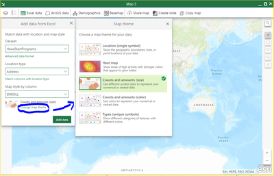
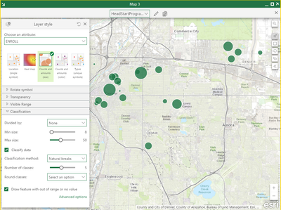
Answers to questions 1-2: Yes, there are multiple options to change the symbology in the map, and you can change the default symbology when you add your data to the map. The first graphic shows how to change the default symbology, and the second graphic shows the comprehensive Layer style (symbology) options within the map. Your last question is a bit trickier, I know we can ingest and visualize Real Time data from the ArcGIS Online Portal or Enterprise Portal directly in our ArcGIS Maps for Office Map but if we want to modify symbology or run analysis on specific time periods of our Real Time data we need to use ArcGIS Pro or Map Viewer. I hope my answers have provided some clarity, and I will be looking further into the Real Time capabilities of ArcGIS Maps for Office.
- Mark as New
- Bookmark
- Subscribe
- Mute
- Subscribe to RSS Feed
- Permalink
The graphics help somewhat, its just that since Pro came out the
"overlapping circles" symbology has been nearly the default and its
frustrating because its not a 'smooth' representation of the range of
values for X variable in a geographic region, and I never remember seeing
anything like this going all the way back to ArcView. To see that even the
New York Times uses this in their illustrations makes me wince...
The Real Time issue I admit is something separate (though to have circles
increase in size ...?!?!) but its been on my mind a lot.
I remember when I was using Geomedia to edit values in a project I saw that
as I typed in an edited value in the table the same number would show up in
the view and the data (e.g., polyline segment) would adjust at the same
time (for lack of a better word).
!!!
The thing is that "spatial temporal data" is part of our jargon these days
and if so that would seem to suggest the user should be able to capture
data for X time period let alone the feed in real time. I don't get why
other agencies' real time apps are so readily presentable and yet ESRI's
stuff requires plugging into Portal or whatnot for over head
infrastructure. It just feels like there should be a democratization of
accessibility to this type of data.

