Turn on suggestions
Auto-suggest helps you quickly narrow down your search results by suggesting possible matches as you type.
Cancel
- Home
- :
- All Communities
- :
- Services
- :
- Esri Training
- :
- Esri Training Matters Blog
- :
- Simple 3-Step Analysis with ArcGIS Pro
Simple 3-Step Analysis with ArcGIS Pro
Subscribe
1052
0
03-27-2015 07:10 AM
- Subscribe to RSS Feed
- Mark as New
- Mark as Read
- Bookmark
- Subscribe
- Printer Friendly Page
03-27-2015
07:10 AM
There are many ways GIS professionals can get their work done these days. Technology is providing new capabilities and, at the same time, the user experience is becoming simpler, more intuitive, and integrated. Case in point: ArcGIS Desktop, which now includes ArcGIS Pro and an ArcGIS Online organizational subscription.
ArcGIS Pro is associated with an ArcGIS Online organization and integration is built into the interface. You can directly publish content you create in ArcGIS Pro to the organization and easily grab content from ArcGIS Online to support mapping and analysis projects.
Here's a simple example that shows how.The Example
Almost every month of the year, Esri Training Services hosts one or more live training seminars. And for years, we've been doing three live broadcasts at the same times on each seminar day. From time to time, we evaluate whether our broadcast schedule is still suitable—do we need to adjust the broadcast times or number of broadcasts?
Examining the distribution of seminar attendees helps us answer these questions. For simplicity, this example focuses on U.S. seminar attendance.Step 1: Prepare the DataFinding the data needed for a GIS analysis is a common challenge. ArcGIS Online organizational subscriptions include access to a large content library. From within ArcGIS Pro, you have easy access to this content.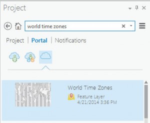
Because the focus is the U.S., clip World Times Zones to the extent of USA States.
When the tool finishes running, a new layer of U.S. time zones is added to the map.Step 2: Create Information
The Summarize Within tool will generate a new output layer that includes a count of attendee points within each time zone polygon.
The tool output is added to the map with a single symbol legend. To better visualize attendance by time zone, apply a graduated colors legend.
Not surprisingly, the most populated time zone (Eastern) attracted the most attendees, followed by the Pacific time zone.Step 3: Share Your Work
These analysis results are useful to those who monitor live training seminar attendance patterns. You can share content you create in ArcGIS Pro with everyone in your organization, with members of organizational groups you specify, or even with the general public.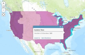
When the share job completes, colleagues can view the web map in the ArcGIS Online map viewer or in ArcGIS Desktop.
And there you have it. It's never been easier to access an extensive collection of high-caliber data, use it for your project needs, apply analysis tools to generate new data, and share your work in a format that others can easily access and understand.
Related posts:Resources to learn more:
ArcGIS Pro is associated with an ArcGIS Online organization and integration is built into the interface. You can directly publish content you create in ArcGIS Pro to the organization and easily grab content from ArcGIS Online to support mapping and analysis projects.
Here's a simple example that shows how.The Example
Almost every month of the year, Esri Training Services hosts one or more live training seminars. And for years, we've been doing three live broadcasts at the same times on each seminar day. From time to time, we evaluate whether our broadcast schedule is still suitable—do we need to adjust the broadcast times or number of broadcasts?
Examining the distribution of seminar attendees helps us answer these questions. For simplicity, this example focuses on U.S. seminar attendance.Step 1: Prepare the DataFinding the data needed for a GIS analysis is a common challenge. ArcGIS Online organizational subscriptions include access to a large content library. From within ArcGIS Pro, you have easy access to this content.

- Start ArcGIS Pro and open a blank project and a new map. Add the seminar attendee data.
- In the Project pane, click the Portal tab, then click the icon for All Portal.
- In the search box, enter world time zones.
- Drag the feature layer into the map. Now search for usa states and drag the USA States (Generalized) feature layer into the map.
Because the focus is the U.S., clip World Times Zones to the extent of USA States.
- Click the Analysis tab, then click the Clip tool in the tool gallery. Fill out the tool's parameters, then run the tool.
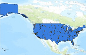
When the tool finishes running, a new layer of U.S. time zones is added to the map.Step 2: Create Information
The Summarize Within tool will generate a new output layer that includes a count of attendee points within each time zone polygon.
- In the Analysis tool gallery, click Summarize Within.
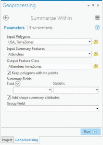 In the tool dialog box, specify Input Polygons, Input Summary Features, and the Output Feature Class.
- Run the tool.
The tool output is added to the map with a single symbol legend. To better visualize attendance by time zone, apply a graduated colors legend.
Not surprisingly, the most populated time zone (Eastern) attracted the most attendees, followed by the Pacific time zone.Step 3: Share Your Work
These analysis results are useful to those who monitor live training seminar attendance patterns. You can share content you create in ArcGIS Pro with everyone in your organization, with members of organizational groups you specify, or even with the general public.

- In the Contents pane, remove the World Time Zones and USA States layers. Turn off the USA time zones and basemap layers. Save the project.
- Click the Share tab and click Web Map. Fill out the Item Description and choose to share to your organization (requires publish privileges).
- Click Analyze to make sure there are no errors, then click Share.
When the share job completes, colleagues can view the web map in the ArcGIS Online map viewer or in ArcGIS Desktop.
And there you have it. It's never been easier to access an extensive collection of high-caliber data, use it for your project needs, apply analysis tools to generate new data, and share your work in a format that others can easily access and understand.
Related posts:Resources to learn more:
Labels
You must be a registered user to add a comment. If you've already registered, sign in. Otherwise, register and sign in.
About the Author
Suzanne is a Maryland native who enjoys writing about Esri technology, GIS professional development, and other topics. She is the Training Marketing Manager with Esri Training Services in Redlands, California.
Labels
-
ArcGIS Desktop
26 -
ArcGIS Step by Step
46 -
Class Resources
18 -
e-Learning
62 -
MOOCs
28 -
Software Demos
10 -
Technical Certification
16