- Home
- :
- Community Resources
- :
- Community Ideas
- :
- Horizontal Scrollbar for Code Sample would improve...
- Subscribe to RSS Feed
- Mark as New
- Mark as Read
- Bookmark
- Follow this Idea
- Printer Friendly Page
- Report Inappropriate Content
Horizontal Scrollbar for Code Sample would improve readability
- Mark as New
- Bookmark
- Subscribe
- Mute
- Subscribe to RSS Feed
- Permalink
- Report Inappropriate Content
When I post code, I would like the option to not use wordwrap, but instead show a horizontal scrollbar, like stackoverflow does.
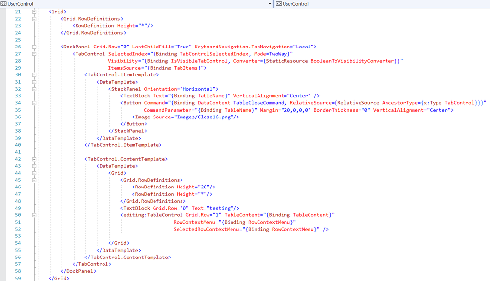
This doesn't look good:
<UserControl x:Class="AttributeTableViewer.AttributeTableView"
             xmlns="http://schemas.microsoft.com/winfx/2006/xaml/presentation"
             xmlns:x="http://schemas.microsoft.com/winfx/2006/xaml"
             xmlns:mc="http://schemas.openxmlformats.org/markup-compatibility/2006"
             xmlns:d="http://schemas.microsoft.com/expression/blend/2008"
             xmlns:ui="clr-namespace:AttributeTableViewer"
             xmlns:extensions="clr-namespace:ArcGIS.Desktop.Extensions;assembly=ArcGIS.Desktop.Extensions"
             xmlns:editing="clr-namespace:ArcGIS.Desktop.Editing;assembly=ArcGIS.Desktop.Editing"
             mc:Ignorable="d"
             d:DesignHeight="300" d:DesignWidth="300"
             d:DataContext="{Binding Path=ui.AttributeTableViewModel}">
     <UserControl.Resources>
        <ResourceDictionary>
            <ResourceDictionary.MergedDictionaries>
                <extensions:DesignOnlyResourceDictionary Source="pack://application:,,,/ArcGIS.Desktop.Framework;component\Themes\Default.xaml"/>
            </ResourceDictionary.MergedDictionaries>
            <BooleanToVisibilityConverter x:Key="BooleanToVisibilityConverter"  />
        </ResourceDictionary>
    </UserControl.Resources>

    <Grid>
        <Grid.RowDefinitions>
            <RowDefinition Height="*"/>
        </Grid.RowDefinitions>

        <DockPanel Grid.Row="0" LastChildFill="True" KeyboardNavigation.TabNavigation="Local">
            <TabControl SelectedIndex="{Binding TabControlSelectedIndex, Mode=TwoWay}"
                        Visibility="{Binding IsVisibleTabControl, Converter={StaticResource BooleanToVisibilityConverter}}"
                        ItemsSource="{Binding TabItems}">
                <TabControl.ItemTemplate>
                    <DataTemplate>
                        <StackPanel Orientation="Horizontal">
                            <TextBlock Text="{Binding TableName}" VerticalAlignment="Center" />
                            <Button Command="{Binding DataContext.TableCloseCommand, RelativeSource={RelativeSource AncestorType={x:Type TabControl}}}"
                                    CommandParameter="{Binding TableName}" Margin="20,0,0,0" BorderThickness="0" VerticalAlignment="Center">
                                <Image Source="Images/Close16.png"/>
                            </Button>
                        </StackPanel>
                    </DataTemplate>
                </TabControl.ItemTemplate>

                <TabControl.ContentTemplate>
                    <DataTemplate>
                        <Grid>
                            <Grid.RowDefinitions>
                                <RowDefinition Height="20"/>
                                <RowDefinition Height="*"/>
                            </Grid.RowDefinitions>
                            <TextBlock Grid.Row="0" Text="testing"/>
                            <editing:TableControl Grid.Row="1" TableContent="{Binding TableContent}"
                                              RowContextMenu="{Binding RowContextMenu}"
                                              SelectedRowContextMenu="{Binding RowContextMenu}" />

                        </Grid>
                    </DataTemplate>
                </TabControl.ContentTemplate>
            </TabControl>
        </DockPanel>
    </Grid>

</UserControl>
This is more readable, but a user can't copy and paste:
- Mark as Read
- Mark as New
- Bookmark
- Permalink
- Report Inappropriate Content
The previous version of GeoNet had horizontal scrolling instead of wrapping
- Mark as Read
- Mark as New
- Bookmark
- Permalink
- Report Inappropriate Content
Thanks for the request for this functionality. We will look into the options to change the behavior from wrap to horizontal scroll and report back.
- Mark as Read
- Mark as New
- Bookmark
- Permalink
- Report Inappropriate Content
@Anonymous User I'm finding lots of posts that are compressed as a single line of code... is this related or another issue.
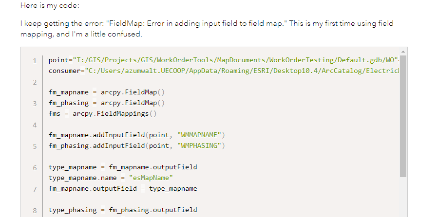
EG this page https://community.esri.com/t5/python-questions/fieldmap-error-in-adding-input-field-to-field-map/td-p/129796
When loading the page it looks okay:
And Once loaded I get a compressed single line of code in the code block
- Mark as Read
- Mark as New
- Bookmark
- Permalink
- Report Inappropriate Content
Thanks Graham for the question. What you are seeing with compressed code is a known issue with some migrated code snippets and I think different to the topic of this request for horizontal scrollbar instead of wrap in displaying code samples.
This example you shared was created in 2019 and we migrated this to our new platform in 2020. I have an open support ticket on this issue and have added this example to that ticket for further investigation. I have added your report to this document for further updates when we have them Known Issues and Future Enhancements - Esri Community
- Mark as Read
- Mark as New
- Bookmark
- Permalink
- Report Inappropriate Content
The horizontal scrollbar was deployed today - please let us know your thoughts on this change and whether it meets your original suggestion?
- Mark as Read
- Mark as New
- Bookmark
- Permalink
- Report Inappropriate Content
SO.... Much.... Better. Thank you for focusing on the users!
- Mark as Read
- Mark as New
- Bookmark
- Permalink
- Report Inappropriate Content
I found some more old content that has lost the formatting and makes taking the code sample almost impossible to reuse.
- Mark as Read
- Mark as New
- Bookmark
- Permalink
- Report Inappropriate Content
Thanks Graham, good news we actually have a fix for this in our lower tier environments which is undergoing testing. This fix will be applied to all content where the code snippet has lost its formatting which we understand mostly applies to old content prior to our migration in November 2020. We are hoping to deploy this fix in the next few weeks.
- Mark as Read
- Mark as New
- Bookmark
- Permalink
- Report Inappropriate Content
You must be a registered user to add a comment. If you've already registered, sign in. Otherwise, register and sign in.


