- Home
- :
- All Communities
- :
- Products
- :
- ArcGIS StoryMaps
- :
- Classic Esri Story Maps Questions
- :
- Shortlist thumbnails stretched
- Subscribe to RSS Feed
- Mark Topic as New
- Mark Topic as Read
- Float this Topic for Current User
- Bookmark
- Subscribe
- Mute
- Printer Friendly Page
Shortlist thumbnails stretched
- Mark as New
- Bookmark
- Subscribe
- Mute
- Subscribe to RSS Feed
- Permalink
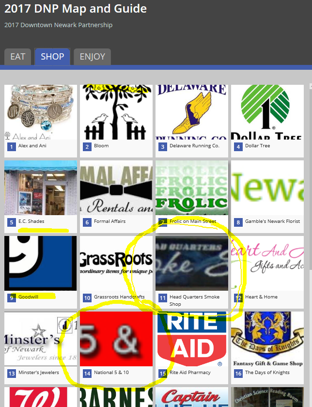
Hi. I have been working with StoryMaps Shortlist Beta to develop a web map app of downtown businesses in Newark, DE, and I am having trouble with the thumbnails appearing incorrectly in the main category Tabs (Eat, Shop, Enjoy). I have read several other similar questions on the topic, but I thought it better to ask.
I am using business logos of varying sizes in the pixel x and y directions, and include both landscape and portrait orientation. If my original jpg was larger than 280x210, I would reduce, for example, the pixel x to 280 and let the pixel y change to whatever calculated count to preserve aspect ratio (assuming it did not end up being greater than 210). If only one pixel count exceeded 280 or 210, I would reduce count respectively. If the original jpg was less than 280x210, I left it alone. I have spent quite a bit of time adjusting file sizes hoping to find the right size so that each thumbnail looks as it should, but with no luck. Some thumbs have the top and bottom cropped, other thumbs that are small to begin with, are grossly stretched. The miage resolutions are mainly 72x72, with some at 300x300. The images are being hosted on a server outside of our firewall. The CSV file I use to create the web map and app have URLs pointing to the files on the server. I copied all of the images to Flickr, but I got nowhere with that (some sort of user name error whenever I tried to access the camera roll). So I am not sure what I am doing incorrectly, not understanding, etc. Thank you in advance for any help. Sincerely, Jay

- Mark as New
- Bookmark
- Subscribe
- Mute
- Subscribe to RSS Feed
- Permalink
If I drag and drop files into the Builder from my desktop, instead of specifying a URL to the image hosted on an external server in the CSV file, will the app display the images for other users?
- Mark as New
- Bookmark
- Subscribe
- Mute
- Subscribe to RSS Feed
- Permalink
I figured out a way to manage images of varying pixel size and the distortion. Using GIMP, I resized the canvas behind the logo to provide a more consistent image size and "margins" around the logo. The logos look great.