Business Blog

cancel
Showing results for 
Show  only  | Search instead for 
Did you mean: 

Other Boards in This Place


Latest Activity

(15 Posts)
Liz_esri
Esri Contributor

Discover what's new with Esri Demographics

Read more...

more
2 0 49
ShareUser
Esri Community Manager

Watch this webinar hosted by Esri solution engineers in the Mid-Atlantic Region

Read more...

more
0 0 107
Liz_esri
Esri Contributor

Esri’s U.S. Market Potential data, updated annually, provides insights into consumer behaviors, preferences, and demand for thousands of products or services such as gift cards.

Read more...

more
0 0 125
Liz_esri
Esri Contributor

Understanding urbanicity can provide valuable insights into people’s behaviors, shopping habits, and more. Discover how Esri's newly released urbanicity data offering can benefit your business. 

Read more...

more
1 0 152
ChrisChiappinelli
Esri Contributor

An inside look at how GIS analysts are helping companies assess their impacts on nature and respond to new reporting demands.  

Read more...

more
3 0 457
by Anonymous User
Not applicable

As a GIS user, you may have been tasked with implementing a new GIS Systems or solution in the company, as many of us know the majority of the GIS departments are not that big, and usually, one person is doing it all, so what are the steps that you need to know to undergo this new task and encouraging the end-users to ensure the best possible success? 


Read more...

more
5 4 6,073
rsands
by Esri Contributor
Esri Contributor

When I was in grad school, I spent a lot of time working with remotely sensed data. When the June 2018 release of ArcGIS Online introduced the Relationship mapping style, it immediately activated the same parts of my brain that really appreciates false color imagery. Relationship mapping makes it easier than ever to use color to explore the relationships between variables.

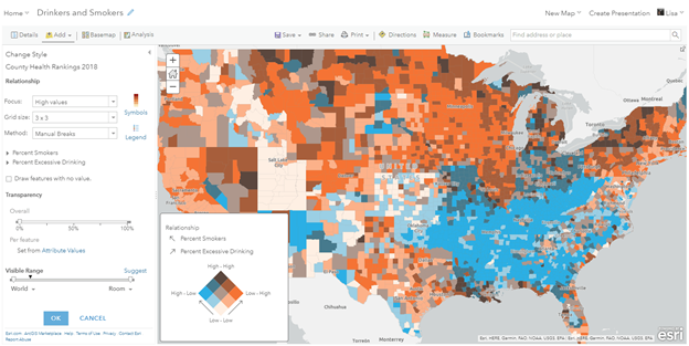
If you haven’t seen read them yet, Lisa Berry’s introduction to Relationship mapping and “how to” guide provide a great overview of relationship mapping with several use cases. In the map below from Lisa’s blog, relationship mapping is used to show the similarities and differences in the spatial patterns of persons who smoke and persons who drink:

But what if I wanted to map the relationship between drinking, smoking, and some other variable at the same time?

Enter attribute-driven symbology in ArcGIS Pro. Attribute-driven symbology allows you to customize  symbols to reflect different aspects of the data by connecting your rendering properties to feature attributes. These feature attributes can include normal attributes in your data, as well as Arcade functions. The ability to leverage Arcade becomes particularly useful. As you’ll see below, we can use an Arcade function to transform three columns of data into an rgb or rgba code.

Getting Started

When I try to learn something new, I always find it helpful to start with inputs for which I know what the expected result should be. Since color combinations are important here, working with an image was a helpful starting point, so I decided to create some test data using an image from the Esri User Conference in 2019:


To use attribute driven symbology, the first thing that needed to happen was transferring the RGB values from the image to a polygon dataset. Without getting too deep into the weeds, the workflow involves converting the raster data into a polygon dataset, then using analysis tools to effectively transfer the average RGB values to a new set of polygons:


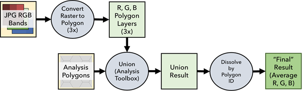
This result is a polygon feature class with three attribute fields that I wanted to use to set the red, green, and blue color values for each feature. In this case, the values represent the average red, green, and blue values from the source image within each polygon, but they could be any fields in your data.

With test data in hand, the next step is to enable attribute driven symbology, and add the Arcade function. 


Because our test data already has red, green, and blue fields, all I need to do is write an Arcade function that returns something like “rgb(111, 222, 333)”. Here’s the code I used, but you could also write an Arcade function to create RGB values from your data, or use HSL, CMYK, or one of the many other supported color formats:

function getRGB(r, g, b) {
  return "rgb(" + r + ", " + g + ", " + b + ")";
}

getRGB($feature.MEAN_Red, $feature.MEAN_Green, $feature.MEAN_Blue)‍‍‍‍‍‍‍‍‍‍‍‍‍‍‍‍‍‍‍‍‍‍‍‍‍‍‍‍‍‍‍‍‍‍‍‍‍‍‍‍‍‍‍‍‍‍‍

With attribute-driven symbology now controlling the features’ colors, the last step is to click apply and enjoy the result:


At this point, I was eager to apply this to some real data. But first I had to answer a few questions from around the office. The first one was “Did you reproject your face?” followed by “How exactly is this working?”  and lastly “Can you do this to a picture of my cat?” – to which the answers were “no,” “let me show you,” and “of course!”:

Bringing it all back together

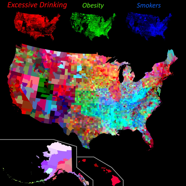
I hope that this (less than) practical example helps paint the picture of how you can use Attribute Driven Symbology in ArcGIS Pro to link the color in your maps to the attributes in your data. Using the example I showed from the beginning of this blog, what would a map look like if we wanted to show the relationship between smoking, drinking, and obesity?

Using Attribute Driven Symbology, we can create just this map! In this case, I used Arcade to rescale all three values from 0 – 255, and return that value as an RGB code. In the new map, red represents excessive drinking, green represents obesity, and blue represents smokers. The way that the colors combine contains a lot of information. For example, yellow areas are high in both excessive drinking and obesity, but relatively lower in smoking.


Try it out!

Hopefully, there’s enough information in this post for you to start experimenting with attribute driven symbology on your own. As you experiment, it’s important to consider your audience and use case. Using color as the only way to convey information on your map can have serious implications for how accessible your maps are and may not always be a good option. Esri’s Javascript API documentation has a great reference page where you can find color ramps that meet specific criteria, including being colorblind-friendly.

For fun (and to the benefit of your social media accounts) feel free to check out this python toolbox that should make it easier to start with a picture & a polygon dataset and end up with a new dataset which you can use for attribute driven symbology. Ever wonder what a family picture would look like when mapped to US County boundaries? There’s only one way to find out!

more
6 2 5,766
EmilyKnish-Anderson
Esri Contributor

There will be a webinar this Friday March 20th at 2:00 CST to cover all of the current resources available around the COVID-19 pandemic. I will review what is available and how these resources could be used in your own organizations.

Register from the link below:


Registration: https://attendee.gotowebinar.com/regist…/1833267819664196619


At the end of the call we would also like to hear from the community about content you are creating that has been helpful and resources you would like to have.


This is a very intense time and we here at Esri are all here to help anyway we can with your GIS needs. Do not be afraid to reach out to your account team for assistance on finding data or help standing up necessary applications to stay informed about the current situation.

more
1 0 1,871
EmilyKnish-Anderson
Esri Contributor

ArcGIS Hub is gaining a lot of attention, especially with the COVID-19 GIS Hub site trending in popularity. Hub helps to assist communication and collaboration across many different use cases and audiences. Using the COVID-19 GIS Hub as an example, it looks similar to any modern web page we interact with on a daily basis. Information is clear and organized, there are even datasets that can be downloaded from the site directly. Applications, such as Dashboards for ArcGIS, can be embedded into the site pages as well. The COVID-19 GIS Hub includes many different application examples that are ready for users to interact with, along with Tweets updated in real-time about current health and risk topics. There is a lot of information on this Hub site! The Hub software gives you the ability to properly organize this data though, so it is not overwhelming for the end user. Anyone from a seasoned GIS professional to someone who knows absolutely nothing about GIS (like maybe your internet savvy Grandma) can obtain actionable information from this site.

COVID-19 Hub Site Overview

There are two versions of ArcGIS Hub, Hub Basic is included with your ArcGIS Online subscription. It is also worth mentioning that Hub Basic is similar to Enterprise Sites (in ArcGIS Enterprise). Hub Premium offers additional capabilities such as initiative management, event management, and Hub site performance tracking dashboards. You can view the complete breakdown here of the features included at each level.

Initiatives in Hub can be created around many different use cases, this can be like the example above, sharing information and data from a central page about the COVID-19 event. Initiatives can also be about outreach campaigns within communities, or a specific project a department is working on (like a project around data collection after a recent natural disaster, or important stuff like if the office should have donut Fridays). Survey 123 forms can be embedded into the Hub site to collect feedback. ArcGIS Hub also includes the ability to manage events (like an annual GIS Day event), this is a great tool to further increase collaboration among users of the site.

Still not totally clear on ArcGIS Hub? Still not sure how you could use it or why it matters? Well, luckily there are plenty of marvelous examples to hit this point home. The main ArcGIS Hub Gallery has a wealth of examples. A couple of my favorites include The Northern Tornadoes Project and the Earth Challenge 2020 Hub sites.

Some other examples that do a wonderful job showcasing Hub’s many capabilities are below:

Irelands’ Sustainable Development Goals Data Hub - Notice the great use of individual interactive cards for each sustainability goal.

Esri Australia’s Hub site built around content related to Bushfire activity - There are links to data and ready to use applications for users to be able to easily find and use.

The CUSEC Shaken Fury Hub – This is a unique example. The Shaken Fury Exercise simulates the response and recovery to a 7.7 magnitude earthquake scenario near Memphis, Tennessee. This hub site shows the coordination efforts shared from many different sources around this exercise.

The City of Los Angeles GeoHub – Is a great example of using a Hub site to share open data. The “Unlock the City’s Geodata” section is very well done.

I hope this helps to clarify how valuable a Hub site can be, and to get the creative ideas flowing around how you could start building one today! If you have built a Hub site that you are super proud of and can share, please share that with us! It is always fantastic to see the amazing content you all build, and it would be great to see examples from our Business community!

more
2 0 1,875
DennisJarrard
Esri Contributor

Introduction

Date/Time fields add a whole new dimension to analysis and visualization of spatial data. They specify an exact point in time, similar to how coordinates specify an exact point in space. When working with spatial data, generating relative content is something we naturally do all the time. For example, we might calculate an area (such as a buffer) that is anchored on an input point. Or we might measure a distance from a point to another object. The outcomes of those analyses are relative, that is, they are relative representations based on an exact starting point. By themselves, the exact coordinates might not mean much, but we can derive something of meaning and value from it.

Time works the same way. When talking about your birthday party, you could say “my birthday party on February 15th 2020, 6:00 PM”…but it’s easier for the person you’re talking to understand if you just say “my birthday party last night”. Or when your friend asks you “When will the burgers be done?”, you could say “February 26th, 5:30 PM”, when “in about 30 minutes” is going to be far more effective in getting your point across. These expressions are relative to a precise point in time: right now. In ArcGIS, dates and times are specified precisely, but you can incorporate relative representations of those dates and times in your maps to make them easier to understand. In this post, we're going to look at manipulating symbols and popups to reflect relative time.

Incorporating Relative Time in Symbology

When viewing a live feed, we might want to want to symbolize the data in such a way that, as events age, they become less and less visually significant until they phase out all together. For example, take a look at the map below. We pulled in MODIS Hotspots from the Living Atlas, applied a filter to just show the last 24 hours, and then used Arcade to categorize each hotspot to a "recentness" category. As these hotspots age, they'll diminish and ultimately disappear from view.

Map Showing Relative Time Symbology of MODIS Hotspots

With Arcade, you have the flexibility to work with your date fields in any number of ways, customize thresholds, and even calculate your own new, derived dates. Read on to learn how to build this exact map for yourself to get started.

First, lets setup the map. Open a new webmap, Click Add >> Browse Living Atlas Layers >> and search "MODIS". The first result should be a "Satellite (MODIS) Thermal Hotspots and Fire Activity" feature layer by Esri. Go ahead and add that layer to your map. In the Content pane, click on the filter button for the MODIS layer and set a filter for "Acquisition Date in the last 1 day(s)". Apply Filter. This will filter the hotspots to be in the last 24 hours. Now click Basemap at the top, and select the Dark Gray Canvas basemap.  Now it's time to use Arcade to build our own relative time symbology for the hotspots.

For the MODIS layer, click the Change Style button. Expand "Choose an attribute to show", scroll to the bottom of the field list and click "New Expression". This will launch the Arcade Expression builder. Paste the following code into the Expression body.

function determineCategory(value){
    if (value <= 4 ){
        return "1"
    }
    else if (value > 4 && value <= 8){
        return "2"
    }
    else if (value > 8 && value <= 12){
        return "3"
    }
    else if (value > 12 && value <= 16){
        return "4"
    }
    else if (value > 16 && value <= 20){
        return "5"
    }
    else {
        return "6"
    }
}

var hours = DateDiff(now(),$feature["ACQ_DATE"], "hours")
determineCategory(hours)‍‍‍‍‍‍‍‍‍‍‍‍‍‍‍‍‍‍‍‍‍‍‍‍‍‍‍‍‍‍‍‍‍‍‍‍‍‍‍‍‍‍‍‍‍‍‍‍‍‍‍‍‍‍‍‍‍‍‍‍‍‍‍‍‍‍‍‍‍‍‍‍‍‍‍‍‍‍‍‍‍‍‍‍‍‍‍‍‍‍‍‍‍‍‍‍‍‍‍‍‍‍‍‍‍‍‍‍‍‍‍‍‍‍‍‍‍‍‍‍‍‍‍‍‍‍‍‍‍‍‍‍‍‍‍‍‍‍‍‍‍‍‍‍‍‍‍‍‍‍‍‍‍‍‍‍‍‍‍‍‍‍‍‍‍‍‍‍‍‍‍‍‍‍‍‍‍‍‍‍‍‍‍‍

You can modify the thresholds for each category here if desired. Just keep in mind that the filter we applied to the layer only displays those hotspots that were recorded in the last 24 hours. If you happen to be working with a different layer, you'll need to replace the $feature["ACQ_DATE"] so it's pointing to a date field in your layer. Click "Test" to make sure it's working. If it's successful, you should see a Result value of 1-6 (1 being most recent, 6 being oldest). Click OK to apply the script.

The "Unique symbols" types will automatically be selected. Click Options to modify how these display. Modify the symbol order to 1-6 by dragging the entries to the appropriate position. Now that everything is in the right order, go ahead and change the Labels for each category so that they are reflective of the time range.. I used "In the last 4 hours" for the first one and a schema of "X to Y hours ago" for the last five. Alright, now we're ready to create the symbols. Click on the first symbol to open up the Symbol Changer. Click Shape, open the dropdown, and select "Firefly". The ramp I used was the light green to red ramp.
Firefly Ramp

Select the most intense one on the ramp (the farthest to the right), and set the size to 36. Repeat this process for the other categories, working your way left on the ramp, and decreasing the size each time by 6 (e.g. 36, 30, 24, 18, 12, and 6). Once all your symbols are configured how you like, go ahead and play around with the Transparency slider in the Style pane to dial in the look you're going for. When it's all said and done, your Style pane should look something like this:

Symbol Pane

Click OK to lock it all in. And, voila! You should now have a map of MODIS hotspots that age over time based on current time. Great work! Also, don't forget to save your map!

Incorporating Relative Time in Popups

You can also setup relative time expressions in your popups and transform a precise date and time into something a little more human-friendly. For example, go back to the example map provided toward the top of this post. If you click a hotspot, in the popup you'll see the exact date and time as well as a relative expression like "2 hours and 5 minutes ago". That second part is being calculated by Arcade on-the-fly as well. 

To set this up in your own map, open the "Configure Popup" pane for the MODIS Hotspot layer. Click "ADD" under the Attribute Expressions section. This will launch another Arcade Expression builder. Paste the following code into the Expression block:

var myDateField = $feature["ACQ_DATE"];

function getTimeDelta(alertDate){
    var minutes = DateDiff(now(),alertDate, "minutes")
    var hours = DateDiff(now(),alertDate, "hours")
    var days = DateDiff(now(),alertDate, "days")
    if (minutes <= 120){
        return round(minutes) + " minutes ago"
    }
    if (minutes > 120){
        if (hours <= 48){
            var tFloor = floor(hours)
            var deltaMin = datediff(now(),dateadd(alertDate,tFloor,'hours'),'minutes')
            return round(tFloor) + " hours and " + round(deltaMin) +  " minutes ago"
        }
        if (hours > 48){
            var dFloor = floor(days)
            var deltaHour = datediff(now(),dateadd(alertDate,dFloor,'days'),'hours')
            return round(dFloor) + " days and " + round(deltaHour) + " hours ago"
        }
    }
}
return getTimeDelta(myDateField)‍‍‍‍‍‍‍‍‍‍‍‍‍‍‍‍‍‍‍‍‍‍‍‍‍‍‍‍‍‍‍‍‍‍‍‍‍‍‍‍‍‍‍‍‍‍‍‍‍‍‍‍‍‍‍‍‍‍‍‍‍‍‍‍‍‍‍‍‍

This expression will look at the time delta between the current time and the date in the field and use some conditional logic to build a human friendly expression of that delta. This expression is built to also work with Days, but since we've setup our hotspots to only see the last 24 hours, we won't see that. But you can use this expression as a template to for other layers you want to work with. In that case, the only thing you'll have to do is change the $feature["ACQ_DATE"] bit to point to a date field in your layer. 

Click Test to verify it works, followed by an exuberant click of the "OK" button. From here, configure the popups however you like, making sure that the expression you created is visible. The expression acts like a field, so you can see it as part of a default popup style or configure it as part of a custom attribute display.

Popup

Arcade gives you the flexibility to customize how things are conveyed to your audience without requiring you to modify the schema of your data or run constant field calculations. Temporal representations is just one use case of that. Hopefully this gives you a start to exploring whats possible. Thanks for reading!

more
5 5 3,633
27 Subscribers