- Home
- :
- All Communities
- :
- Products
- :
- ArcMap (Retired)
- :
- ArcMap Questions
- :
- Re: Plotting overlapping points in ArcMap
- Subscribe to RSS Feed
- Mark Topic as New
- Mark Topic as Read
- Float this Topic for Current User
- Bookmark
- Subscribe
- Mute
- Printer Friendly Page
- Mark as New
- Bookmark
- Subscribe
- Mute
- Subscribe to RSS Feed
- Permalink
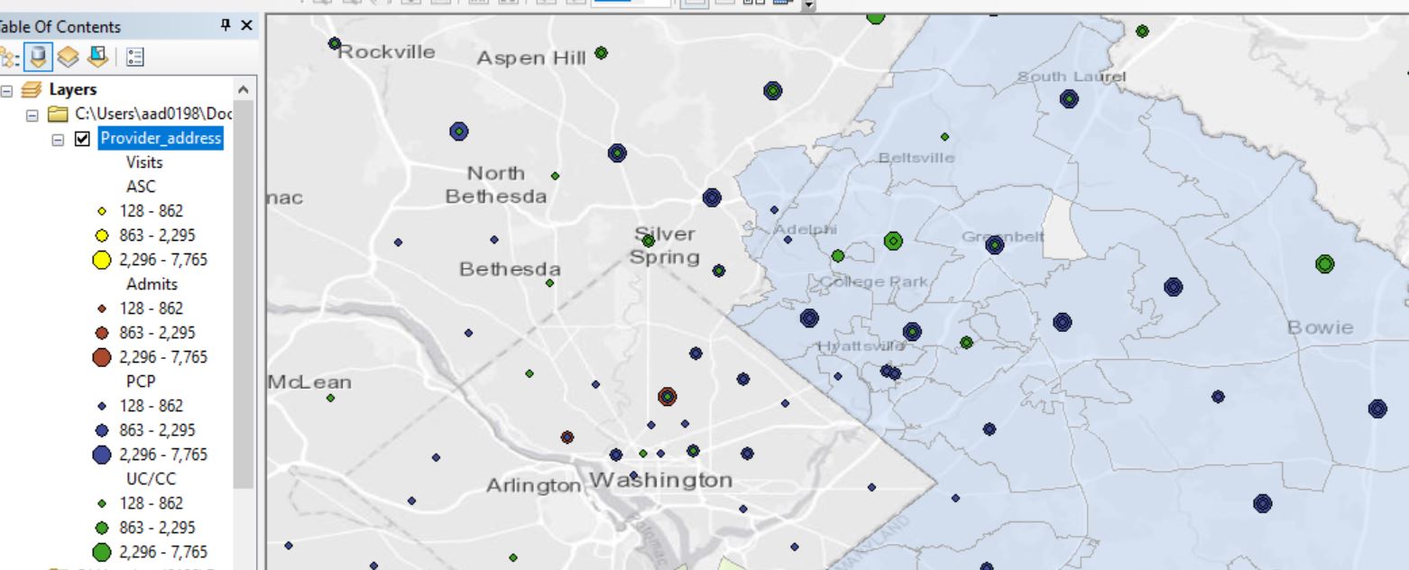
Hello: I am trying to plot four categories of health care providers, using X/Y coordinates for address. Several provider addresses have the same X/Y coordinates, and are therefore overlapping. However, for some reason, the "ASC" category (shown in yellow in the screenshot below) are not displaying at all. When I remove the other three categories from the layer, the "ASC" category is displayed.
Would appreciate any suggestions for formatting, etc. I have tried changing the shape for this category and slightly increasing the offset for the "ASC" category, but that conflicts with the business requirements for this project.
Thank you!

Solved! Go to Solution.
Accepted Solutions
- Mark as New
- Bookmark
- Subscribe
- Mute
- Subscribe to RSS Feed
- Permalink
By default, features are drawn in the order they are returned from the database, not they way they are in the symbology. So, points in the bottom of the attribute table will draw over the points in the top.
You will still have the overlaps, but you might be able to use Symbol layer drawing to change the order they are drawing.
I haven't used it, but see this post, the first comment with the video and link. Might accomplish what you are after.
Could also copy the layer 4 times, put a definition query on each layer to only show one of the classes, then symbolize them and group to provider_address group layer. Different layers do draw in the order of the TOC.
Depending on you final goal, you might be able to use clustering.
R_
- Mark as New
- Bookmark
- Subscribe
- Mute
- Subscribe to RSS Feed
- Permalink
How To: Offset overlapping point feature symbols (esri.com)
You'd also need label classes for the different values. The representations way is a bit trickier also. Nothing super easy I'm afraid.
- Mark as New
- Bookmark
- Subscribe
- Mute
- Subscribe to RSS Feed
- Permalink
Are you sure the ASC's aren't being drawn "under" the others so you just don't see them until you remove the others?
Could make the yellow dot's a bunch larger to see if they are underneath the others.
R_
- Mark as New
- Bookmark
- Subscribe
- Mute
- Subscribe to RSS Feed
- Permalink
Thanks - yes, that appears to be the issue. They are underneath the other categories, but I don't know why.
I tried changing the order of the categories several times, and it doesn't have any effect.
I exaggerated the size of the ASC circles to make them pop out, but it doesn't have any effect.
I changed the shape of ASC to squares and yep, they sort of peep out from behind the circles.
- Mark as New
- Bookmark
- Subscribe
- Mute
- Subscribe to RSS Feed
- Permalink
By default, features are drawn in the order they are returned from the database, not they way they are in the symbology. So, points in the bottom of the attribute table will draw over the points in the top.
You will still have the overlaps, but you might be able to use Symbol layer drawing to change the order they are drawing.
I haven't used it, but see this post, the first comment with the video and link. Might accomplish what you are after.
Could also copy the layer 4 times, put a definition query on each layer to only show one of the classes, then symbolize them and group to provider_address group layer. Different layers do draw in the order of the TOC.
Depending on you final goal, you might be able to use clustering.
R_
- Mark as New
- Bookmark
- Subscribe
- Mute
- Subscribe to RSS Feed
- Permalink
Thanks again. I think my best bet at this point is copying the layer, as you mentioned, and adjusting the order of the new layers.