- Home
- :
- All Communities
- :
- Products
- :
- ArcMap (Retired)
- :
- ArcMap Questions
- :
- Re: Continous color pie chart legend
- Subscribe to RSS Feed
- Mark Topic as New
- Mark Topic as Read
- Float this Topic for Current User
- Bookmark
- Subscribe
- Mute
- Printer Friendly Page
Continous color pie chart legend
- Mark as New
- Bookmark
- Subscribe
- Mute
- Subscribe to RSS Feed
- Permalink
Hello!
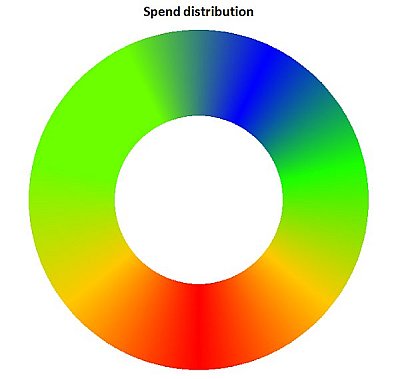
I am in search of a way to create a continuous color pie chart legend in ArcGIS.
I have raster data with values from 1 to 365 days. When I use the available color ramps in ArcGIS (for example Blue to red) the problem is that days like 1(blue) and 365(red) have a very different colors while they are just one day away from each other. What I want is that the color is so continuous that day 1 and 365 have a similar color.
The image below shows what I really want to achieve but I don't know yet how to get it done.
I will appreciate your help even if it has to be done with a different software.
- Mark as New
- Bookmark
- Subscribe
- Mute
- Subscribe to RSS Feed
- Permalink
In ArcMap click the Customize tab and then select Style Manager

When the "Style Manage" opens click to expand the "C:\..." folder and select "Color Ramps"

Right click in the white space to the right of the partition and select "New" > "Multi-part Color Ramp..."

In the Color Ramp dialog that opens click "Add" and Choose "Algorithmic Color Ramp"

Double click the Color Ramp image that appears to the left and pick blue for Color 1 and red for Color 2 and click apply.

Repeat the last few step to "Add" another algorithmic color ramp under the first this time select red as Color 1 and blue as Color 2 and clip apply. The results will look like this:

When you hit apply you can click on the Name and give it any name you want. The next time you open your color ramps in ArcMap it will appear as an option.

Hope this helps.
K
- Mark as New
- Bookmark
- Subscribe
- Mute
- Subscribe to RSS Feed
- Permalink
Thank you @KimberlyGarbade for your kind reply.
I really appreciate it.